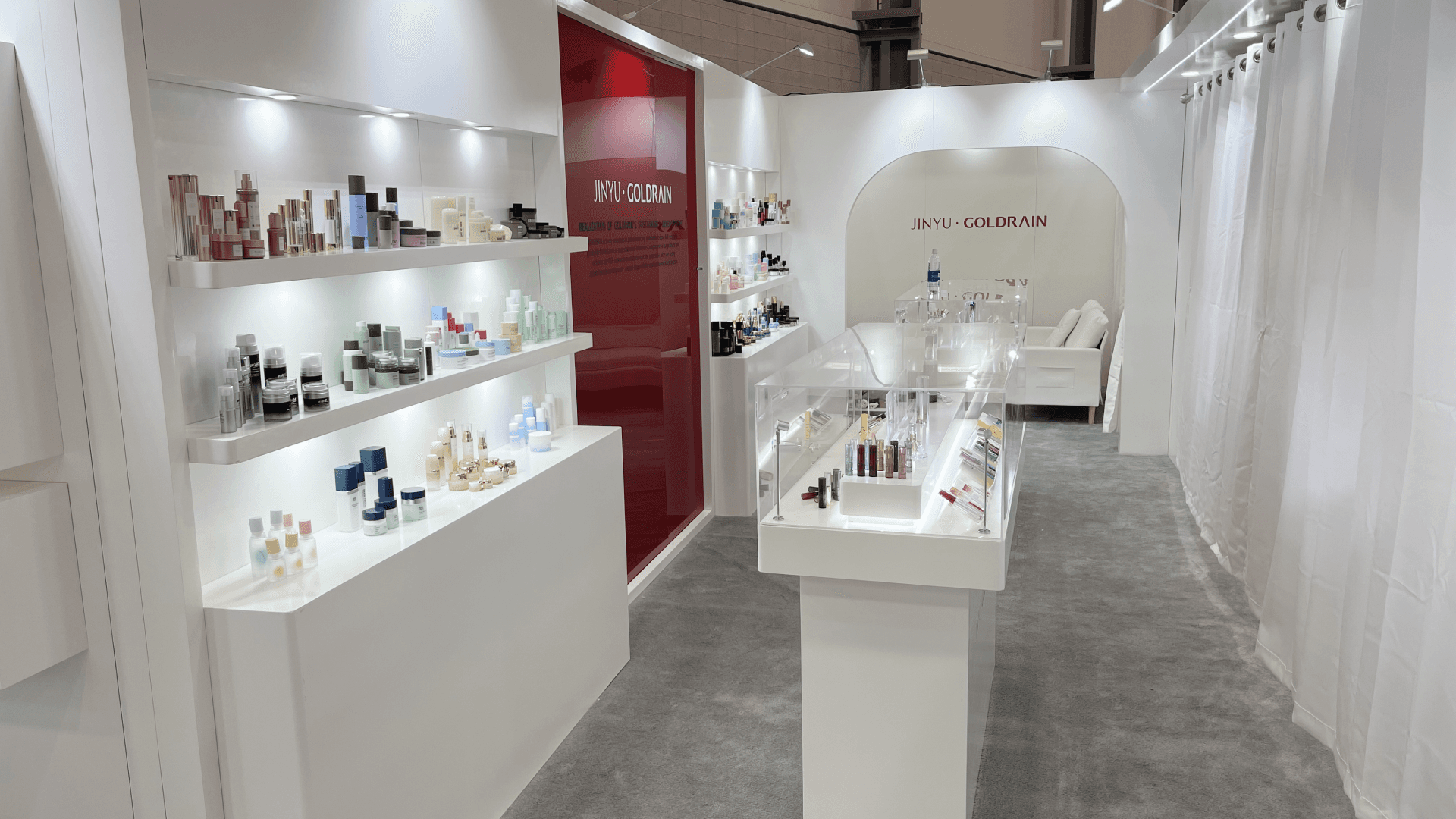
Goldrain’s 20×30 booth at Cosmoprof 2023 was built to make small packaging details easy to understand on a busy show floor—airless bottles, lotion pumps, and cosmetic dispensing components presented like a clean retail shelf, but executed for B2B conversations. We designed the space around three needs: “see it from the aisle,” “touch it at the counter,” and “discuss it privately without leaving the booth.”
If you’re preparing for Cosmoprof North America Las Vegas, the environment rewards booths that stay legible at a distance while supporting close-up evaluation—finishes, closures, and component feel. To keep the product story consistent across multiple SKUs, we treated the wall as a structured presentation system—category shelving, lighting temperature control, and repeatable label positions—so visitors could compare finishes, caps, and closures without confusion. The booth also relied on precision alignment between fabrication and graphics, which is why we planned the build with our graphics & brand presentation workflow from the start.
Because the footprint was a true 20×30 with multiple display faces and a dedicated meeting zone, the layout followed a “front-to-back” flow that supports peak traffic while protecting conversations. For teams planning a similar footprint, our 20×30 booth size guide breaks down what changes when you scale up—display density, storage strategy, and install sequencing.


💼
Client:
📅
Year/Exhibition:
📍
Location:
📐
Size:
🏢
Industry:
Challenge
Cosmetic packaging booths have a specific problem: visitors judge in seconds, but the “value” is in details—material feel, actuator smoothness, bottle wall thickness, finish consistency, and how a line looks as a family. For Goldrain, the challenge was to convert a large catalog into a booth experience that stayed calm, clean, and comparison-friendly.
We needed to handle two opposing behaviors at once:
Fast aisle scanning (people only stop if the display reads clearly at distance)
Deep evaluation (buyers want to inspect components closely and ask precise questions)
That meant the booth couldn’t be “decor-first.” It had to be a controlled presentation environment with reliable lighting, organized shelving logic, and a meeting area that felt private without looking closed.
Design vs. On-site Execution
From a design standpoint, the core move was to treat the booth like a packaging showroom: white surfaces to reduce color cast, evenly lit shelving to reveal finish, and a clean central counter to support sampling and side-by-side comparison. We used a simple geometry language (soft radius entries + long straight product lines) so the booth looked premium without relying on heavy structures.
On-site, the risk is always alignment: shelves, lightboxes, and product acrylics only look “luxury” if edges meet cleanly and lighting is uniform. We sequenced install so the “presentation spine” (lit shelves + hero panels) went in first, then counters, then final trim—reducing last-minute rework and protecting the white finish during move-in and touch-ups.
Category Shelving Wall
A retail-style shelving layout organized by packaging type (bottles, pumps, closures), designed for fast scanning at the aisle and easy side-by-side comparison once visitors step in.
Sample-Ready Demo Counter
A clean working counter positioned for quick “hand-to-hand” demos—opening, closing, and dispensing actions—without blocking circulation. Built for repeatable demos during peak traffic.
Lightbox Product Story Panels
Large-format backlit panels to communicate application context (cosmetic dispensing system, skincare, personal care) and reinforce the brand story when the booth is busy.
Private Meeting Lounge Behind Curtains
A meeting zone screened by soft drape—visually light from the aisle, but effective for privacy. Designed for short negotiations, line review, and follow-up scheduling.

On-site Execution Highlights: Clean Install, Bright Displays, and Fast Restock Flow
Aisle-Ready Entry and Circulation
Precision-Lit Shelf & Display Alignment
Backlit Graphics Installed for Color Accuracy
Storage + Restock Path Built into the Booth
Detail-Finish Control for a Premium White Build
Outcome
Clear shelf logic and large hero panels helped visitors understand “what Goldrain makes” before they even stepped fully inside.
The demo counter and repeatable product positions let staff run the same explanation smoothly—even when multiple visitors arrived at once.
The curtain-screened lounge created privacy for buyer conversations while keeping the booth open and welcoming.
Uniform lighting and tight edge alignment delivered a showroom-level finish that matched the product category.
For cosmetic packaging, “clean” isn’t a style—it’s a functional requirement. When lighting is uneven or shelves are cluttered, buyers can’t compare finishes or trust consistency across a line. This booth worked because every element supported evaluation: stable lighting, organized categories, and enough counter space to demonstrate real actions (dispense, cap fit, closure feel).
A small but important detail was the privacy strategy. Instead of building a hard wall that visually shrinks the booth, the curtain approach maintained openness while giving buyers a place to ask pricing, MOQ, and customization questions without standing in the aisle.
Q&A :
Q: Why prioritize shelving over large décor pieces?
A: Packaging is judged by details. Shelving and lighting make those details readable and comparable—fast.
Q: What makes a demo counter “work” at a cosmetics packaging show?
A: It needs clear standing room, reset speed, and a surface that supports repeated handling without clutter.
Q: How do you add privacy without looking closed?
A: Use visually light screening (like drape) and place it deeper in the footprint—so the booth stays open at the aisle.