When Does a Simpler Booth Layout Work Better?
Begin with what most target visitors will do first. If they primarily need to see one product, watch one demonstration, or ask a short qualifying question, give that activity an obvious place to start. Several equally prominent destinations may make visitors search for the right one.
The product may already provide the visual focus. A physical sample, equipment in motion, or the result of a working demo can draw attention from the aisle. Graphics and staff can supply context once people understand what they are looking at. When the product needs a comparison to make sense, that comparison may deserve space too.
Look at what happens as features are added. Does a counter hide the product? Does another screen pull attention from the demonstration? Is furniture taking the position an employee needs to operate or explain it? These are signs to revise the layout, even when each addition has a reasonable purpose.
A small footprint, familiar brand, repeat exhibition program, or rental structure may support a focused plan. None decides the layout on its own, and a large booth can still have one dominant visual priority. The next step is to examine what every proposed element contributes and what it occupies.

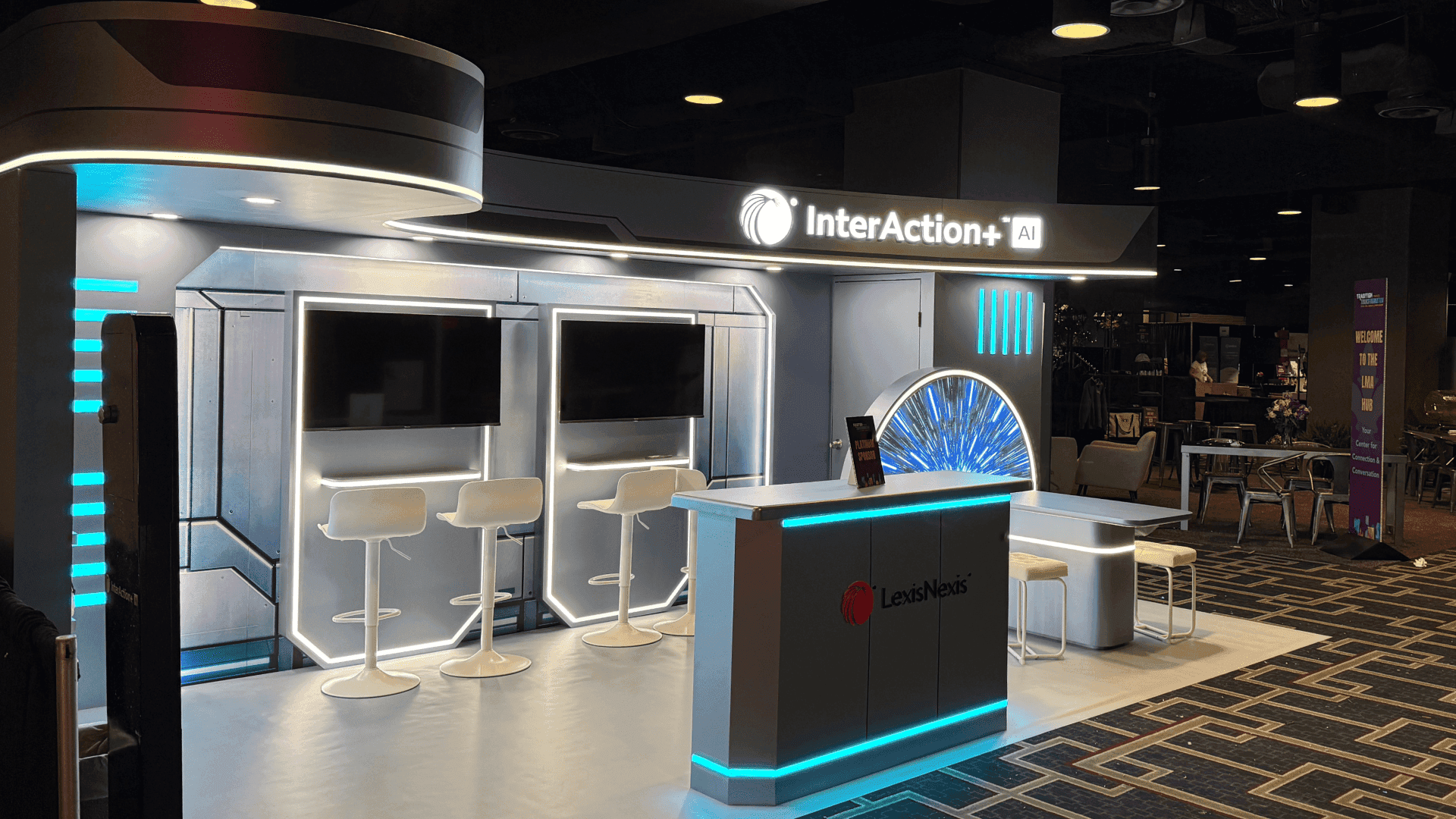
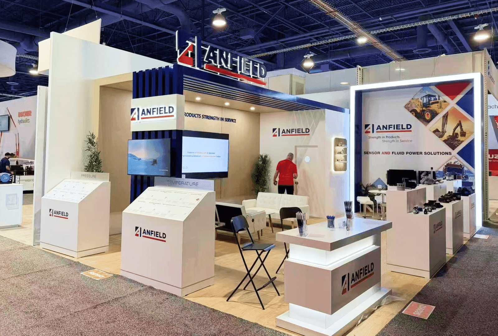
Within the same 10x20 footprint, removing a repeated screen and shifting the counter gives visitors a clearer route to the main demo.
Which Booth Elements Are Competing for Space or Attention?
Give each proposed element a specific job. Then check how it affects the product view, entrance, visitor position, and staff workspace. How often an element is used matters, but so does how essential its job is when needed.
A second screen may be compensating for an unresolved content decision. The split between a fixed message and moving demo content is part of booth graphics and branding; settle it before reserving another display surface.
Element | Intended job | Conflict to check | Keep it when | Adjustment |
|---|---|---|---|---|
Second screen | Show a separate demo, close-up, or viewing angle. | It repeats the main display, splits attention, or hides the product. | The main screen cannot serve a necessary view or a simultaneous activity the team can support. | Combine repeated content with the main display; reposition or remove the second screen if it has no distinct job. |
Front reception counter | Welcome visitors, check them in, or hand over samples. | Its size or staff position closes off the entrance. | Those tasks need a dedicated surface during the show. | Test a smaller counter or move it to the side. Keep a front position only if the work requires it. |
Additional product displays | Show the range or allow comparison. | Secondary items crowd the first view or the demo area. | Buyers need a physical comparison or must quickly identify a relevant core product category. | Group the essential products and move the rest out of the first sightline. |
Meeting furniture | Support buyer discussions. | Seating takes room from viewing, entry, or staff movement. | Regular appointments, longer conversations, or privacy needs justify a dedicated position. | Use a compact standing spot for brief talks; retain more furniture when the conversation requires it. |
Decorative structure | Frame the product, establish brand presence, or define a zone. | It interrupts visibility or consumes working space. | It helps visitors recognize the booth, find the interaction, or use the space. | Reduce parts that add visual mass without serving those purposes. |
The decision is not based on frequency alone. Storage or equipment access, for example, may be essential even if visitors never notice it. For each item, identify the task that would become harder without it before giving its space to something else.
What Must Stay in a Focused Booth?
Visitors should be able to identify the main product, demonstration, or message from the aisle. They also need a way in that is not closed off by a counter or by employees stationed across the opening.
During the show, staff need positions from which they can operate equipment, explain the product, and receive the next visitor. Removing a work surface does not remove the work. Check where samples will be handled and where a conversation can continue without displacing demo viewers.
A live demo needs room for people to watch, enter and leave, and for staff to prepare the next run. These areas may look empty in a rendering while doing essential work during show hours. If the product is demonstrated or tested repeatedly, plan those viewer and reset positions in the live demonstration booth layout.
Samples, cables, and staff belongings need storage as well. Without an assigned place, they can spread into the area opened up by removing other features.

The revised layout assigns one staff member to the demo and another to visitor greeting, while preserving viewing and storage space.
A 10x20 Example: Editing an Overloaded Booth Layout
Take a 10x20 draft with two staff members and one live demo. It includes a main demo screen, a second screen with repeated content, a counter across the entrance, a small meeting table, and necessary storage.
Approach the plan from the aisle. The second screen provides no separate view or activity in this scenario, so remove it. Shift the counter to one side or make it smaller, then check whether a visitor can see the demo and enter without walking around the employee greeting them.
Run through a demonstration next. One person operates the product and resets it; the other welcomes arrivals and handles short questions. Keep the storage so neither person has to leave samples or cables beside the screen or in the visitor path.
Now test the meeting table against the appointment schedule. If longer conversations can take place between demos, a compact standing position may be enough. If appointments regularly overlap with the public presentation, a separate spot could help. With one person presenting and the other in a meeting, however, no one is assigned solely to greet arrivals. Set appointment times or arrange coverage before approving that version.
Before sign-off, check the aisle view, entry, viewer positions, and both employee positions in the booth design mockup.
Those requirements also give the team a useful filter when comparing 10x20 rental designs: start with demo visibility, entry, and storage, then assess optional counters and seating.
When Does a Second Zone Earn Its Space?
Look at the activities the booth must support during the same part of the day. Two independent demos may need separate viewers and operators. Equipment may require its own working and viewing position. Scheduled buyer discussions may need a quieter place while the public presentation continues.
A dedicated zone can also be justified by the nature of an activity, even when it is not constantly in use. Give it a defined purpose, a person responsible for it, and enough space to function. Furniture alone cannot create capacity if two activities depend on the same employee at the same time.
Trace how visitors reach each position. Can new arrivals enter while others watch? Can a buyer move toward a conversation without crossing the demo? If those paths still collide after the unnecessary elements are removed, the issue extends to booth size and visitor flow. That is when to reconsider what the chosen footprint can support.
Conclusion
A focused layout gives necessary activities enough room to work. For each screen, counter, display, chair, or structure, identify its job and what it displaces. Keep elements that serve a real visitor, staff, or product need. Resize or move useful pieces that create conflicts, and remove repeated features that make the main interaction harder to find.
FAQ
Does a simpler trade show booth have to look minimalist?
No. A focused booth can have strong graphics, distinctive structure, and several necessary functions. “Simpler” describes how easily visitors can find and use its main interaction; it does not prescribe a visual style.
Can an unfamiliar brand use a simpler booth design?
Yes. Brand recognition may help people identify a booth, but it is not a requirement for a focused layout. An unfamiliar brand should make its product category and reason to stop understandable from the aisle.
What if buyers need to compare several products?
Keep the products needed for that comparison accessible together. Choose which one introduces the range from the aisle, then group related items where buyers can examine them without crowding the entrance or demonstration. The display should follow the comparison buyers need to make.