FLASH brought a 20x20 booth to NPA Convention & Expo with a clear job: make parking technology feel practical, readable, and decision-maker-relevant in a show environment built around operators, owners, municipalities, and mobility teams. This was not a booth that could rely on broad smart-city language or generic transportation claims. It had to help attendees understand quickly how FLASH fits into parking access, payments, enforcement, permits, and day-to-day operational control in a real venue environment.
For a parking technology booth at this scale, the visual system had to carry a large share of the workload. Instead of forcing visitors to decode too many equal-priority ideas, the booth needed to create a fast brand read, a clearer solution story, and a conversation setting where parking professionals could move naturally from first interest into more specific operational questions. That made graphics and brand presentation especially important, because the booth had to translate digital parking workflows, mobility logic, and site-level management value into something attendees could understand in seconds.
A 20x20 footprint also creates the right kind of discipline. It offers enough room for stronger visibility, structured demo zones, and multiple conversation points, but it still forces the booth to stay focused. That matters at NPA, where attendees are comparing parking systems, transaction flow, operational efficiency, and implementation practicality rather than casually browsing. In that context, a 20x20 booth size guide is the right structural reference because it gives the brand room to make an impact without letting the layout drift into clutter.
💼
Client:
📅
Year/Exhibition:
📍
Location:
📐
Size:
🏢
Industry:
🏢
Venue Context:
Challenge
The first challenge was message control. FLASH’s value does not sit inside one narrow product claim. It touches payments, access, parking operations, permits, enforcement logic, and mobility workflow. In a 20x20 booth, that range can turn into visual noise very quickly if every benefit is treated the same way. The booth needed to reduce that complexity into a clearer parking-operations story that attendees could understand almost immediately from the aisle.
The second challenge was audience relevance. NPA is not a broad technology expo where abstract innovation language is enough. It is a business environment where visitors want to know how a platform improves throughput, reduces friction, supports compliance, or helps manage parking assets more effectively. That meant the booth had to feel solution-led, operationally grounded, and conversation-ready rather than reading like a generic mobility-tech display.
The third challenge was balancing branded structure with openness. A 20x20 booth can support stronger architecture than a smaller footprint, but if the build gets too heavy, the space starts to feel closed and less usable. For this case, the layout needed to create impact through vertical surfaces, clean demo positioning, and stronger zone definition while still protecting sightlines, circulation, and meeting usability. That is also why this case supports design and engineering, because the booth had to feel intentional in both appearance and visitor movement.
Design vs. On-site Execution
The concept started with one simple rule: let the booth communicate in layers. The first layer had to establish FLASH fast. The second had to show that this was a serious parking technology brand with real operational value, not just a branded presentation shell. The third had to support deeper conversations around payments, access, permits, site management, and system fit once visitors stepped into the space.
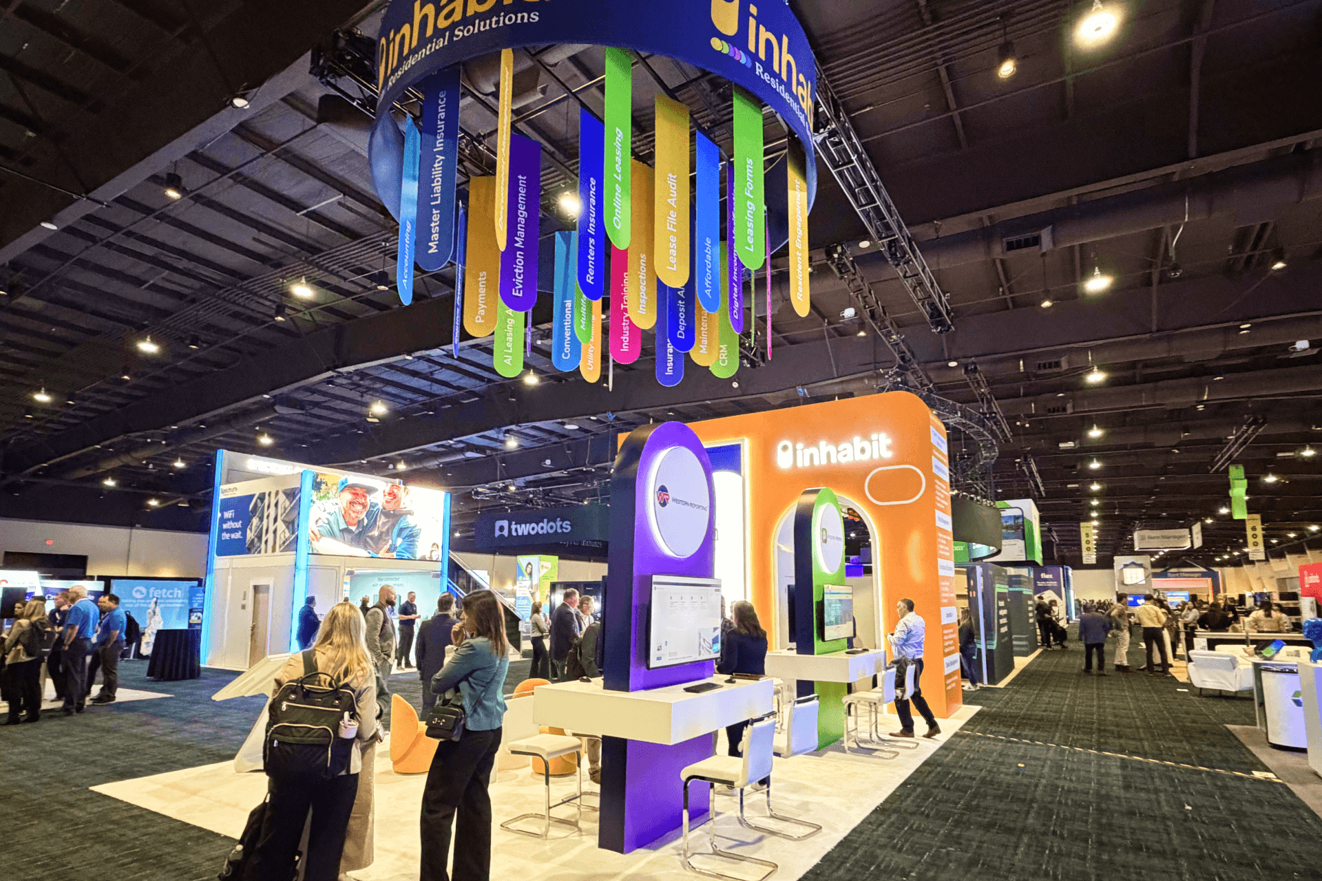
From an execution standpoint, the footprint was organized around visibility, readability, and meeting practicality. Strong branded surfaces created a faster first impression from multiple directions. Screen-led presentation areas gave the booth a clearer digital center. Open conversation zones kept the footprint useful for live discussion without making it feel blocked or crowded. That is exactly why a 20x20 booth size guide works here: it gives enough room to build hierarchy while still forcing the story to stay tight.
For a future parking technology exhibit, booth rental planning in Las Vegas should reserve space for screen demonstrations and operator discussions without letting seating block the approach.
Aisle-Facing Brand Entry
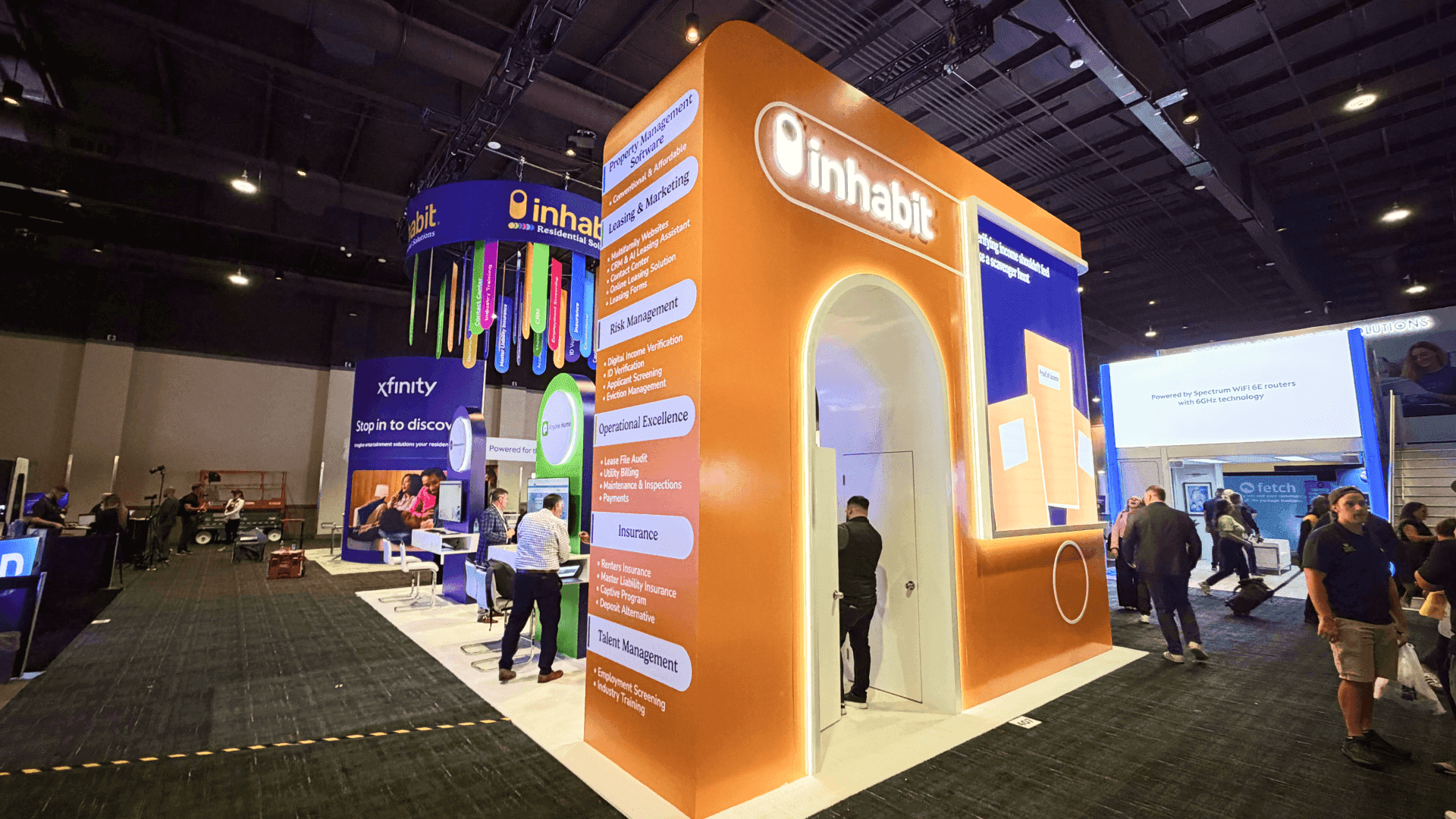
A strong front-facing zone helped the booth register quickly and made FLASH readable from the aisle before the deeper product story began.
Digital Demo and Solution Wall
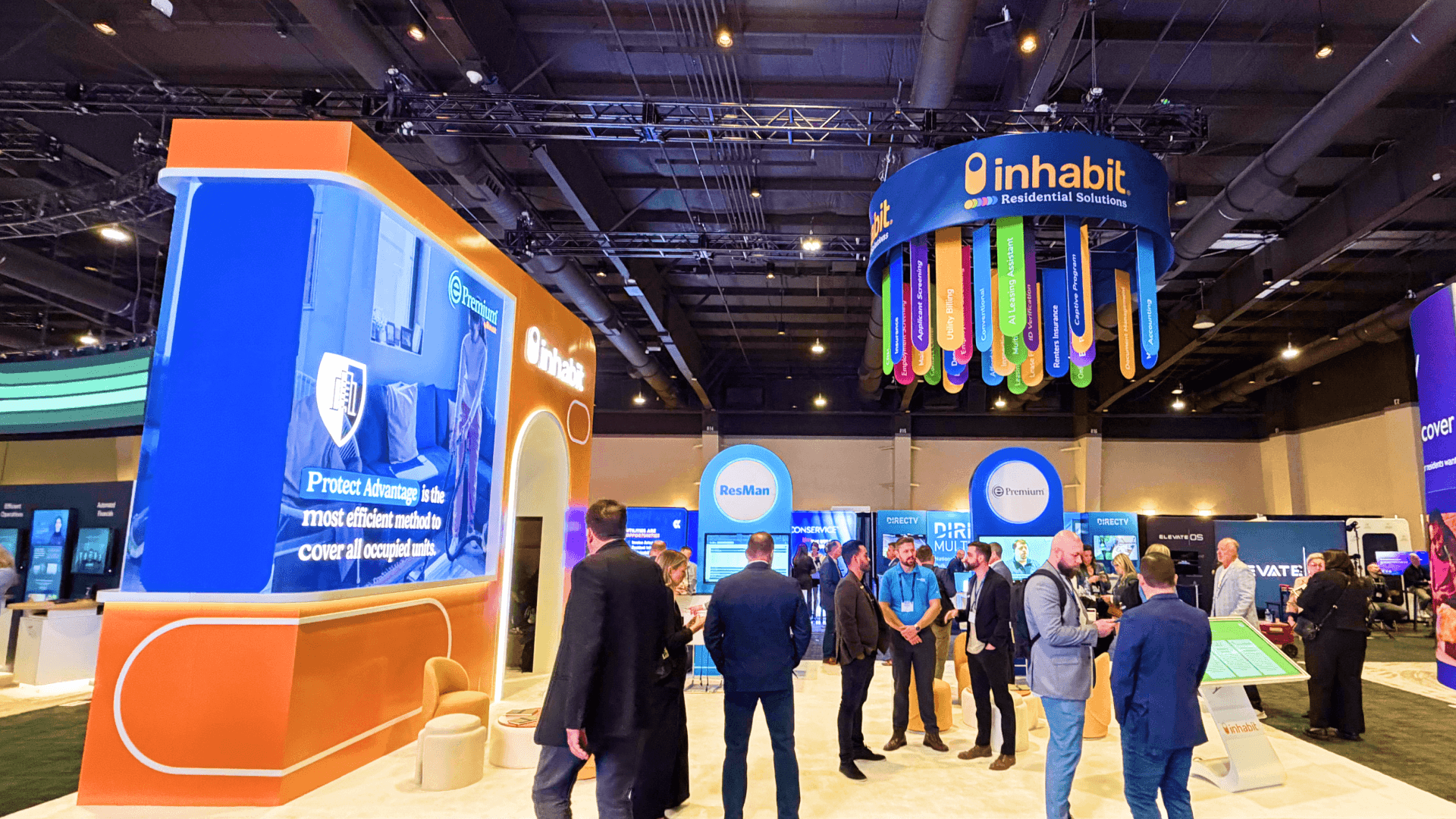
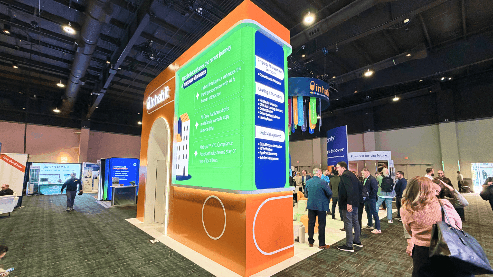
Screen-led presentation surfaces gave the team a practical way to explain parking workflows, access logic, payments, and operational value without relying only on verbal explanation.
Open Consultation Table Zone
Conversation tables supported quick introductions, deeper operator discussions, and more flexible meeting flow without closing off the footprint.
Branded Architectural Anchor
A stronger architectural element helped organize the booth visually, giving the brand a clearer structural presence while keeping circulation open.
On-site Highlights
This booth worked because the execution protected clarity from first sightline to final conversation point. In a 20x20 parking technology environment, it is easy to overbuild the structure or overload the booth with disconnected claims, screens, and talking points. Here, the better move was discipline. The booth created a visible branded presence without sacrificing openness. The demo surfaces gave the team a clear explanation point. The conversation zones made the footprint usable for real buyer discussion instead of leaving it as a purely visual activation.
What stood out on site was the balance between structure and usability. The booth felt polished and commercially serious, but it did not overwhelm the visitor. It created enough branded form to establish FLASH as a credible parking technology company, while still leaving room for practical, business-led interaction. That balance is what helped the booth feel accessible, focused, and ready for decision-maker traffic.
On-Site Execution Highlights
Clear First-Read Branding
Digital Demo Focus
Open Meeting Layout
Controlled Architecture
Show-Ready Execution
Outcome
The booth gave FLASH a faster and clearer first impression in a vendor-heavy parking technology hall.
The layout made payments, access, and parking-operations value easier to understand without overexplaining.
Open zones supported quick intros and deeper conversations without making the 20x20 footprint feel blocked.
Branded structure and controlled messaging gave FLASH a more polished decision-maker-ready show-floor presence.
What made this booth work was not size alone. It was message order. At a show like NPA, visitors do not want to decode a wall of unrelated technology claims. They want to understand, quickly, what the company helps improve, why that matters operationally, and whether the booth is worth stepping into for a real conversation. For FLASH, that meant connecting parking technology back to practical business needs like access control, payment flow, permit logic, and smoother site operations. Once that message hierarchy became clearer, the booth felt much more useful.
FLASH’s booth needed to connect parking technology to everyday questions about access, payments, and site operations. Our Las Vegas booth builders plan screen positions and conversation zones around those workflows, giving visitors a clear starting point before a detailed demonstration.
Quick Q&A
Q: Why is a 20x20 booth a good fit for a parking technology brand?
A: It gives enough room for brand presence, demo surfaces, and business conversation while still forcing the message to stay focused.
Q: What matters most for a booth at NPA Convention & Expo?
A: Operational relevance. Attendees need to understand quickly how the solution improves parking workflow, payments, access, or management.
Q: Why are screens useful in this kind of booth?
A: Because complex parking workflows are easier to explain when digital content supports the message in a clear visual sequence.
Q: What is the biggest risk in a booth like this?
A: Trying to say too much at once and turning the space into a visually busy technology wall instead of a readable business booth.
Q: What makes the layout more effective on site?
A: Strong first-read branding, open sightlines, clear focal points, and meeting zones that feel planned rather than leftover.


