Acara Partners brought a 20x20 booth to Medical Spa Show with a focused objective: create a premium, credible environment that reflected the business side of medical aesthetics while still feeling approachable to owners, operators, and growth-minded med spa teams. This was not a booth that could rely on generic wellness language alone. It had to communicate sophistication, trust, and strategic value quickly, while giving attendees a comfortable reason to stop, engage, and ask deeper questions about scaling a medical aesthetics business. Medical Spa Show 2024, presented by the American Med Spa Association, took place April 11–14, 2024, at Wynn Las Vegas and is positioned as the premier trade show for medical spas and non-invasive medical aesthetics. Acara Partners describes itself as a full-service business consulting agency specializing in the aesthetic medical industry.
For a med spa consulting booth at this scale, the environment had to do more than display a logo. The space needed to feel polished enough for a premium industry audience, but also warm enough to support real business conversations. That made graphics and brand presentation especially important, because the booth had to express business growth, strategic support, and operational confidence through a clean visual system instead of relying on overly dense messaging. In an industry where aesthetics matter, the brand experience itself had to signal quality.
A 20x20 layout also creates the right kind of discipline. It offers enough room for presence, hospitality, and consultation, but it still forces the booth to stay intentional. At a show like Medical Spa Show, where attendees are comparing brands, treatment partners, business services, and growth support, that discipline matters. A 20x20 booth size guide is the right structural reference here because it gives a brand enough room to feel substantial without losing clarity or traffic flow.


💼
Client:
📅
Year/Exhibition:
📍
Location:
📐
Size:
🏢
Industry:
🏢
Venue Context:
Challenge
The first challenge was positioning. Acara Partners operates in the medical aesthetics space, but its value is not about a single device, treatment, or product line. Its strength is strategic support, growth consulting, and business expertise for med spa operators. That kind of offer is valuable, but it is not always easy to communicate visually in a trade show environment. The booth needed to make that value feel immediate and credible without becoming too text-heavy or overly corporate.
The second challenge was audience expectation. Medical Spa Show is not a casual lifestyle expo. It is a focused event for medical spa and non-invasive aesthetics professionals who are looking for education, products, partnerships, and business insight. That means exhibitors need to feel relevant from the first glance. For Acara Partners, the booth had to strike a balance between polished aesthetics and business seriousness, so attendees could immediately understand that the company was there to support practice growth, not just brand visibility.
The third challenge was translating a premium service brand into a physical environment. The booth had to feel elevated without looking closed off. It needed strong branding, but it also needed comfort, hospitality, and space for real conversations. That required careful attention to design and engineering, because the layout had to support visibility, private discussion, and an overall feeling of quality from multiple angles.
Design vs. On-site Execution
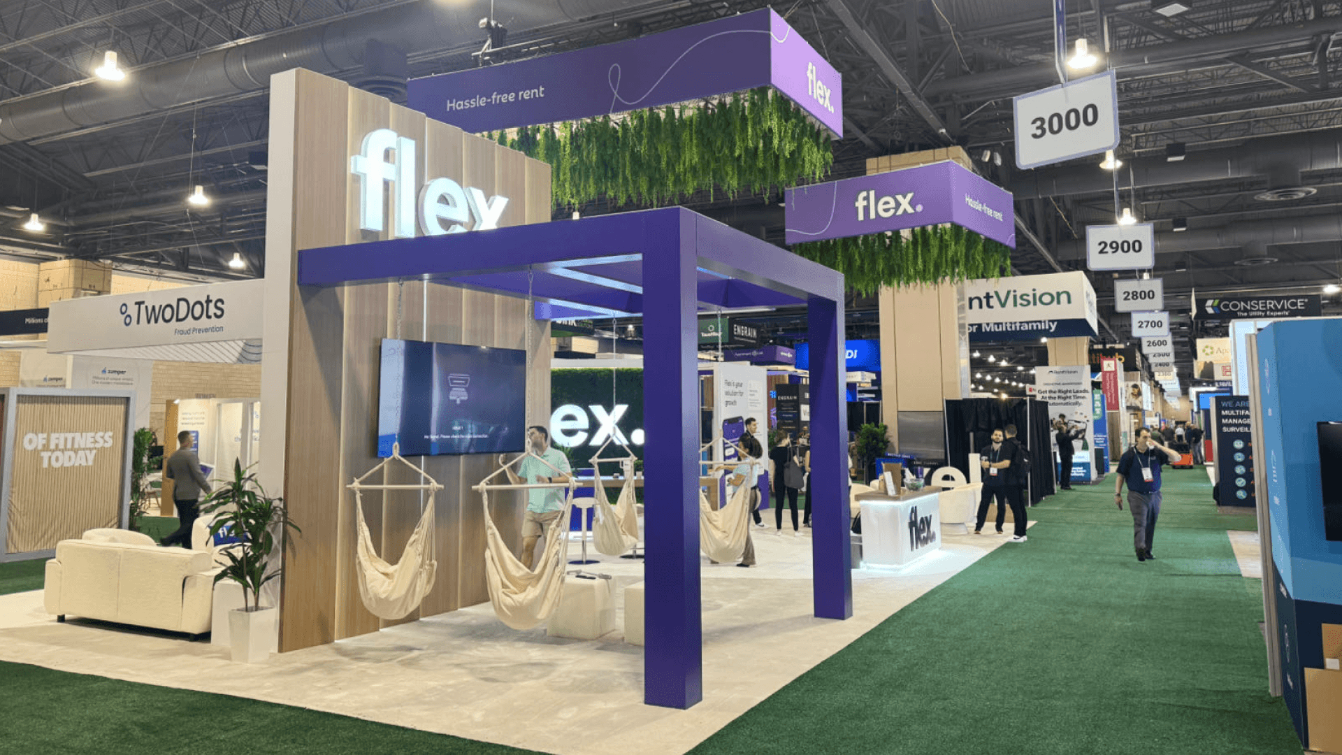
The concept centered on one clear idea: make the booth feel like a high-end, business-ready destination inside the show floor. Instead of filling the footprint with too many disconnected elements, the space was organized around atmosphere, brand recognition, and comfortable engagement. Large overhead hanging signs extended visibility across the aisle. Warm wood textures, soft neutral seating, and integrated greenery helped soften the architecture and create a more welcoming med spa-adjacent mood. Bold purple framing added structure and brand clarity without making the booth feel cold.
From an execution standpoint, the 20x20 footprint was divided into clear experiential layers. Open lounge seating invited conversations. A central hospitality zone supported first contact. Private or semi-private enclosed areas created a more intentional setting for longer discussions. Tall branded walls gave the booth a stronger visual identity from distance, while the open perimeter kept circulation fluid. The result was a booth that looked premium, felt approachable, and supported the consultative nature of the brand.
That is exactly why a 20x20 booth size guide works well in a case like this: it offers enough space to create emotional tone, conversation zones, and strong brand presence without losing functional clarity.
Overhead Brand Visibility Zone
Large suspended signs with branded messaging extended visibility across the hall and helped the booth register quickly from long approach angles.
Open Lounge and Reception Area
Soft seating and a clean front hospitality point created an inviting first-stop environment for introductions, casual conversations, and guided traffic flow.
Private Consultation Rooms
Enclosed meeting areas gave the booth a more strategic feel and supported deeper business discussions away from the aisle.
Feature Graphic and Branded Wall System
Tall branded walls and oversized product-style visuals created a premium visual anchor while helping the booth tell its story with clarity.

On-site Highlights
This booth stood out because it did not try to compete through noise. Instead, it competed through atmosphere, scale, and control. The overhead hanging signs gave the booth reach across the hall. The tall branded walls created a strong visual frame. The greenery softened the architecture and brought a more curated, upscale tone to the space. The lounge seating made the booth feel comfortable rather than transactional, which matters in a category built around trust, experience, and long-term business relationships.
What worked especially well on site was the balance between openness and structure. The booth felt substantial without becoming heavy. It offered enough visibility to pull attention from the aisle, while still preserving quieter zones for meaningful conversations. That helped the space feel more like a premium brand environment and less like a basic rental footprint with graphics applied.
On-Site Execution Highlights
Suspended Brand Presence
Hospitality-Driven Layout
Premium Material Contrast
Private Meeting Capability
Strong Visual Hierarchy
Outcome
The booth established a bold, recognizable presence that helped Acara Partners stand out in a competitive medical aesthetics environment.
The premium design language reinforced the company’s role as a serious strategic partner in the medical aesthetics space.
The combination of open seating and more private zones supported both casual introductions and longer business discussions.
The booth felt curated, polished, and intentional—qualities that aligned well with the expectations of the Medical Spa Show audience.
What made this booth effective was not just its size. It was the way the space aligned brand tone with business purpose. In a medical aesthetics setting, visitors notice atmosphere immediately. They respond to quality, comfort, and confidence before they ever read a second paragraph of copy. For Acara Partners, that meant the booth needed to feel refined and consultation-ready from the start. The wood finishes, greenery, clean structural lines, and softer lounge zones all helped create a more elevated first impression.
The broader lesson is simple. A 20x20 booth becomes stronger when it gives equal attention to visibility and comfort. Medical aesthetics is a category where emotional tone matters, but so does credibility. If the booth feels too cold, it loses warmth. If it feels too soft, it can lose authority. The strongest result comes when architecture, messaging, and visitor flow work together. That is also where an experienced Las Vegas trade show booth builder can make a real difference—by turning a mid-size footprint into a booth that feels polished, memorable, and commercially useful on site.
Quick Q&A
Q: Why is a 20x20 booth a strong fit for a medical aesthetics brand or consulting group?
A: It offers enough room for premium presence, comfortable seating, and private conversations without becoming oversized.
Q: What matters most at Medical Spa Show?
A: A strong mix of credibility and experience. Exhibitors need to feel professional, relevant, and visually aligned with the aesthetics market.
Q: Why was greenery effective in this booth?
A: It softened the structure, added warmth, and helped the environment feel more curated and inviting.
Q: Why include enclosed meeting space in a booth like this?
A: Because strategic or business-focused conversations often need a quieter setting than an open aisle can provide.
Q: What is the biggest design risk in a booth like this?
A: Letting the footprint become visually busy or overbuilt, which can reduce readability and make the space feel less welcoming.


