Why Technical Workflow Messaging Is Hard at NAB
NAB is built around media, entertainment, broadcast, production, streaming, AV, content workflows, and technology systems. Many exhibitors are not showing a simple product that visitors can understand in three seconds. They may be showing a workflow: camera to switcher, encoder to cloud, production to distribution, live feed to control room, or dashboard to media operations team.
That creates a booth messaging problem. The exhibitor may understand the full workflow, but the visitor sees only a screen, a rack, a camera, a dashboard, or a wall graphic. If the first message is too technical, visitors walk past. If the first message is too broad, serious buyers do not know whether the booth solves their problem.
This article supports NAB broadcast workflow demo booth planning instead of trying to become a general NAB Show overview. The main event page should stay focused on NAB Show booth planning, while this article explains how workflow messaging should be simplified inside the booth.
A technical workflow booth at NAB should make the first product message clear from the aisle before visitors enter a deeper broadcast or AV demo conversation.
NAB Event Context for Exhibitors
NAB detail | What it means for booth messaging |
|---|---|
Venue | Las Vegas Convention Center requires attention to long aisle views, screen visibility, and move-in timing. |
Exhibitor type | Broadcast, production, streaming, cloud, AV, media technology, and workflow tools need clearer demo sequencing. |
Show-floor behavior | Visitors scan quickly, but serious buyers often need a deeper workflow explanation before they judge the product. |
For venue-specific setup context, see Las Vegas Convention Center booth planning.
The First Screen Should Explain the Workflow, Not Every Feature
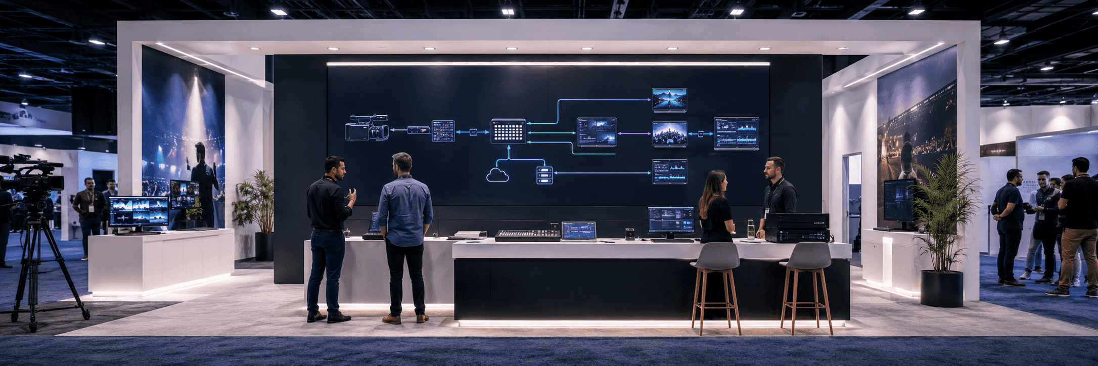
For technical exhibitors, the first screen is often overloaded. It may show dashboards, multi-window interfaces, production controls, signal diagrams, or feature lists. The problem is not the screen itself. The problem is that the screen is asked to do too much at once.
At NAB, the first screen should answer one question: what workflow are we helping visitors understand? It should not try to explain every use case, every integration, every dashboard, and every spec in the first view.
When a workflow demo needs more than one screen, a counter, staff handoff space, and a follow-up conversation area, 20x30 booth planning is often a better reference than a smaller inline layout.
Technical workflow | What visitors need first | What can wait |
|---|---|---|
Camera workflow | What the camera or lens system helps capture, control, or monitor | Full menu structure and detailed specs |
Live switching | What source, operator, and output flow the system supports | Advanced switching logic |
Cloud production | What moves from local capture to cloud workflow | Full backend architecture |
Broadcast operations | Which team or operation the platform supports | Full dashboard walkthrough |

The first screen in a NAB workflow demo should explain the input, process, and output before showing advanced features, dashboards, or full technical settings.
How We Usually Simplify a Technical Booth Message
For NAB-style workflow booths, we usually separate the message into three layers: the aisle message, the demo station, and the deeper conversation. The aisle message helps visitors understand the workflow category. The demo station shows the workflow in action. The deeper conversation is where staff can discuss integrations, production requirements, or enterprise needs.
Aisle message: explain the workflow category quickly.
Demo station: show sequence, handoff, input, output, or operator action.
Staff handoff: move qualified visitors into deeper technical questions.
Follow-up area: keep serious conversations out of the first demo path.
Why Workflow Graphics Matter More Than Decorative Graphics
For NAB exhibitors, graphics are not just background decoration. They should reduce the amount of explaining staff has to do. A good workflow graphic can show input, process, output, user role, or system handoff before the screen demo begins.
This is where graphics and brand presentation support matters. The booth graphics should match the product explanation, screen content, lighting, and visitor reading distance.
What the workflow starts with.
What the system changes or controls.
Who uses the workflow.
What output or decision the workflow supports.
Where the visitor should look first.

Workflow graphics help visitors understand what the demo is showing, where the process starts, and why the screen-led booth message matters before staff begins the full explanation.
Where Technical Messaging Usually Breaks Down
Technical booths often fail because the exhibitor tries to prove expertise too early. The booth uses complex diagrams, many product names, dense labels, or several screens running at the same time. The result may look advanced, but visitors do not know where to start.
Problem on the booth floor | What visitors experience | Better planning response |
|---|---|---|
Too many screens with no order | Visitors do not know which demo to watch first | Use one primary screen as the starting point |
Dense technical graphics | Visitors see expertise but not the product category | Use a simple workflow graphic before deeper specs |
Staff standing in front of screens | The demo is blocked during conversations | Define staff positions before final layout |
No handoff area | Serious visitors remain in the aisle | Create a second conversation point |
Booth Messaging Checklist for NAB Workflow Exhibitors
Can a visitor understand the workflow category from the aisle?
Does the first screen show the starting point of the workflow?
Are workflow graphics supporting the screen instead of competing with it?
Does staff know where to stand during the first explanation?
Is there a place for deeper technical questions after the first demo?
Are AV needs, screen size, cable paths, and graphics production confirmed before setup?
Show-Site Execution Still Matters
Simple messaging does not only come from writing shorter copy. It also depends on how the booth is built and handed off. Screen placement, lighting, graphic alignment, demo counter height, cable routing, and final AV checks all affect whether the message works.
For workflow booths with multiple screens, demo equipment, AV checks, graphics delivery, and booth materials, logistics and pre-show coordination should be confirmed before move-in. When the booth includes multiple screens, product demos, staff handoff points, and technical equipment, show-site booth execution should support the messaging plan.
Real NAB Project Proof
NAB Show booth projects can help connect this article to real booth examples, photo evidence, screen-led layouts, and technical product display references from the NAB cluster.
How This Article Supports the NAB Event Cluster Without Competing
This article should not replace the NAB Show main page or the broadcast workflow child page. It supports NAB Show booth planning and NAB broadcast workflow demo booth planning by explaining one specific issue: why technical workflows need simpler booth messaging before the full demo begins.
FAQ
Why do NAB workflow booths need simpler messaging?
NAB workflow booths often explain systems, screens, operator roles, and technical processes. Simpler messaging helps visitors understand the product category before they enter a deeper demo conversation.
What should the first screen show?
The first screen should show the workflow starting point, the key user action, or the operational problem the product helps solve.
How can graphics support technical workflow demos?
Graphics can show input, process, output, user role, and workflow sequence. They should help visitors understand the demo before staff begins a full explanation.
Should this article link to 20x20 booth planning?
Not as the main target. This article is about workflow messaging, so the main internal link should point to the NAB broadcast workflow demo booth planning page.
Related Planning Links
NAB broadcast workflow demo booth planning — the main target page for this article.
NAB Show booth planning — the main NAB Event Hub.
20x30 booth planning — booth size reference for technical demo stations and buyer conversations.
Las Vegas Convention Center booth planning — venue context for NAB setup.
graphics and brand presentation support — service support for workflow graphics and screen messaging.
logistics and pre-show coordination — support for freight timing, AV checks, and setup sequence.
show-site booth execution — fabrication, installation, and final on-site handoff support.
Final Takeaway
Technical workflow booths at NAB do not need more complicated messaging. They need clearer message order. When the first screen, workflow graphics, staff path, booth size, LVCC setup, logistics, and show-site handoff all support the same story, a technical booth becomes easier to understand without losing technical depth.


