Group Products by How Buyers Compare Them
Buyers do not always compare souvenirs by product type alone. A useful product group may bring together choices based on:
product family or destination collection
price level and packaging format
logo, color, or other customization options
order volume and purchasing requirements
For example, show one collection across several price points, or one product with different logos and packaging. The display should make clear what changes, what stays the same, and which option fits the order.
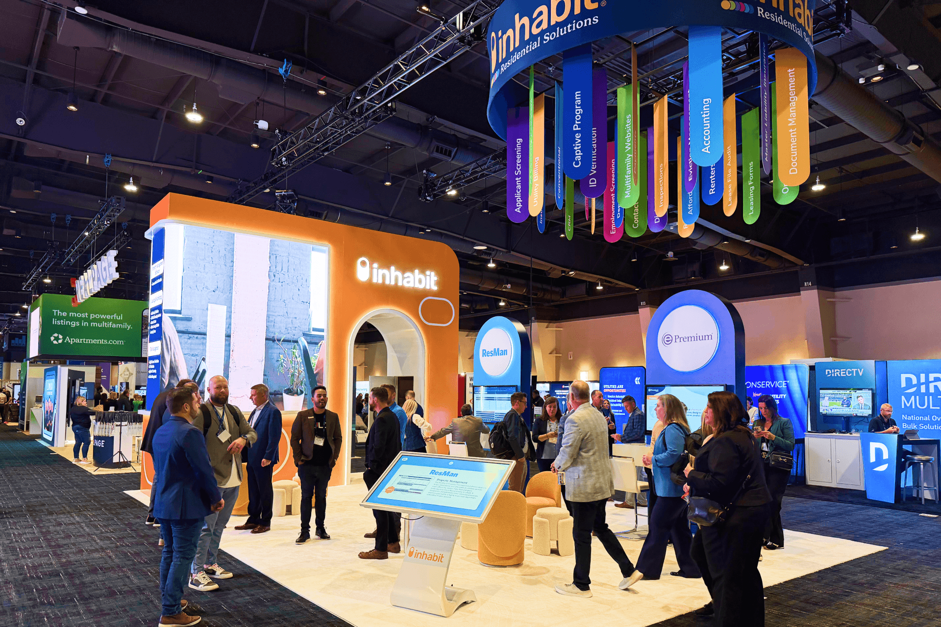
Souvenir products grouped by collection, destination, and packaging so wholesale buyers can compare related options more easily.
Decide What Buyers Need to See in Person
Not every color, logo, or package needs its own physical sample. Use a real product when size, construction, finish, or handling matters. Swatches, images, or a catalog can cover differences that are mainly visual.
Product Difference | Best Way to Show It | What Buyers Need to Understand |
|---|---|---|
Main product form | Physical sample | Size, construction, and handling |
Color or finish | Selected samples or swatches | Available range, texture, and finish |
Destination design | Representative examples | Artwork or location differences |
Custom logo | Sample with a placement guide | Logo position and finished appearance |
Packaging | One physical example | Retail presentation |
Remaining SKUs | Catalog or digital reference | Full range without crowding the display |
One well-chosen sample can explain several related SKUs. Show the differences buyers need to judge in person, and leave the remaining versions in a catalog or digital reference.

Representative products, color swatches, destination graphics, and packaging examples used to explain a wider assortment without displaying every SKU.
Show the Range Without Filling Every Shelf
Shelves and sample walls should help buyers understand the assortment, not hold every SKU. Use one clear example for repeated shapes, then group related colors, destinations, or packaging under simple product-family labels. Leave enough space between groups so the display is easy to scan.
Keep the fixture within its practical capacity. Products that need closer inspection belong near eye level, while upper and lower areas can direct buyers to additional options through selected samples, swatches, or a catalog.
Show Custom Options Where Buyers Can Compare Them
Keep destination names, logos, colors, packaging, and imprint locations beside the products they change. Buyers should be able to see the differences without moving between several shelves or reading the same explanation more than once.
Use graphics and brand presentation to place one clear logo, color, packaging, or imprint example beside the relevant product. Add quantity requirements to the same group so buyers can review appearance and order details together.
Keep Backstock Behind the Display
Only the samples buyers are meant to handle should stay on the shelf or sample wall. Keep the following behind the main display:
replacement stock and boxed inventory
worn, damaged, or heavily handled samples
loose stock waiting for the next display reset
Staff should be able to reach these items from the back or side without stepping into the comparison area. This keeps cartons and loose merchandise out of view while making sample replacement easier during the day.
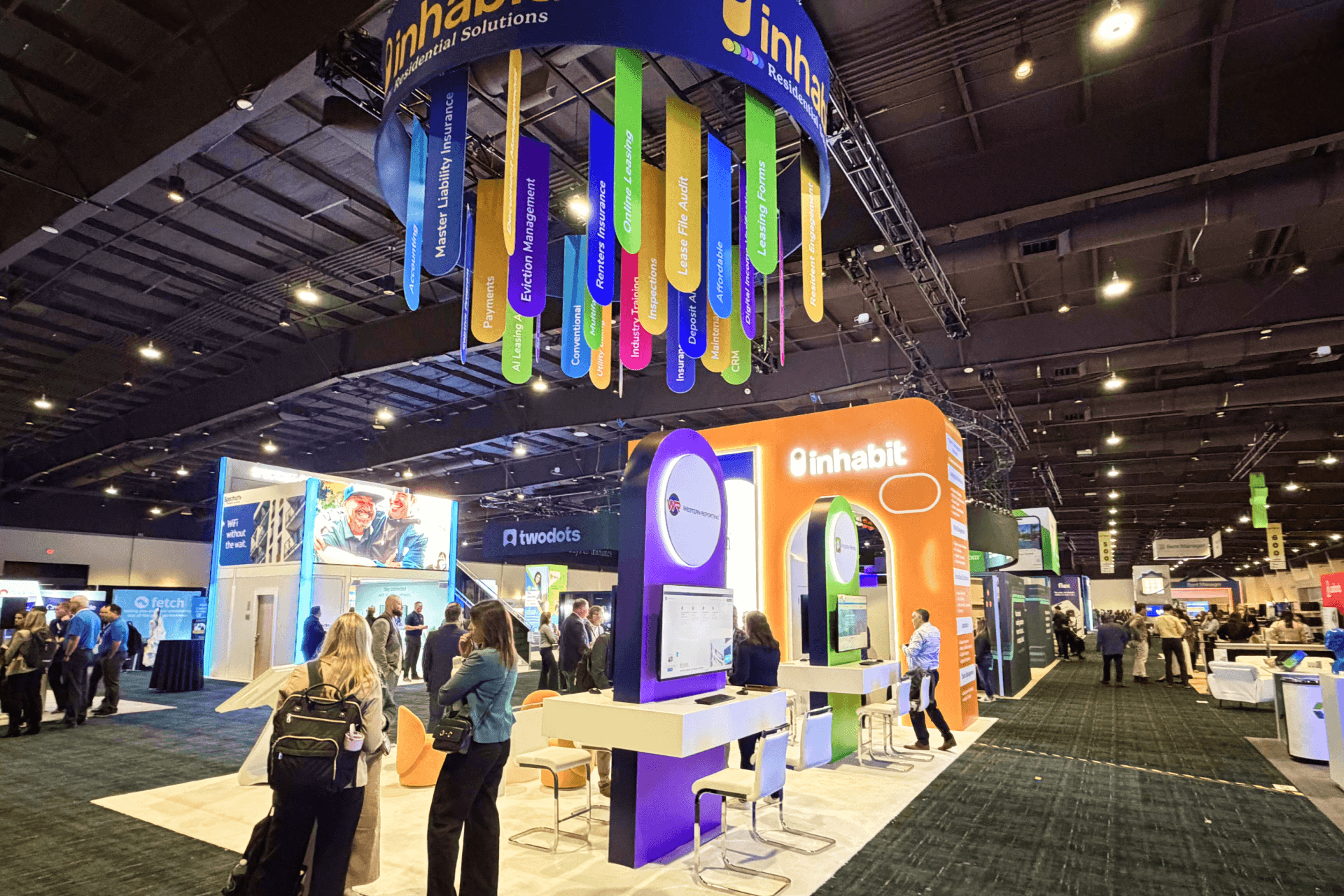
An illustrative layout separating the buyer comparison area from backstock, replacement samples, and the staff restocking path.
Discuss Order Details After Product Review
Once buyers have narrowed the product family and variations, the conversation can turn to pricing, quantities, customization, and follow-up. Keep it close enough to reference the samples, but not directly in front of the shelves.
A clear wholesale buyer flow from browsing to order writing lets the discussion continue without blocking people who are still reviewing the display.
When the Display Starts to Feel Overloaded
The display gets harder to follow when every color, logo, package, or destination version is shown as a separate sample. Without clear product-family groups, buyers have to work too hard to see which items belong together and which differences actually matter.
Customization notes placed away from the product, backstock on the main shelves, and repeated labels or images can also make the assortment harder to read.
FAQ
How many souvenir SKUs should be shown as physical samples?
Show the main product forms and the differences buyers need to judge in person. Extra colors, destination graphics, logo options, and packaging variations can be covered with swatches, photos, or a catalog. The goal is to explain the range clearly, not turn every SKU into another sample.
How should custom merchandise options be displayed?
Keep each custom option beside the product it changes. One example can show a logo position, destination name, color, package, or imprint location, while a short note covers quantity requirements. Buyers should not have to search across several shelves to understand one customization choice.
Where should replacement stock be kept?
Keep replacement stock, boxed inventory, and worn samples behind the main display, close enough for staff to reach without entering the comparison area. Restocking should happen from the back or side so cartons and loose items never interrupt buyers or take over shelf space.