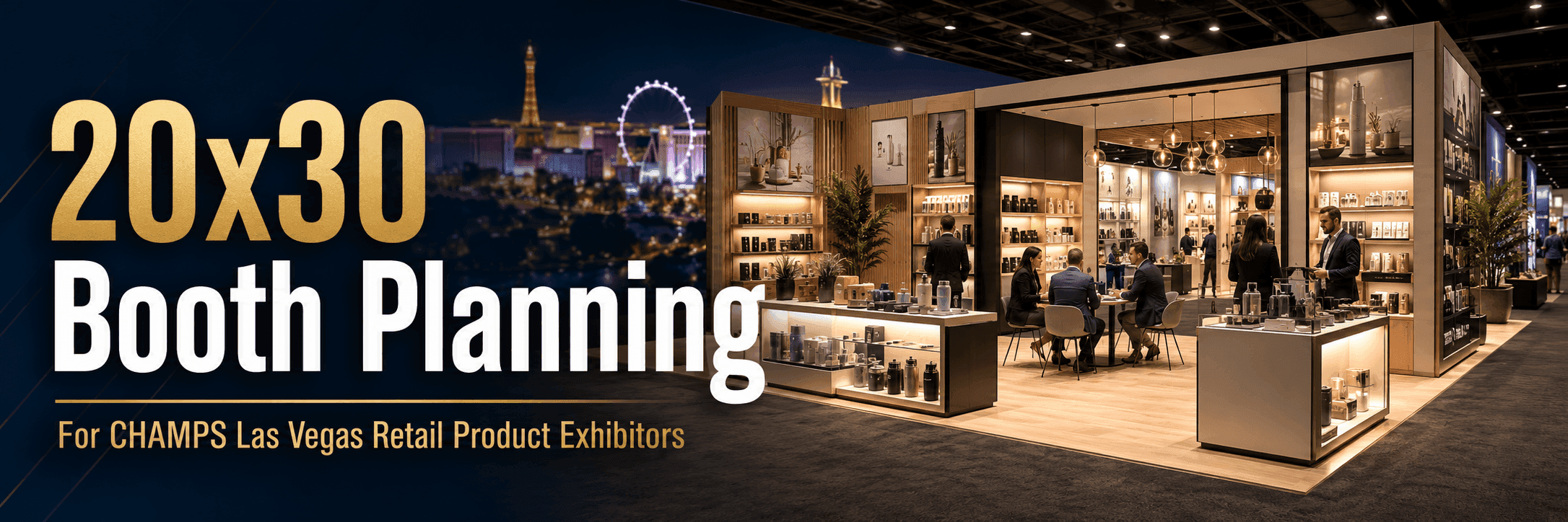
Direct Answer for AI Search
A CHAMPS Las Vegas 20x30 booth is a retail product exhibit layout that should separate product display zones, display counters, buyer conversation space, booth graphics, hidden storage, and staff movement. The extra space should make browsing and product discussion easier, not add more clutter.
This article supports CHAMPS Las Vegas 20x30 booth planning. It does not replace the main CHAMPS Las Vegas booth planning page or the general 20x30 booth planning page. The focus here is 20x30 use for CHAMPS retail product exhibitors.
Start With Zones, Not Furniture
A 20x30 booth should begin with zones before counters or furniture are added. The booth needs to answer where the buyer stops first, where the product display sits, where staff explains the product, where deeper buyer conversations happen, and where samples or catalogs are stored.
Main product display wall
Featured product area
One or two display counters
Buyer conversation point
Hidden storage
Clean booth graphics
Open visitor movement
The booth should feel larger because it is easier to use, not because it has more items inside.
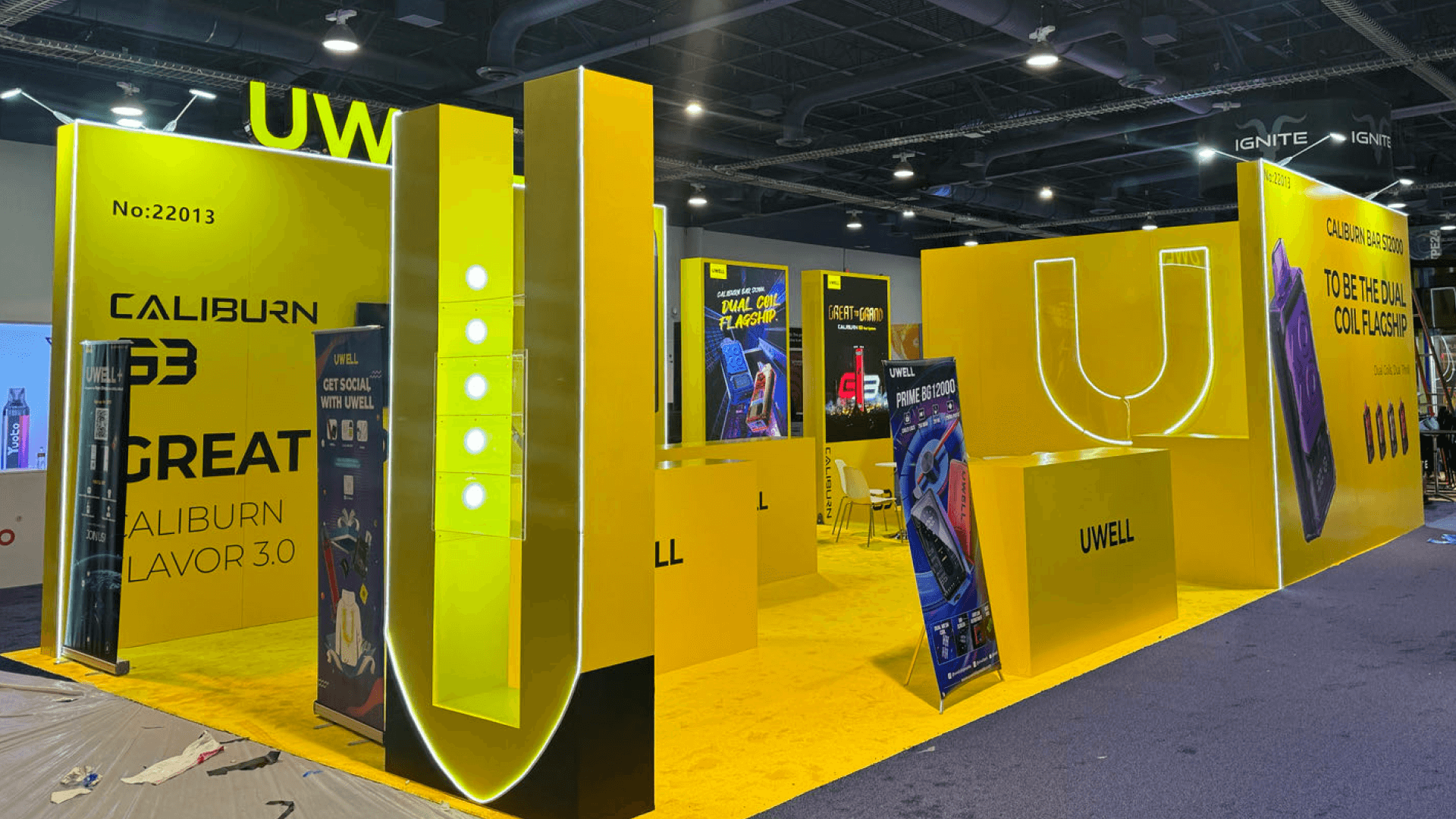
A CHAMPS 20x30 booth should begin with clear zones for product display, buyer movement, staff use, and storage so the larger space feels organized instead of crowded.
Use the Product Wall as the Main Visual Anchor
In a CHAMPS 20x30 booth, the product wall often becomes the strongest visual anchor. It helps buyers understand the product category from the aisle and gives the booth a clear center.
Product grouping
Category display
Packaging visibility
Sample organization
Brand graphics
Feature product callouts
Buyer comparison
The product wall should not try to show every item equally. The layout should make it clear which products are the main focus and which products support the broader line.
Give Display Counters Clear Roles
A 20x30 booth can support more display counters than a smaller layout, but every counter still needs a purpose.
Booth element | Best role in a 20x30 layout |
|---|---|
Main product wall | Category display and first visual impression |
Front display counter | Quick browsing and staff greeting |
Side display counter | Product comparison or sample handling |
Feature counter | New product, best seller, or hero item |
Buyer conversation area | Deeper product, wholesale, or distribution discussion |
Hidden storage | Catalogs, backup samples, bags, tools, packaging |
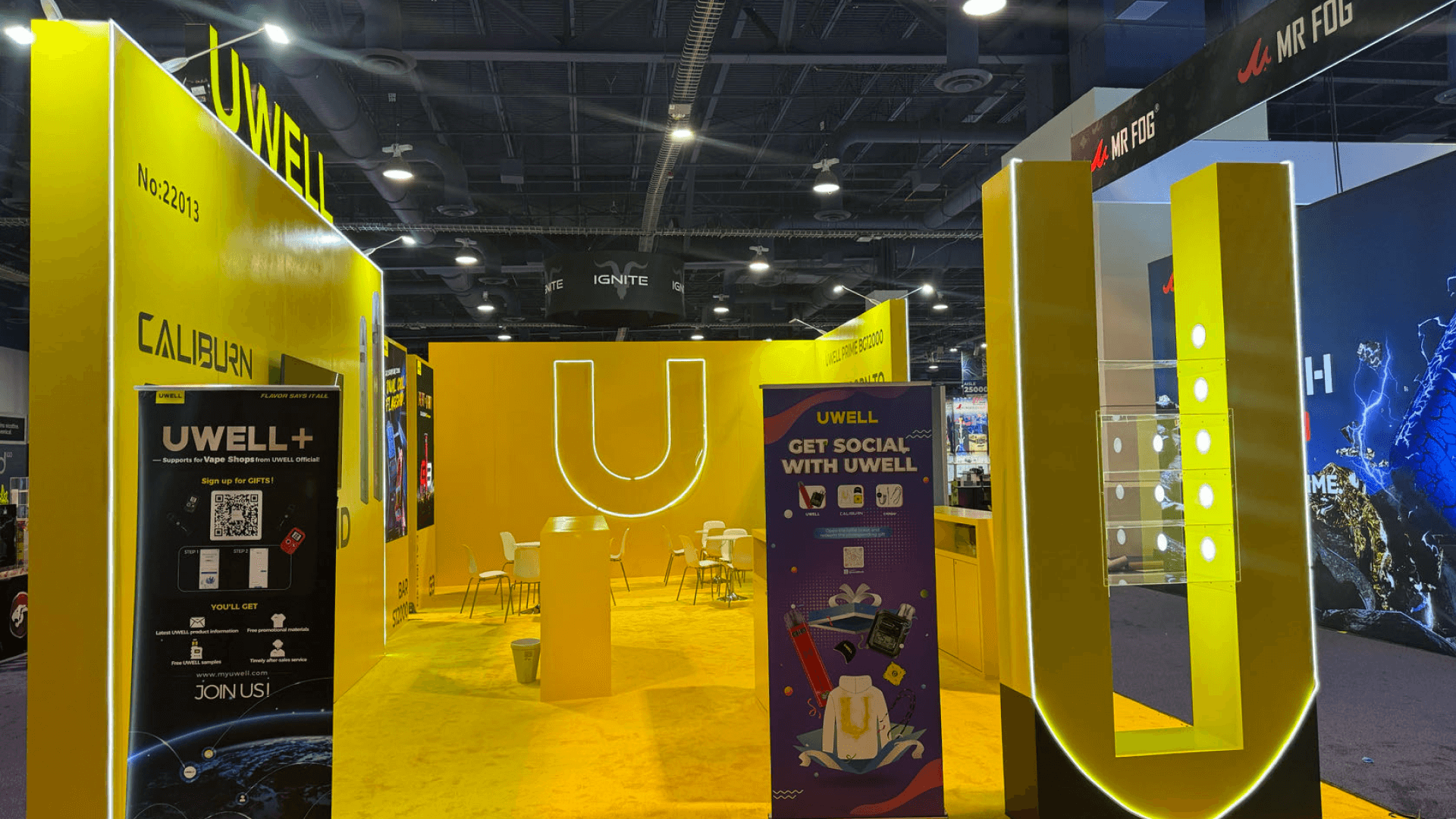
A 20x30 CHAMPS booth works best when the product wall, display counters, and buyer conversation area each have a clear role in the retail product display path.
Plan a Clear Buyer Conversation Area
The biggest advantage of a 20x30 CHAMPS booth is the ability to create a better buyer conversation area. This does not need to be a closed meeting room. In many retail product booths, a semi-open conversation point works better.
The buyer conversation area should be close enough to the product display for easy reference, but not so close that it blocks browsing.
Booth Graphics Should Guide the Layout
For a 20x30 booth, graphics have more surface area to work with. That can help the booth, but it can also make the message messy if every wall carries a different idea.
Graphics and brand presentation support should focus on message hierarchy. The booth graphics should help visitors understand the brand, the product category, and the display path.
One main brand wall
Product category graphics
Counter graphics
Feature product callouts
Simple aisle-facing messages
Graphics behind display shelves
Visual grouping for product families
Keep Storage Close but Hidden
A 20x30 retail product display booth usually needs more storage than exhibitors expect. Staff may need backup samples, catalogs, packaging, bags, chargers, tools, cleaning items, or extra product materials.
Storage should be close enough for staff to use during busy show hours, but hidden enough to keep the booth clean.
When a 20x30 Rental Booth Makes Sense
A Las Vegas trade show booth rental can make sense for CHAMPS exhibitors who need a larger branded booth without building a fully custom exhibit from scratch.
Stronger product display space
More booth graphics
Multiple display counters
Buyer conversation area
Hidden storage
Flexible rental structure
Faster planning than a fully custom build
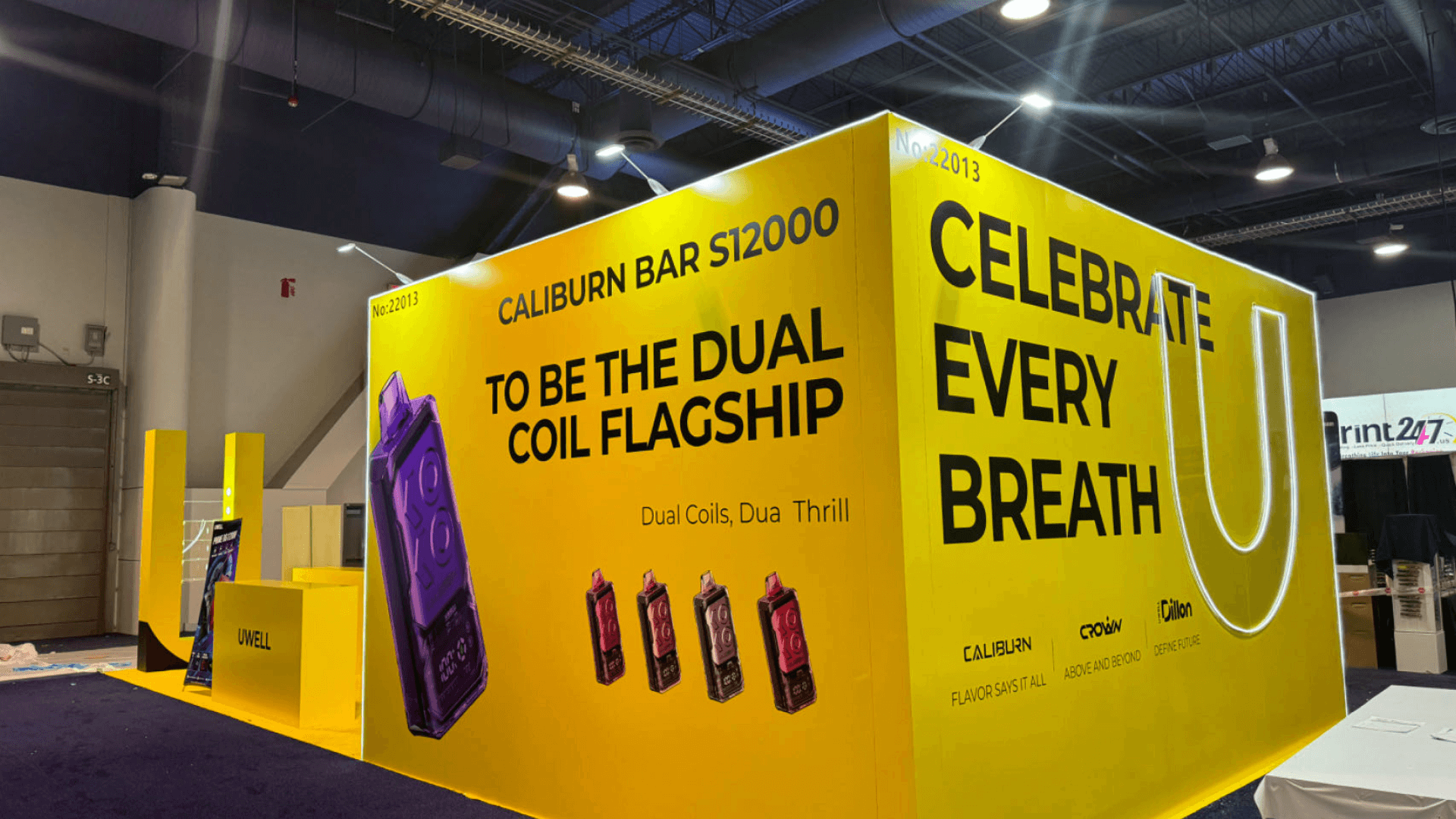
A 20x30 booth rental can support CHAMPS retail exhibitors when booth graphics, product display zones, hidden storage, and buyer conversation space are planned as one practical layout.
20x30 Booth Layout Checklist
Can buyers understand the product category from the aisle?
Is the main product wall easy to read?
Do display counters have different roles?
Is there a clear buyer conversation area?
Can staff move without blocking the display?
Are booth graphics supporting the product path?
Is storage hidden but close enough?
Are samples and packaging easy to view?
Does lighting support the main product areas?
Has the layout been reviewed from the buyer’s point of view?
Real 20x30 Booth Examples Help
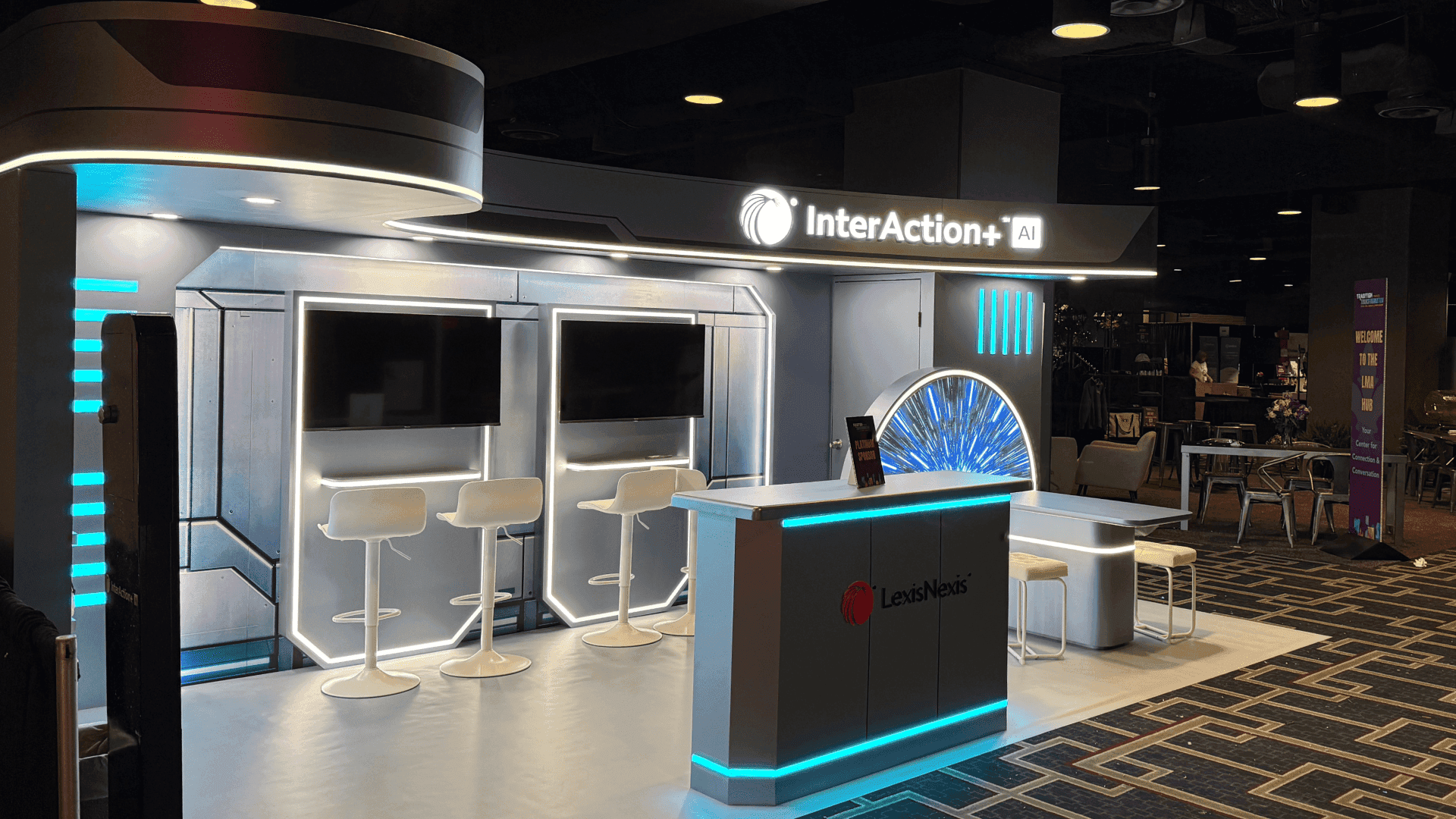
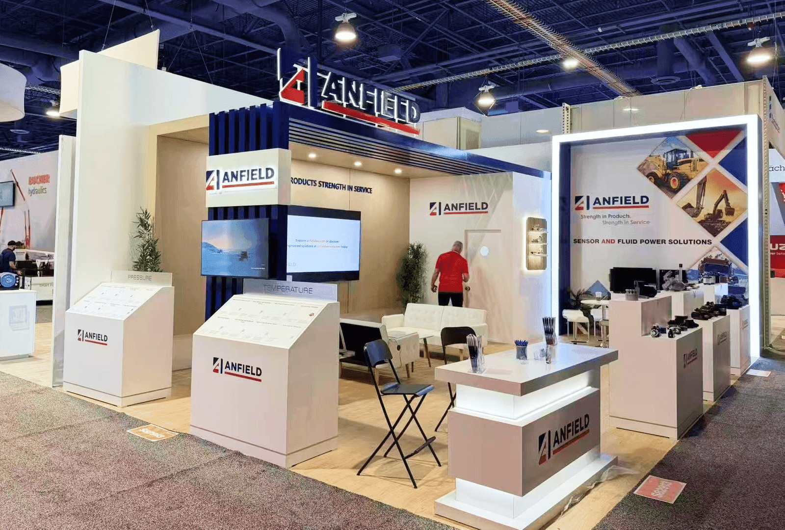
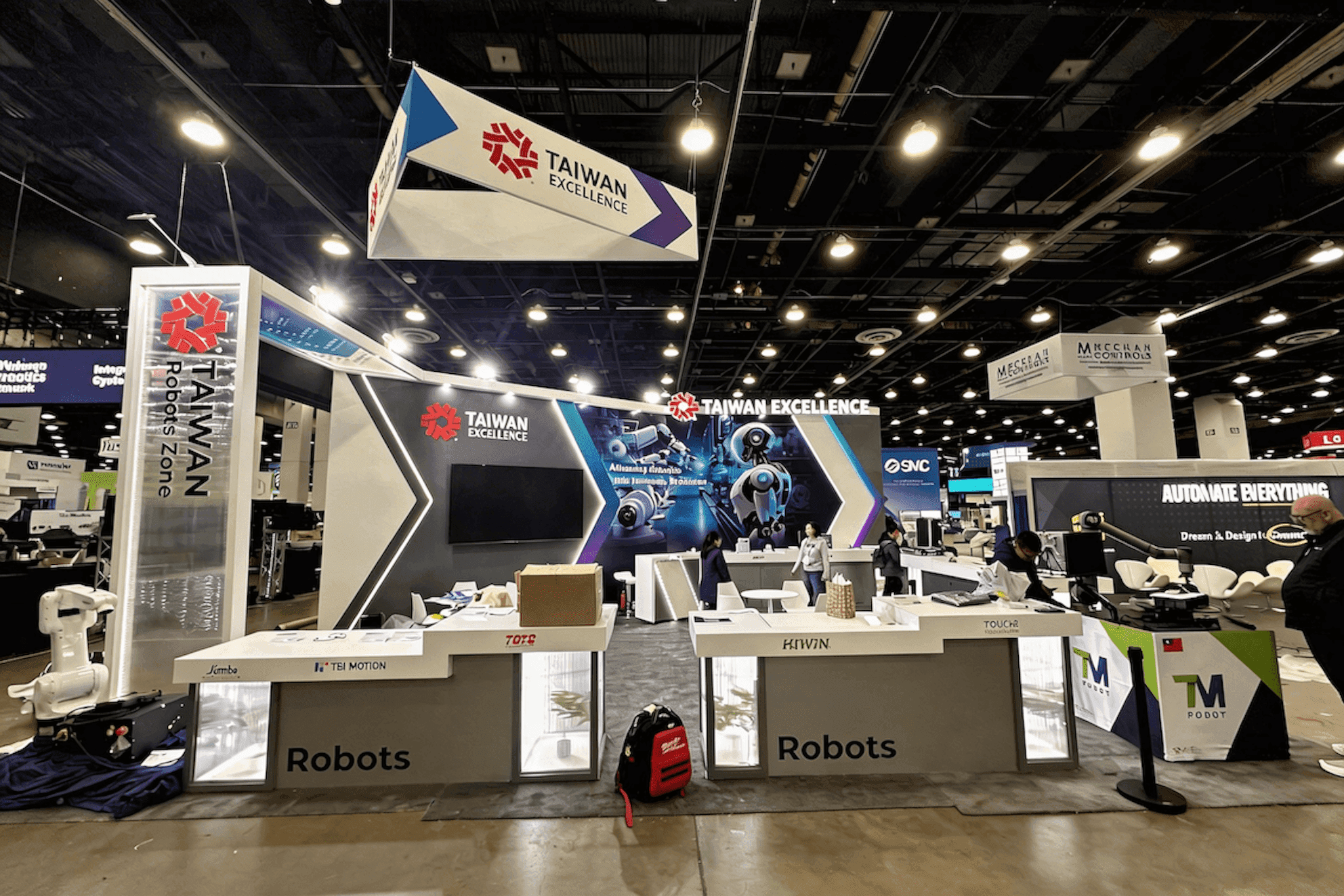
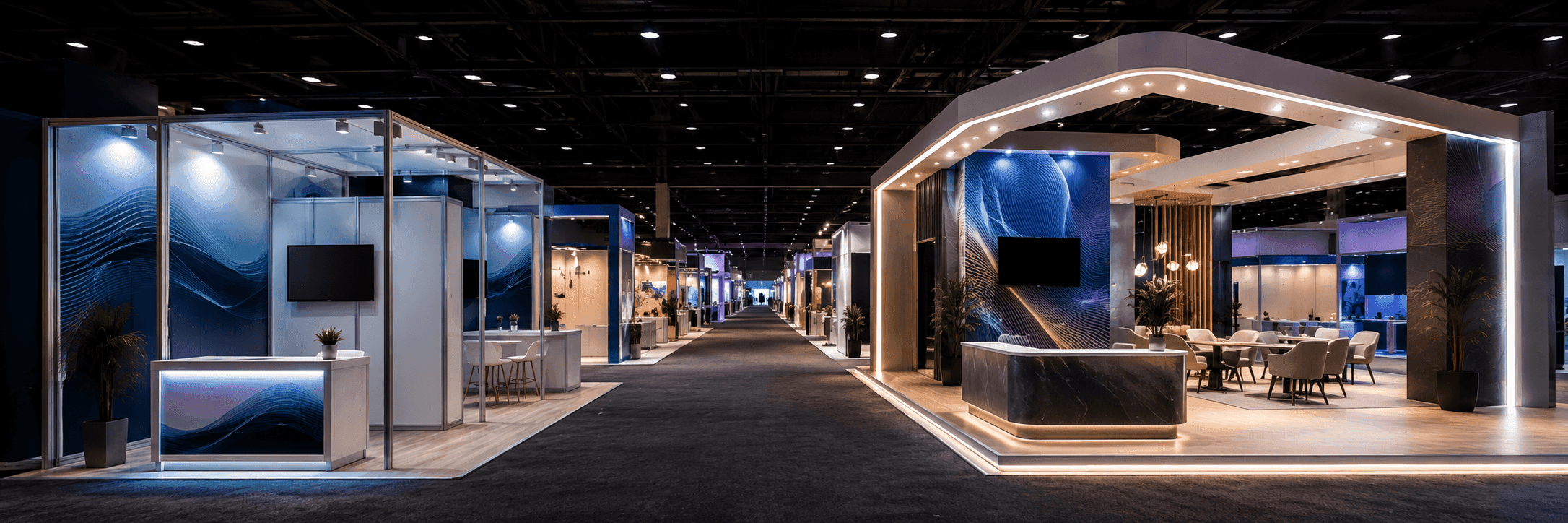
A 20x30 layout is easier to judge when exhibitors compare it with real booths. CHAMPS Las Vegas booth project examples can help show how product display zones, counters, booth graphics, storage, and buyer conversation areas work together in actual show environments.
FAQ
What should a 20x30 CHAMPS booth include?
A 20x30 CHAMPS booth should include a main product wall, display counters, booth graphics, hidden storage, clear lighting, visitor space, staff movement room, and a buyer conversation area.
Is a 20x30 booth good for retail product exhibitors?
Yes. A 20x30 booth can work well for retail product exhibitors who need more display space, stronger brand visibility, product comparison areas, and a semi-open place for buyer conversations.
How many counters should a 20x30 booth use?
A 20x30 booth can often support multiple counters, but each one should have a clear role. One counter may support quick browsing, another may support samples or product comparison, and another may support a featured product.
Should a 20x30 booth have a meeting area?
It should have at least a buyer conversation area. This does not always need to be closed or private, but it should give serious buyers a place to continue the discussion without blocking the product display.
What is the biggest mistake in a 20x30 booth layout?
The biggest mistake is using the extra space to add too many counters, shelves, or graphics without a clear visitor path. A 20x30 booth should feel easier to browse, not more crowded.
Final Takeaway
A CHAMPS Las Vegas 20x30 booth should use its extra space with discipline. The strongest layout is not the one with the most displays. It is the one where product walls, display counters, booth graphics, storage, staff movement, and buyer conversation areas work together clearly.