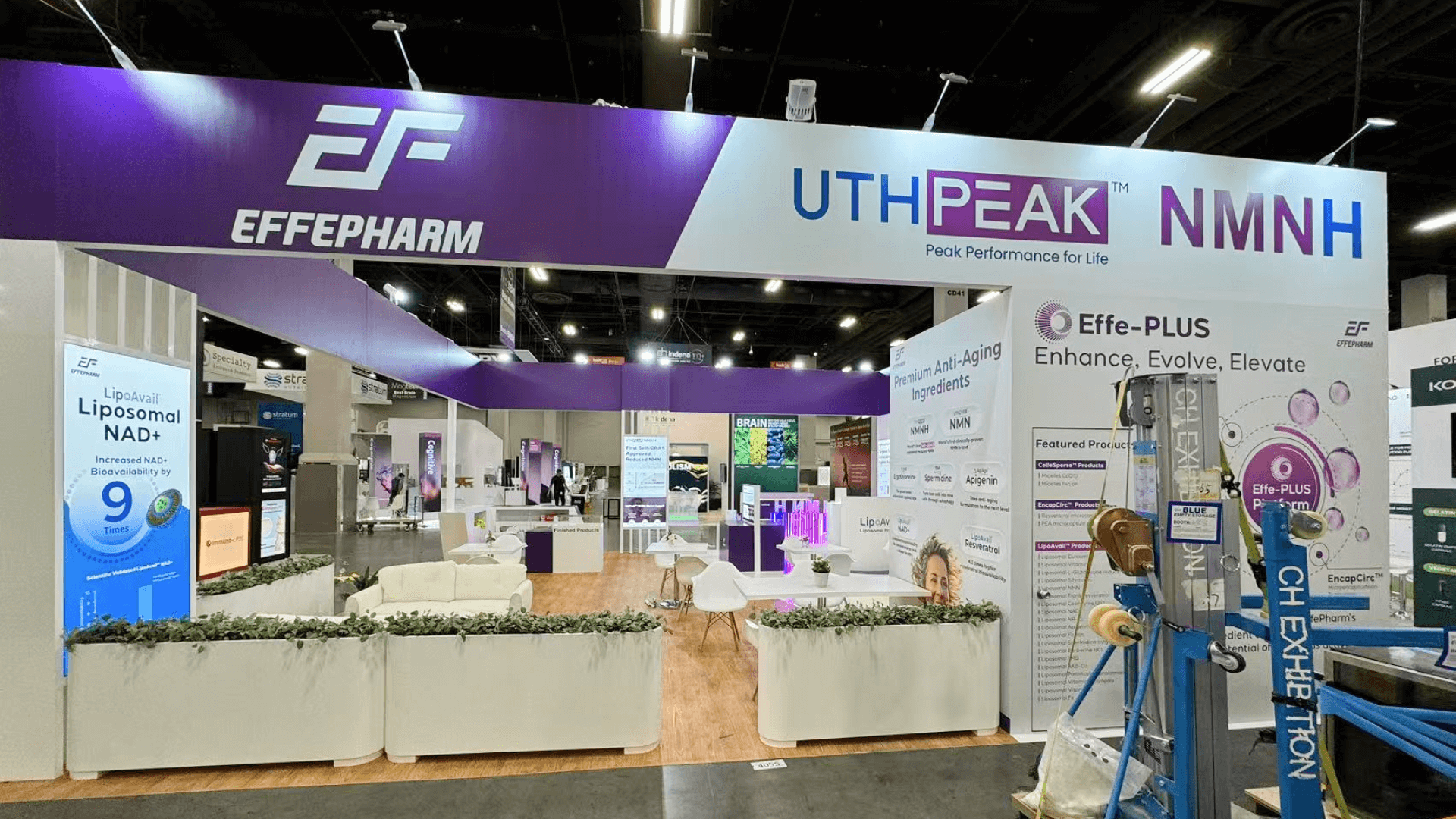
Effepharm brought a 30x30 booth to SupplySide Global in Las Vegas, built to turn nutraceutical formulation science into a show-floor environment that felt clear, approachable, and buyer-ready. Instead of relying on dense technical copy, the booth used strong purple-white contrast, illuminated structures, and guided product-discovery zones to help visitors understand the brand quickly. In an ingredients show where attendees compare suppliers, documentation readiness, and formulation logic in one pass, the layout had to make the booth readable in seconds while still supporting longer technical conversations.
Because SupplySide traffic is meeting-heavy and specification-driven, we treated product education, circulation, lounge placement, and counter logic as part of the booth system from day one. That allowed the space to support fast introductions at the edge while still giving the team room for ingredient discussion, sourcing conversations, and deeper buyer meetings inside the footprint. For a larger 30x30 trade show booth size guide, the key is not adding more objects, but keeping zoning and visibility under control.
To keep the build predictable at Mandalay Bay, we planned the booth around freight timing, staged deliveries, display readiness, and the practical sequence needed to get counters, graphics, and meeting areas usable before buyer traffic built. That same planning logic is why this case also connects naturally to design & engineering, where larger booths benefit from earlier structural review, material decisions, and layout control before show week begins.


💼
Client:
📅
Year/Exhibition:
📍
Location:
📐
Size:
🏢
Industry:
🏢
Venue Context:
Challenge
The main challenge was clarity. At SupplySide West, many nutraceutical exhibitors are trying to explain efficacy, formulation logic, sourcing credibility, and application scenarios without having highly theatrical physical products to lean on. For Effepharm, the booth needed to translate complex ingredient science into something visitors could understand quickly while still feeling differentiated inside a hall full of biotech and supplement messaging. The space had to balance education, engagement, and brand visibility without becoming dense or visually repetitive.
The second challenge came from execution. Once a booth depends on illuminated structures, acrylic presentation, product podiums, and open lounge flow, it moves beyond concept and into sequence control. Structure, lighting, graphics, and finish elements all need to arrive and land in the right order or the booth loses hierarchy quickly. That is why this case also supports booth fabrication and pre-build checks in Las Vegas. For a booth like this, readiness is what protects clarity, finish quality, and buyer confidence on opening day.
Design vs. On-site Execution
The concept was built around disciplined contrast. Instead of trying to force a “lab booth” through generic white surfaces alone, the design used a purple-white color system, illuminated structures, and controlled product-discovery points to turn the brand identity into spatial language. The goal was to help visitors read the booth through order, not just through copy. That meant creating a footprint where brand recognition, ingredient education, and meeting flow could happen together without competing for attention.
On site, that concept only worked because the install sequence protected the same priorities as the layout. Illuminated elements had to establish hierarchy early, podiums needed to stay clean and evenly spaced, and the lounge had to feel visible yet calm enough for longer conversations. In a booth like this, design clarity and show-floor execution are tightly connected. The goal was not to make the space feel crowded with content, but to make it feel structured, polished, and conversation-ready throughout the day. This final sentence is an inference based on the case’s open-layout planning and the event’s meeting-heavy format.
This project was also featured in our portfolio gallery, showcasing real show-floor visuals and exhibit highlights from the event.
View the Effepharm booth at SSW 2024 project gallery for on-site photos and visual references.
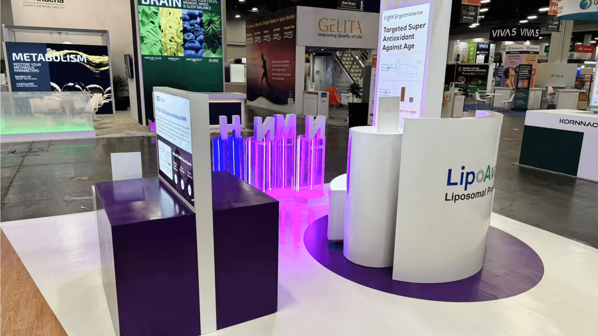
Illuminated Branding Landmark
Custom illuminated elements acted as visual anchors, helping the booth stand out while softening the technical tone of the space. They gave the footprint a recognizable identity without blocking sightlines.
Product Education Wall
A structured education wall allowed Effepharm to present ingredient benefits, sourcing logic, and application scenarios in a modular way. This supported both guided conversations and faster self-directed learning.


Open Business Lounge
An open lounge layout encouraged longer conversations with formulators, buyers, and partners. Seating placement ensured comfort while keeping discussions visible and approachable.
Product Discovery Podiums
Dedicated podiums provided focused touchpoints for ingredient exploration, helping visitors navigate EF’s offerings without information overload.

On-site Highlights
This booth performed well because the execution system protected the same qualities that made the concept work: readability, product hierarchy, and conversation-ready flow. In a SupplySide environment, meeting timing, staged freight, labor sequencing, lighting control, and clean finish condition all affect whether a booth feels usable once buyer traffic starts. The following highlights show how show-floor execution helped keep the Effepharm booth structured, polished, and discussion-ready under real Mandalay Bay conditions.
On-Site Execution Highlights
Overhead Sign + Visibility Coordination
Power + Lighting Control for Acrylic and Display Surfaces
Drayage + Staging Control for Structured Install Order
Union Labor Sequencing + Finish Protection
Install Closeout + Buyer-Ready Opening Condition
Outcome
The booth helped translate nutraceutical formulation science into a more readable show-floor experience, reducing the amount of front-end explanation needed to start a useful conversation.
Purple-white contrast, illuminated elements, and structured zoning made the booth more recognizable from multiple angles while keeping the scientific tone clean and controlled.
By keeping the lounge open and the discovery zones organized, the booth supported both short walk-up interactions and longer sourcing conversations without losing circulation.
Because lighting, podiums, education walls, and conversation areas were sequenced carefully, the booth could open in a cleaner and more presentation-ready condition for buyer traffic.
What made this booth effective was not just the color system. It was the fact that the layout gave ingredient science a visible structure. In a nutraceutical show, visitors are often comparing claims, documentation, and sourcing logic very quickly. That means the booth cannot rely on dense copy alone. By using illuminated forms, disciplined zoning, and a calmer open layout, the booth helped Effepharm feel more credible and easier to approach before the technical conversation even started.
Practical takeaway: if a nutraceutical booth needs to support education, product discovery, and buyer meetings at the same time, do not solve it with more visual noise. Solve it with hierarchy. The strongest booths are the ones where lighting, podium spacing, lounge flow, and literature logic are already working together before the hall opens. That is also where an experienced Las Vegas trade show booth builder adds real value—by making sure the booth feels organized, polished, and usable under real Mandalay Bay conditions. This concluding sentence is an inference supported by the venue’s freight/labor requirements and the case’s open-layout planning.
Quick Q&A
Q: Why did this booth use illuminated elements instead of relying only on printed graphics?
A: The case describes illuminated structures and edge-lit acrylic as part of the design strategy, which helped turn the purple-white brand system into a more spatial and readable show-floor language.
Q: What made the 30×30 format work for this booth?
A: The size allowed the booth to hold branded discovery zones, lounge conversations, and product education without forcing everything into the same front line. This is an inference supported by the case’s open-layout planning and the 30×30 guide.
Q: Why was the open lounge important at SSW?
A: SupplySide is meeting-heavy and specification-driven, so the booth needed visible but comfortable conversation space for buyers, formulators, and partners.
Q: What was the biggest execution priority for this kind of booth?
A: Sequencing. Structure, lit elements, counters, and finish surfaces had to be installed in the right order so the booth felt spec-ready before traffic built.
Q: What is the most overlooked detail in a nutraceutical booth like this?
A: Visual pacing. If every wall, podium, and message block competes equally, the science becomes harder to read and the booth feels more crowded than it is. This is an inference based on the case’s emphasis on guided discovery and disciplined color hierarchy.


