Newegg brought a 20x40 booth to CES 2026, built to turn a broad gaming and PC-hardware retail story into a space buyers, media, and tech enthusiasts could understand quickly from the aisle. Instead of treating the booth like a generic product rack or accessory counter, the layout needed to make Newegg feel like a serious gaming and performance-hardware destination—clear, high-energy, and easy to step into for a real product experience. That direction matches Newegg’s official positioning as a leading global online retailer for PC hardware, consumer electronics, gaming peripherals, home appliances, automotive and lifestyle technology.
Because CES traffic is fast, media-heavy, and category-driven, the booth had to support two things at once: instant first-read recognition from distance and enough structure inside for hands-on product engagement once visitors stepped in. That is why the visual system could not rely on merchandise alone. It needed stronger architecture, tighter lighting logic, and a more deliberate brand frame, which is exactly where graphics and brand presentation matters for a booth like this. CES’s official Gaming XR materials make that especially relevant, highlighting gaming hardware, high-performance PCs, displays, and peripherals as key show-floor directions.
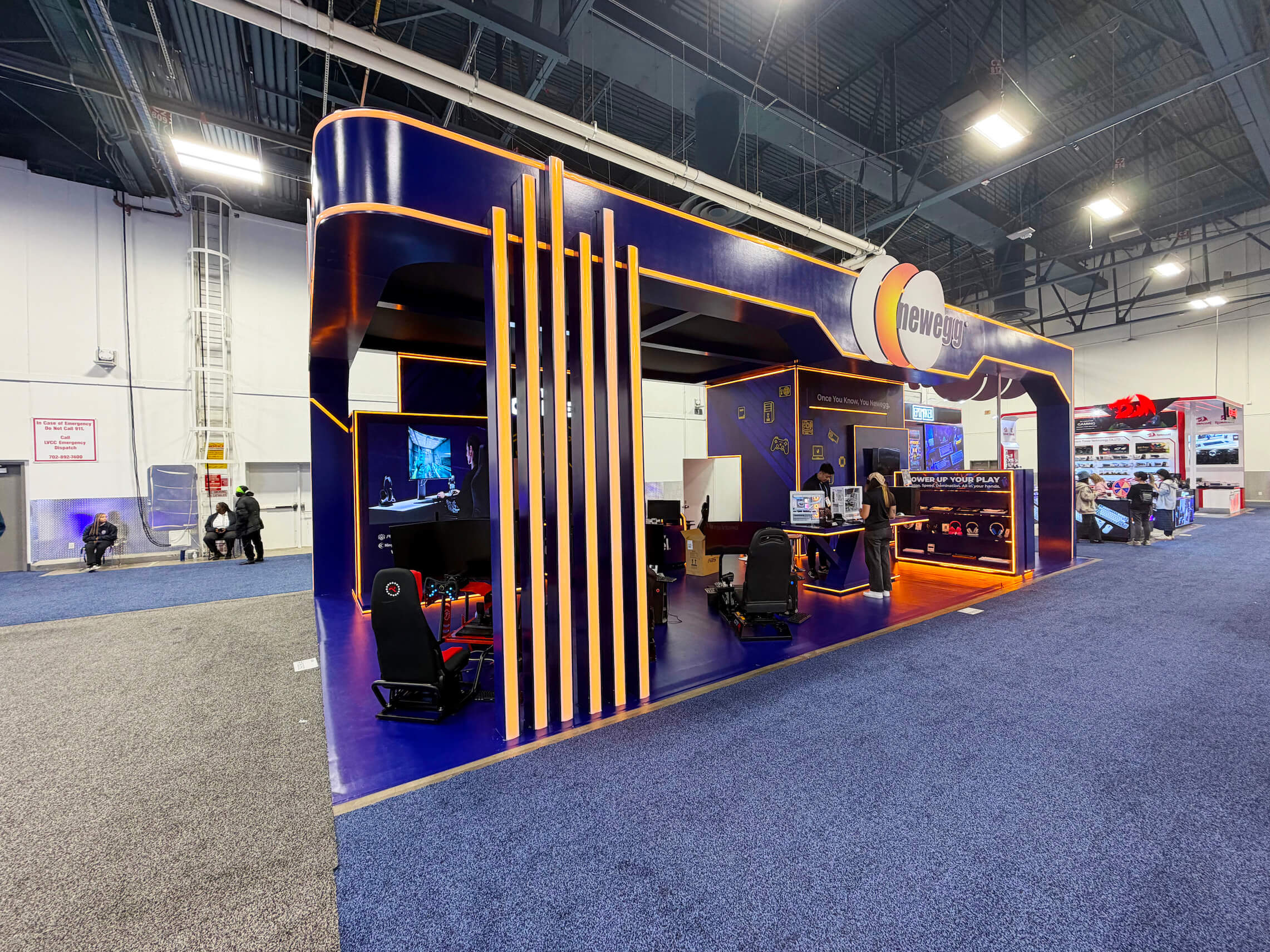
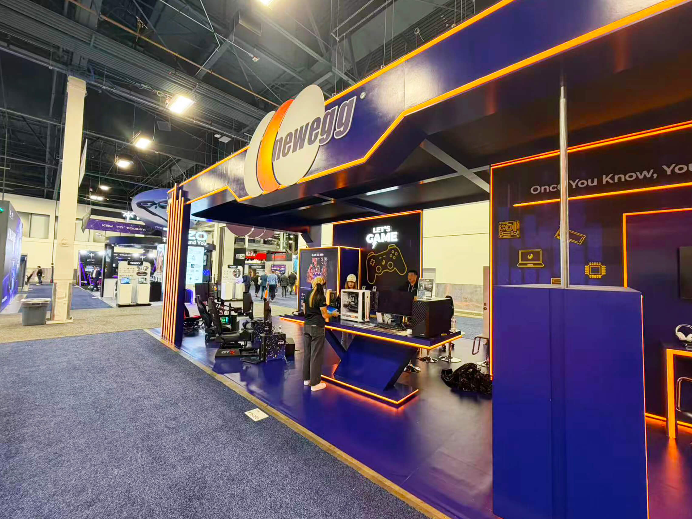
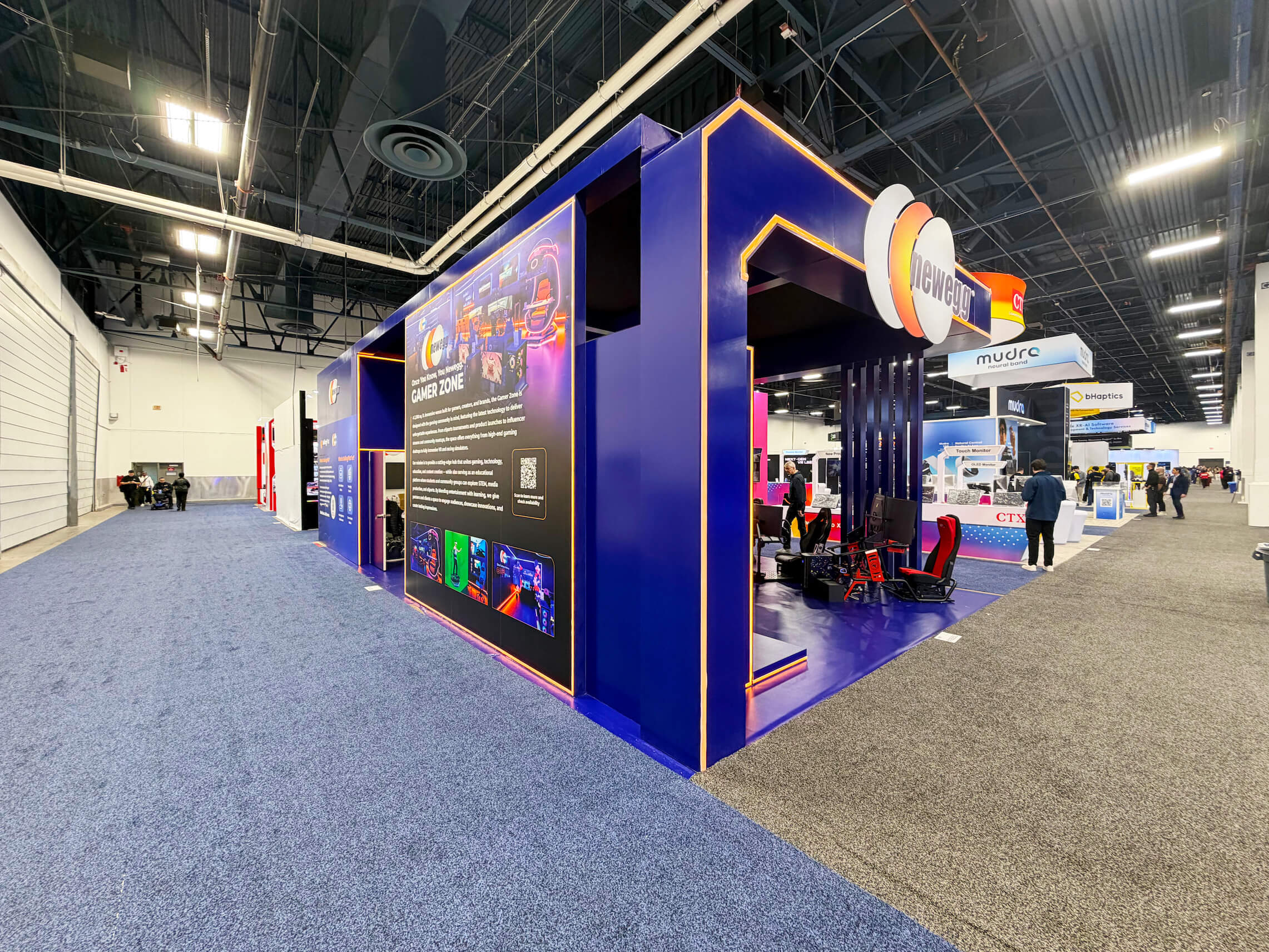
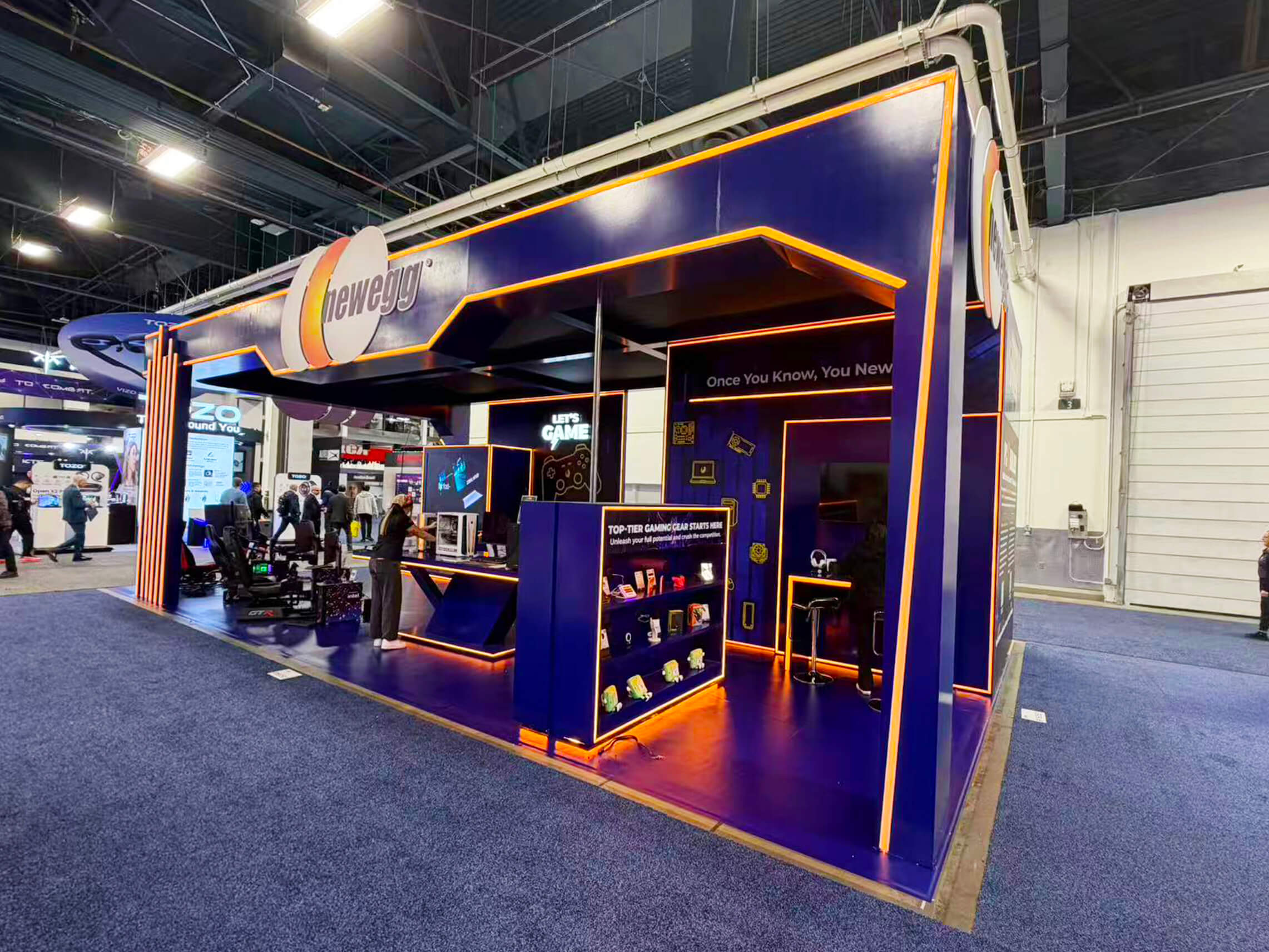
The booth also needed enough scale to separate entry, gaming demo, featured product display, and shopper conversation space without making the footprint feel crowded. For this kind of CES environment, a 20x40 booth size guide is the right structural reference because it gives enough room to support a true branded experience while still keeping the gaming and hardware story readable from multiple aisles. The images support exactly that read: a large fascia system, perimeter-lit geometry, demo seating, open display tables, and a compact product showcase zone all working together inside one disciplined footprint.
💼
Client:
📅
Year/Exhibition:
📍
Location:
📐
Size:
🏢
Industry:
🏢
Venue Context:
Challenge
The main challenge was category breadth. Newegg is not a single-brand hardware manufacturer. It represents a much wider gaming and electronics ecosystem—PC parts, peripherals, displays, accessories, and enthusiast gear—which can easily feel scattered if every product tries to speak at once. The booth had to make the Newegg brand feel central before the product mix started branching outward. Visitors needed to understand quickly that this was a place for gaming performance, PC hardware, and enthusiast-grade technology, not just another mixed electronics stand. That challenge lines up with Newegg’s official positioning around PC hardware, consumer electronics, and gaming peripherals.
The second challenge came from execution. Once a 20x40 CES gaming booth depends on a large fascia structure, illuminated trim, demo stations, branded product showcases, and a walk-in open plan, the result depends on how cleanly the hierarchy is staged. If the structure, lighting lines, demo counters, and product zones do not land in the right order, the booth quickly starts to feel busy instead of premium. That is why this case also supports design & engineering—because a booth like this only works when the frame, visitor movement, and visual emphasis are solved before show week.
Design vs. On-site Execution
The concept was built around one clear priority: the booth had to feel like a Newegg experience before anyone looked closely at individual products. That meant the layout could not rely only on merchandise quantity. It needed a strong architectural frame, a bold color-and-lighting system, and clearly separated zones for gaming demo, featured hardware, and quick product interaction. The booth therefore worked best as a structured 20x40 island—large enough to support multiple engagement points, but still controlled enough to stay legible from several approach angles. For this type of show-floor behavior, a 20x40 booth size guide is the right structural reference: it gives enough room for a true entry moment, a demo strip, a retail-style product showcase, and a cleaner sequence from first glance to hands-on interaction.
On site, that concept only works if the hierarchy is protected all the way through installation. The main fascia has to land first, the illuminated edge lines have to stay sharp, the demo seats and hardware tables have to align to the aisle, and the product display zone has to feel intentional rather than added late. The goal was not to make the booth feel larger than 20x40. It was to make it feel more immersive, more controlled, and easier to understand from the first aisle view.
Primary Brand Fascia Zone
A large top fascia gave the booth immediate long-range recognition and helped Newegg read as a destination brand before visitors reached the product layer.
Gaming Demo Strip
Aisle-facing gaming seats and display positions created an immediate interaction zone, letting the booth communicate “hands-on performance” without blocking the entrance.
Featured Hardware Counter
A central product counter supported direct engagement with PC components and gaming gear while keeping the conversation zone visible from the aisle.
Retail Showcase Wall
A compact product-display wall helped organize accessories and featured items into a more readable retail moment instead of scattering them across the footprint.
On-site Highlights
This booth worked because the execution system protected the same qualities that made the concept effective: first-read brand recognition, controlled lighting hierarchy, and clear visitor flow. In a CES environment, even a strong 20x40 booth can lose its impact quickly if the fascia, trim lighting, demo stations, and retail-display elements do not land in the right sequence. CES officially frames the show as a global gathering place for technology, with gaming and high-performance hardware among the major show-floor categories, so the booth has to open in a state that feels organized, premium, and ready for both media attention and shopper-style interaction.
On-Site Execution Highlights
Fascia-First Brand Set
Lighting Hierarchy Protection
Freight + Structure Delivery Order
Install Sequencing + Finish Discipline
Show-Ready Demo Condition
Outcome
The booth made Newegg’s role as a gaming and hardware destination easier to understand at a glance, helping visitors move from awareness into product exploration.
By leaning on a bold fascia, controlled lighting, and clean geometry, the booth held attention in a visually crowded CES environment without losing clarity.
The open demo strip and central product counter supported both quick walk-up engagement and longer gaming-hardware conversations without blocking the booth.
Because the booth was planned around hierarchy, circulation, and installation order, it could open in a cleaner and more operational condition for CES traffic.
What made this booth effective was not just the lighting or the gaming setups. It was the fact that the booth behaved like a complete Newegg environment first and a product display second. At CES, that matters more than trying to show too many items at once. Visitors do not want to sort through a wall of products before they understand the brand. They want to see the category, feel the energy, and understand whether the booth is worth stepping into. By giving Newegg a strong fascia, a controlled light-trim system, an aisle-facing demo layer, and a cleaner product showcase, the booth turned a broad gaming-and-hardware story into something easier to read and more inviting to enter. Newegg’s official positioning around PC hardware, consumer electronics, and gaming peripherals fits exactly that kind of booth logic.
Newegg’s gaming demos, hardware tables, and retail displays each needed their own space. The fascia and lighting gave our Las Vegas trade show booth builders a way to frame those activities, while the demo seats and open tables kept the products accessible inside the island.
Quick Q&A
Q: Why does a gaming booth need such a strong first-read structure?
A: Because gaming and PC hardware categories are visually crowded. Visitors need to understand quickly whether the booth is about complete systems, components, peripherals, or a broader gaming ecosystem before they decide to stop. CES’s Gaming XR materials make that especially clear.
Q: What makes Newegg different from a single-brand gaming booth?
A: Newegg officially positions itself as a global online retailer spanning PC hardware, consumer electronics, and gaming peripherals, so the booth has to organize a broader ecosystem rather than one product line.
Q: Why is an open demo strip important in a booth like this?
A: CES is built around fast discovery, live comparison, and visible category cues. A front-facing demo edge helps the booth communicate performance and interaction before visitors commit to stepping inside.
Q: What execution factor matters most for a booth like this?
A: Sequence control. When the fascia, light trim, demo stations, and showcase elements do not install in the right order, a premium gaming booth starts to feel messy very quickly.
Q: What is the most overlooked detail in a CES gaming booth?
A: Product pacing. If every product tries to demand attention equally, the booth becomes noise. This kind of booth works better when the structure establishes the mood first and the merchandise follows.


