FinaMill brought a 20x30 booth to The Inspired Home Show 2025, built to turn a colorful kitchen innovation story into a clear retail-facing product experience. The booth needed to do more than display grinders on counters. It had to help buyers understand how FinaMill’s interchangeable spice system, new tabletop models, updated brand colors, and playful flavor positioning could work across cooking, drinks, baking, BBQ, and everyday kitchen routines.
The Inspired Home Show is one of the strongest home and housewares buying environments in North America, so the booth had to support fast recognition, product discovery, and real buyer conversations inside a compact footprint. For this reason, the layout was planned around a clear first-read brand wall, a front-facing product experience zone, and enough open space for retailers to stop, test, compare, and ask questions without blocking the aisle.
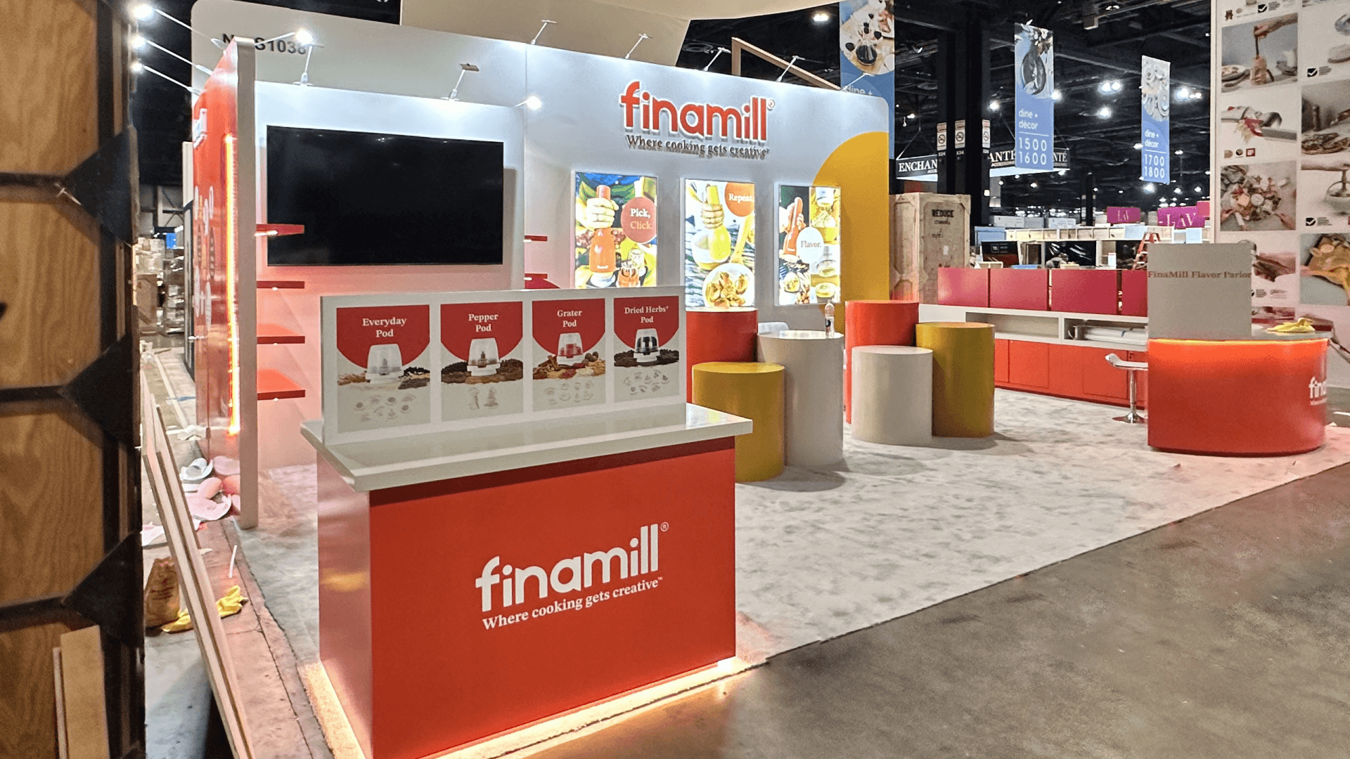
The 20x30 footprint gave FinaMill enough room to show product use, retail merchandising logic, color direction, and buyer-facing interaction without making the booth feel like a crowded appliance shelf. The result was a booth that used color, counter height, product grouping, and movement flow to make the brand feel brighter, easier to approach, and easier to understand from the aisle.


💼
Client:
📅
Year/Exhibition:
📍
Location:
📐
Size:
🏢
Industry:
🏢
Venue Context:
Challenge
The main challenge was clarity. FinaMill’s product story includes more than one object: the grinder system, interchangeable pods, tabletop models, flavor use cases, updated colors, and a more playful brand direction. If every element competed at the same level, the booth could easily feel like a busy product counter instead of a focused retail presentation. The layout needed to make the core idea simple first: FinaMill helps shoppers explore flavor in a more flexible and creative way.
The second challenge came from the IHS environment itself. Buyers at The Inspired Home Show are comparing many home and kitchen products in a short period of time, so a booth has to make product use, retail value, and shelf appeal clear quickly. The display could not depend on long explanation. It needed stronger hierarchy, cleaner counter staging, and more deliberate graphics and brand presentation so the updated FinaMill colors, flavor cues, and product messages worked together instead of competing for attention.
The booth also needed to protect the new brand presentation through setup and show traffic. FinaMill’s brighter color direction, product finishes, packaging cues, and flavor-forward messaging had to stay organized from the first aisle view to the buyer conversation area. A booth like this only works when graphics, counters, product placement, and visitor flow are planned together from the beginning.
Design vs. On-site Execution
The concept was built around a simple idea: visitors should understand the flavor experience before they study individual product details. The booth used a clear structure to separate brand recognition, product discovery, flavor interaction, and buyer conversation. This gave FinaMill enough space to show its grinder system, color palette, tabletop products, and kitchen-use scenarios without making the footprint feel overloaded.
For this type of housewares display, a 20x30 booth size guide is the right structural reference because it allows room for a front-facing product experience, a retail-style counter, a stronger brand wall, and a compact meeting area inside one readable footprint. The booth did not need to feel oversized. It needed to feel organized, approachable, and easy for buyers to understand from multiple aisle angles.
On site, the success of the booth depended on keeping that hierarchy intact. The main graphics had to land cleanly, the product counters had to remain easy to approach, and the flavor-focused display areas had to feel intentional rather than decorative. The final execution treated the booth as a compact retail environment instead of a simple product stand.
Front Flavor Experience Zone
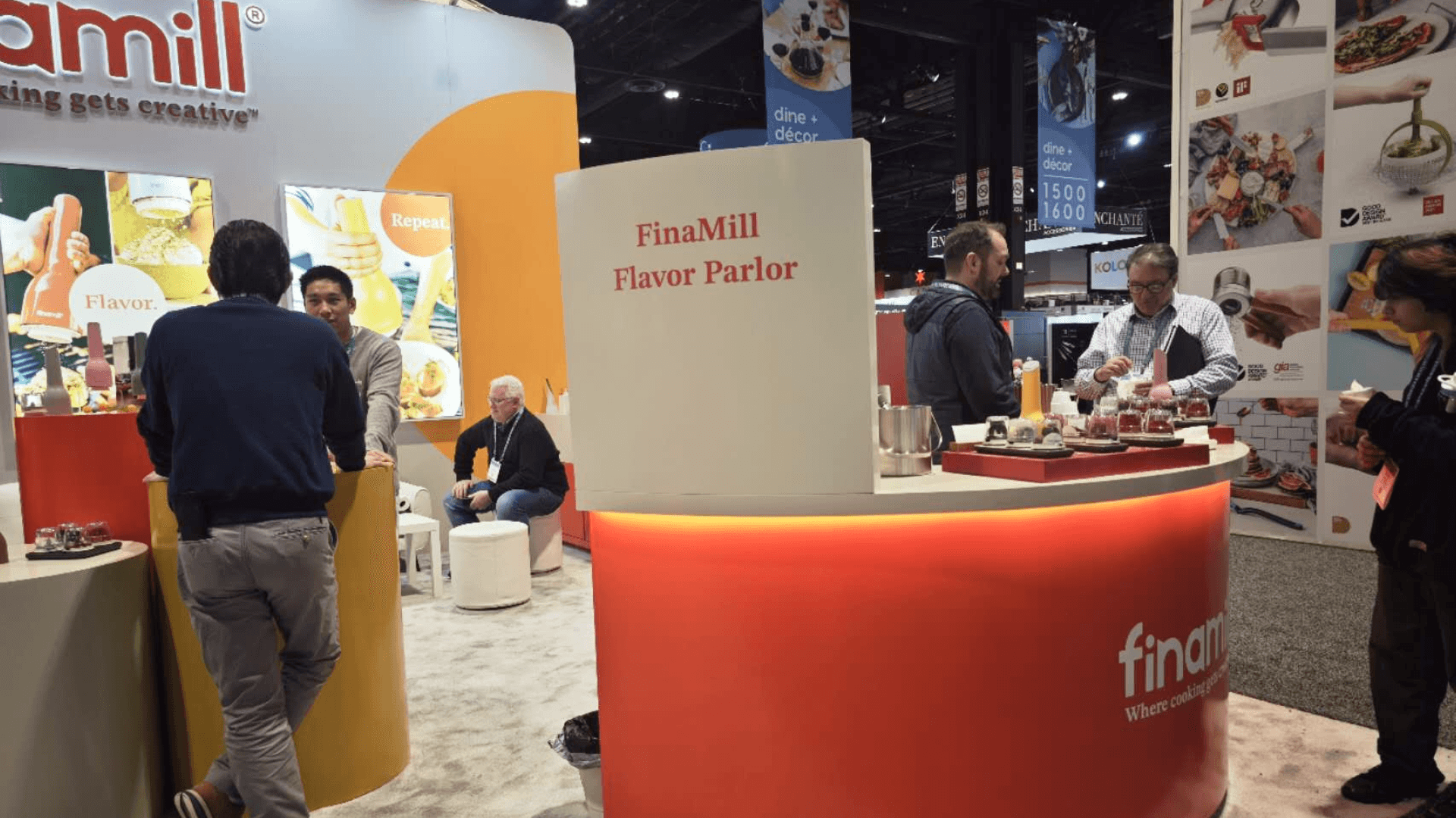
An aisle-facing interaction area helped introduce FinaMill’s flavor story quickly, giving buyers a reason to stop before moving into deeper product discussion.
Product Display Counter
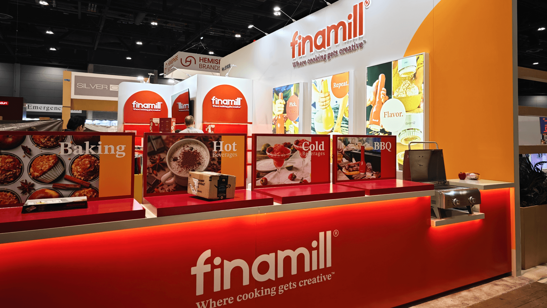
A focused product counter organized grinders, pods, and tabletop models into a clearer retail-style presentation instead of spreading them loosely across the booth.

Color and Brand Wall
A bright brand wall supported the updated visual identity and helped the booth feel more recognizable inside a crowded home and housewares hall.
Buyer Conversation Area
A compact meeting area gave retail buyers and partners space to discuss product positioning, merchandising, and category fit without interrupting the product display flow.
On-site Highlights
This booth worked because the execution protected the same qualities that made the concept effective: a clear flavor story, clean product grouping, and a brighter retail-facing brand presence. At IHS, buyers are comparing product usefulness, shelf appeal, color, packaging, and business potential very quickly. If the counters, graphics, samples, and meeting space do not land in the right order, even a strong product can feel scattered on the floor.
For FinaMill, the booth needed to open in a condition that felt approachable, colorful, and buyer-ready. The product zones had to stay easy to read, the graphics had to support the updated brand direction, and the aisle-facing experience needed enough open space for visitors to stop without creating congestion.
Flavor Demo-First Layout for a 20x30 Kitchen Innovation Booth
Brand Wall Alignment
Product Counter Staging
Flavor Interaction Flow
Graphics Closeout Control
Buyer-Ready Reset
Outcome
The booth made FinaMill’s product system easier to understand by connecting grinder use, flavor creativity, tabletop display, and retail presentation into one clear experience.
The updated color direction and brand wall helped the booth read more quickly from the aisle, giving buyers a clearer reason to stop and explore the product story.
By grouping grinders, pods, tabletop models, and use-case messaging more intentionally, the booth supported faster product understanding and more focused buyer questions.
Because the booth was planned around product hierarchy, counter staging, and final reset, it opened in a cleaner and more retail-ready condition for IHS buyer traffic.
What made this booth effective was the way it treated FinaMill as a flavor experience, not only as a kitchen tool display. At a show like IHS, buyers are surrounded by useful products. The booth has to answer a simple question quickly: why should this product earn attention in a retail setting? For FinaMill, that answer came through color, interaction, and a clear product sequence. The updated brand direction gave the booth energy, while the counter layout helped buyers understand how the grinder system, pods, tabletop models, and kitchen-use scenarios fit together.
Practical takeaway: for a compact housewares booth, do not solve product storytelling by adding more items to the counter. Solve it with hierarchy. The strongest product booths are the ones where the brand wall, product counter, interaction zone, and buyer meeting area already work together before show traffic begins. That is also where an experienced Las Vegas trade show booth builder adds value for national show programs—by helping a booth stay clear, product-ready, and operationally controlled even when the event is outside Las Vegas.
Quick Q&A
Q: Why does a kitchen innovation booth need a strong first-read structure?
A: Because housewares buyers compare many products quickly. A booth needs to communicate product category, use case, and retail value before buyers decide whether to stop.
Q: What made FinaMill’s booth different from a simple product counter?
A: The booth connected flavor interaction, product display, new color direction, tabletop models, and buyer conversation space into one clear 20x30 experience.
Q: Why is open aisle flow important for IHS exhibitors?
A: IHS traffic moves through many product categories. Open flow lets buyers stop, inspect, and ask questions without blocking the booth entrance or product counters.
Q: What execution detail mattered most for this booth?
A: Product hierarchy. The booth needed the brand wall, flavor interaction area, counters, and meeting space to work together so the product story stayed easy to follow.
Q: What should housewares brands avoid in a booth like this?
A: Overloading counters with too many products at equal weight. A cleaner sequence helps buyers understand the main product story faster.


