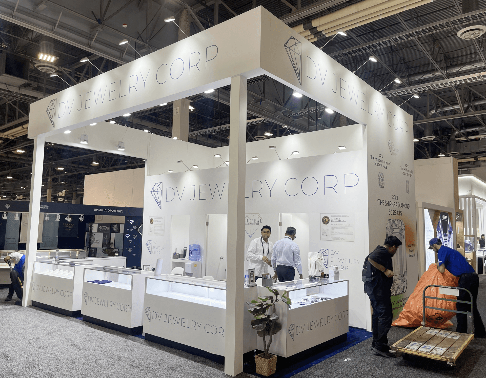
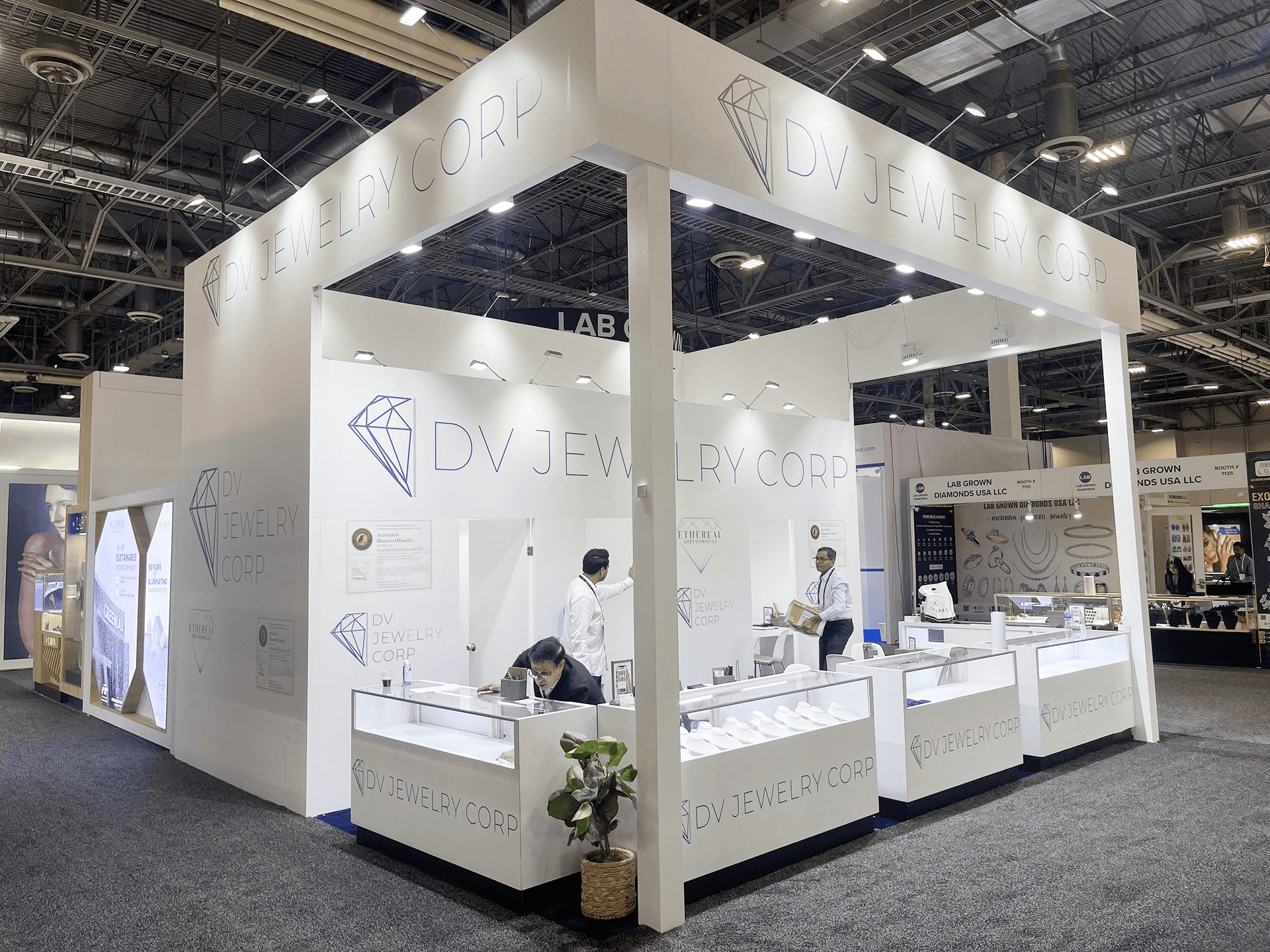
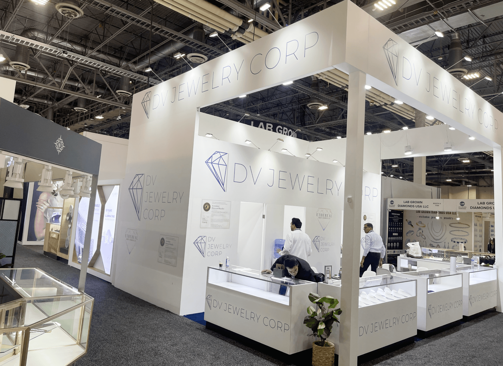
DV Jewelry brought a 20x20 booth to JCK in 2023, built around a clean jewelry presentation system rather than a heavy decorative structure. The booth used a white overhead frame, large DV Jewelry Corp branding, glass showcases, and a controlled island layout to make diamond jewelry easy to view from the aisle. For a JCK environment, that mattered more than visual complexity. Buyers needed to read the brand quickly, approach the counters comfortably, and focus on stones, settings, and display details without distraction.
Because jewelry booths depend on close-range viewing, the layout had to keep the product layer bright, clean, and easy to manage throughout show hours. The counters could not feel crowded, the overhead signage had to stay readable from surrounding aisles, and the interior support area needed enough room for staff to handle documents, samples, and buyer conversations. That is where booth execution becomes more than fabrication. It becomes show-floor control.
The images show a booth that stayed disciplined: high brand visibility, open corner access, illuminated showcase counters, and a back-wall system that supported the jewelry presentation without competing with it. For a fine jewelry exhibitor, this kind of restraint is often what makes the booth feel more premium.


💼
Client:
📅
Year/Exhibition:
📍
Location:
📐
Size:
🏢
Industry:
🏢
Venue Context:
Challenge
The main challenge was controlling density. A 20x20 jewelry booth needs enough showcases to present product clearly, but too many counters can quickly make the space feel tight. DV Jewelry needed a booth that looked open from the aisle while still giving staff enough surface area for diamond jewelry presentation, buyer interaction, and behind-counter support. The structure had to create brand height, but it could not overpower the product.
The second challenge was installation sensitivity. Glass showcases, white wall surfaces, thin-line graphics, and bright lighting leave very little room for rough handling or messy closeout. If counters arrive too early, they can block the build path. If lighting is checked too late, the jewelry layer may not read correctly. If graphics are slightly off, the clean premium look starts to feel unfinished. For this case, on-site installation and dismantle planning mattered because the booth had to move from structure to showcase setup to final cleaning in the right order.
Design vs. On-site Execution
The concept was simple: use a bright architectural frame to make DV Jewelry visible, then keep the product layer calm and readable. The overhead brand band gave the booth a strong first read from distance. The glass counters created the main selling surface. The white walls and minimal graphics kept attention on the jewelry instead of pulling the eye into too many design elements.
For a 20x20 trade show booth, every counter placement affects traffic flow. In this layout, the open edges allowed buyers to approach from different directions while staff could work from inside the booth. The corner view stayed strong, the front counters remained accessible, and the side wall added a quieter brand story without closing off the space.
On site, the build sequence had to protect the same logic. The main frame and walls came first, then the showcases were positioned, leveled, cleaned, and prepared for lighting review. The result was not an overbuilt jewelry booth. It was a controlled retail-style environment that looked ready for product viewing from the moment the show opened.
Aisle-Facing Showcase Line
The front showcase counters created the booth’s main product-viewing edge. Buyers could stop at the aisle, look into the illuminated cases, and start a conversation without stepping into a congested interior space.
Overhead Brand Frame
The large white header helped DV Jewelry Corp stay visible across surrounding aisles. Its simple structure gave the booth scale while keeping the visual language clean enough for a fine jewelry environment.
Interior Staff Support Zone
The interior space behind the counters gave staff room to manage documents, samples, small items, and buyer follow-up. This kept the public-facing showcase line cleaner during active show hours.
Side Wall Jewelry Story Surface
The side wall added secondary brand presence for visitors approaching from the neighboring aisle. It supported the booth story without competing with the display counters or making the 20x20 footprint feel closed.

On-site Highlights
This booth worked because the installation protected the same qualities that made the design effective: clean white surfaces, readable brand height, protected glass showcases, and lighting that supported close jewelry viewing. In a JCK environment, a booth can lose its premium feel quickly if freight staging, counter alignment, graphics, and final cleaning are not controlled. The execution goal was to open with a booth that looked bright, calm, organized, and ready for buyer-facing product review.
On-Site Execution Highlights
Header-First Structure Setup
Glass Showcase Handling
Lighting and Product Readiness
Aisle Access Control
Final Cleaning and Alignment
Outcome
The booth gave DV Jewelry a bright and readable presentation from multiple aisle angles. Visitors could quickly recognize the brand and focus on the showcases without visual distraction.
The 20x20 layout stayed open enough for browsing and conversation without feeling empty. Buyers could approach the counters comfortably, and staff still had room to work behind the display line.
The staged installation process helped protect the showcases and maintain alignment across the booth. That reduced last-minute adjustment pressure and kept the presentation cleaner before opening.
The booth opened in a polished and orderly state, which is especially important for fine jewelry presentation. The final result supported close viewing, steady traffic flow, and confident buyer-facing interaction.
What made this booth effective was the restraint. DV Jewelry did not need a complicated structure to look premium. The booth needed height, light, clean counters, and enough open space for buyers to focus on the jewelry. The white frame gave the brand a strong presence, while the showcases created a simple product path from aisle view to conversation.
The practical takeaway is that jewelry booths should be planned around presentation control. Glass handling, counter placement, lighting checks, and final surface cleaning all affect how the booth feels on opening day. For exhibitors showing fine jewelry, gemstones, watches, or luxury retail products, an experienced Las Vegas trade show booth builder helps make sure the booth is not only designed well, but actually ready for a buyer-facing show floor.
Quick Q&A
Q: Why did a 20x20 layout work for DV Jewelry at JCK?
A: It gave the brand enough room for multiple showcase counters while still keeping the aisle approach open and readable.
Q: What mattered most during installation?
A: The most important points were protecting the glass counters, setting the overhead frame early, checking lighting, and keeping the final surfaces clean.
Q: Why was the booth kept visually simple?
A: Fine jewelry needs a calm display environment. A clean structure helps buyers focus on stones, settings, and craftsmanship instead of booth decoration.
Q: What makes jewelry booth execution different from general product booths?
A: Jewelry booths depend more on lighting, counter alignment, display security, and close-range viewing. Small installation issues are easier to notice.
Q: What is the most overlooked detail in this type of booth?
A: Final cleaning. White walls, glass counters, and bright lighting make fingerprints, dust, and misalignment more visible than in many other booth types.


