The problem is rarely “not enough product”
Most SEMA booths do not suffer because they have too little to show.
They suffer because too much product is trying to speak at the same time.
That usually happens when the vehicle, the wheel wall, the tire display, and the accessory shelving all get pushed into the same visual layer. Everything is visible, but nothing is prioritized. The booth feels full, yet the story gets weaker.
At SEMA, that is a common mistake.
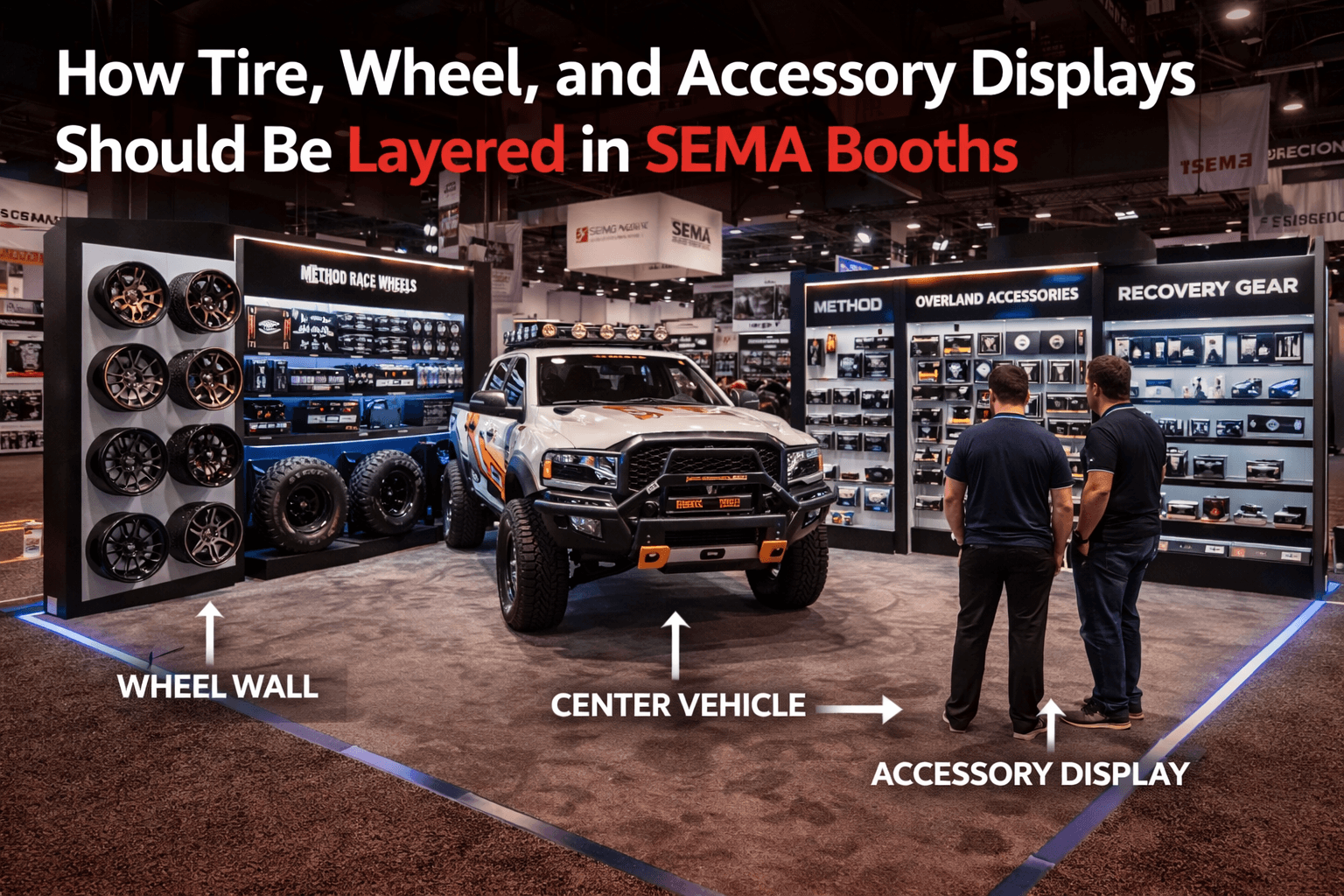
The vehicle should still lead
In most automotive booths, the vehicle earns the first stop.
That part comes naturally.
People notice the stance, the paint, the fitment, the lift, the wheel choice, or the overall build direction before they notice anything else. That is exactly why the booth should protect the vehicle’s role instead of surrounding it with product noise.
The best booths let the vehicle make the first impression, then use the surrounding display zones to explain what that first impression is actually built from.
That sequence matters.
Product layering works better than product stacking
A strong SEMA booth usually does not present every category in one flat wall of information.
It layers the experience.
That often looks like this:
1. Vehicle as the hero
The center display creates the first visual stop.
2. Wheels and tires as the closest supporting layer
These are usually the most directly connected to the vehicle story.
3. Accessories as the next category layer
Lighting, recovery gear, overland parts, electronics, or supporting hardware deepen the display after the visitor understands the core setup.
When those layers are clear, the booth feels easier to move through and easier to understand.
Wheels and tires should usually sit closest to the vehicle story
That is not just because they are visually strong.
It is because they help the visitor connect product to application very quickly.
If the booth features a lifted truck, performance car, or off-road build, the wheel and tire display often acts like the most immediate “translation layer” between the center vehicle and the product line around it.
That is why wheels and tires usually work best:
beside the vehicle
slightly behind the first sightline
close enough to feel related
far enough away not to cut off the main view
When they sit too far forward, they start competing with the vehicle.
When they sit too far back, they lose their connection to the main display.
Accessory zones need more discipline than teams expect
Accessories are where many booths start getting cluttered.
That is because accessories often cover a wide range:
recovery gear
lighting
mounts
storage
electronics
interior upgrades
overland systems
smaller hardware items
Once these all enter the booth, the layout can start behaving like a retail shelf instead of a trade show presentation.
That is why accessory displays need stronger category logic than many exhibitors assume.
They should not just fill remaining wall space.
They should help the visitor understand what kind of system or use case the booth is really about.
Different product types should not share the same visual weight
This is where layering becomes critical.
Not every category deserves the same size, height, or placement.
For example:
Wheel wall
Usually works well as a visually strong vertical feature.
Tire display
Often works better as a grouped product zone, not scattered throughout the booth.
Small accessories
Need cleaner grouping and simpler headers, or they quickly become visual clutter.
Premium or feature accessories
Should sit in selected focal zones, not diluted across every shelf.
When everything is presented with equal intensity, the booth feels noisy.
When the hierarchy is controlled, the categories feel more premium.
A 30x40 booth gives this layering room to breathe
This is one reason a 30x40 trade show booth works so well for SEMA displays that need both a center vehicle and multiple product families.
That footprint often gives enough room to separate:
the main vehicle zone
the wheel and tire layer
the accessory display layer
the circulation line
the conversation space
In a tighter footprint, the categories often collapse into one dense ring around the vehicle. In a better 30x40, each layer can support the booth story without suffocating the center.
That is where the display starts feeling deliberate.
Clean circulation is what makes the layering visible
A good product layout is not only about where the shelves go.
It is also about how people move between them.
If the circulation path is clean, visitors can:
stop at the vehicle
notice the wheel and tire story
move toward the accessory categories that match their interest
continue into a conversation without doubling back into the center
If the circulation is weak, even a smart category layout starts feeling crowded because the booth has no room to separate attention from movement.
That is why layered product zones only work when the booth also protects open walking space.
Graphics are what make the layers readable
This is where graphics and brand presentation become essential.
Without strong graphic support, the booth may still show all the right products, but the visitor has to work too hard to decode what belongs where.
Good graphics help define:
product family
application
use case
relationship to the vehicle build
why one category matters before the next
That does not require more copy.
It requires better grouping.
Short category headers, clean visual framing, and consistent message structure usually do more than trying to explain every SKU in detail.
Builder planning matters because product layering changes booth behavior
A tire wall, an accessory display, and a vehicle platform are not isolated pieces.
They affect:
sightlines
entry conditions
photography angles
staff movement
aisle readability
conversation flow
That is one reason exhibitors often benefit from working with a Las Vegas trade show booth builder that understands how all these elements interact once the booth is live.
A product zone may look strong on its own and still weaken the booth if it blocks the center or compresses the edge.
The booth only works when the layers support each other.
A better SEMA booth usually follows this sequence
The strongest tire, wheel, and accessory booths often follow a simple order:
Vehicle first
The center display earns the stop.
Wheel and tire layer second
The booth gives the most immediate product context.
Accessory layer third
The visitor gets deeper category detail without losing the main story.
Conversation fourth
Sales activity happens after the booth has already explained itself visually.
That order keeps the booth easier to read and easier to trust.
Final thought
At SEMA, tire, wheel, and accessory displays should not crowd the vehicle just because they are important.
They should make the vehicle easier to understand.
When the booth layers product zones properly, the display feels more open, the categories feel more premium, and the center vehicle keeps its visual authority.
That is usually what separates a crowded product booth from one that actually sells the full system.
Planning a product-focused booth for SEMA Show?
Start with SEMA booth planning, then strengthen the category layout with a clearer graphics and brand presentation approach that keeps the vehicle visible while the product zones do the explaining.


