A lot of CES booths do a good job getting people to stop.
The problem starts right after that.
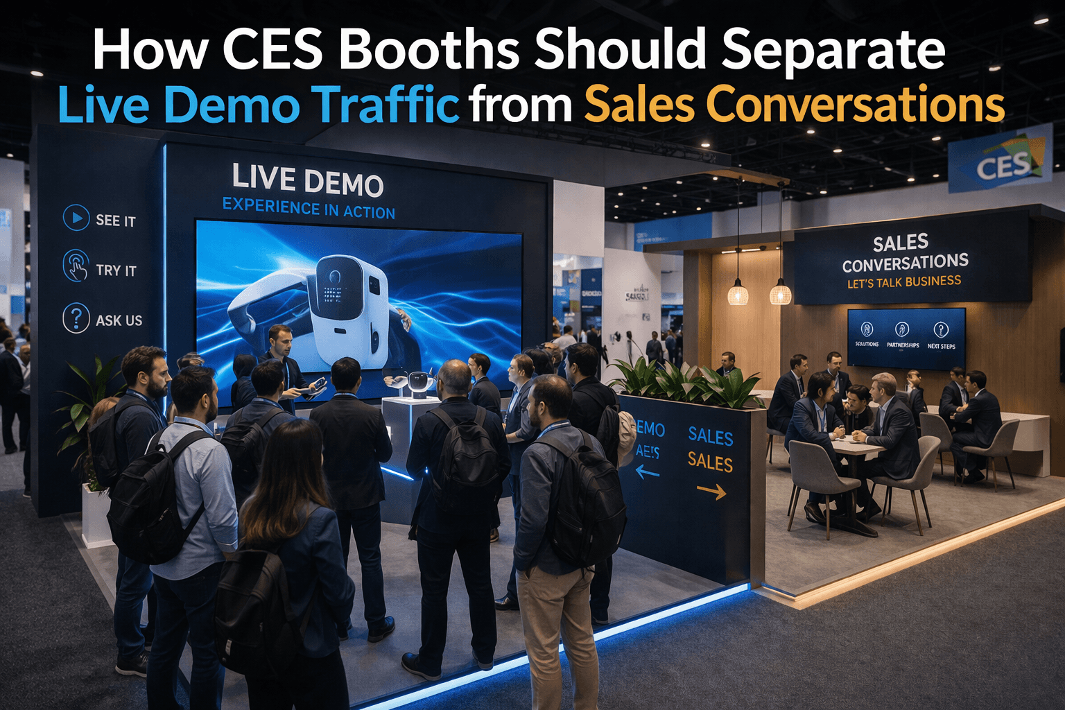
Someone watches the demo. A staff member starts answering questions. Another visitor tries to step in. A second staff member begins a more serious conversation with someone who looks qualified. Within a few minutes, the same zone is trying to do three jobs at once. It is hosting the product moment, the first interaction, and the sales discussion.
That usually works for a few minutes. Then it starts working against the booth.
At CES in Las Vegas, traffic moves too fast for that kind of overlap to stay manageable for long. The booth needs to pull people in quickly, but it also needs to know what happens after the stop. If live demo traffic and sales conversations share the same patch of floor, the booth begins to lose clarity. The demo feels crowded. Conversations feel rushed. New visitors hesitate because they cannot tell where to stand or whether they are interrupting something.
This is why separation matters.
A CES booth does not need a wall between demo traffic and sales activity. It needs a layout that gives each one enough room to behave differently.
The demo zone should be able to attract attention, hold a short interaction, and keep moving. The conversation zone should be able to slow things down without dragging that slower pace back into the front of the booth. When those two behaviors are stacked into the same area, neither one really performs the way it should.
That is often where booths lose conversion. Not because the product is weak. Not because the staff are bad. But because the people who are ready to talk seriously are occupying the same space the next wave of traffic needs in order to understand the demo.
The front of the booth should usually belong to the live product moment.
That is the area that needs the cleanest sightlines, the easiest first stop, and the least friction. People approaching from the aisle should be able to tell where the demo is happening and where they can pause without being forced immediately into a sales conversation. The booth should feel open at the front, not clogged with long discussions.
The sales corner usually works better farther back or off to one side.
It does not need to be hidden. It just needs to sit in a place where the conversation can continue without interrupting the next arrival. That kind of placement gives the booth a better rhythm. The front pulls attention. The middle explains the product. The rear or side zone handles the serious talk. Once that sequence is in place, the booth starts feeling much more natural.
This is one reason a 20x20 trade show booth works so well for CES. It is often the first footprint that gives enough room to separate these roles without making the booth feel oversized. In a tighter booth, the demo and the sales conversation are usually forced into the same few feet. In a better 20x20, the booth can support a front-facing demo zone and still leave room for a quieter conversation area behind or beside it.
That kind of separation also improves the quality of both interactions.
The demo feels more watchable because it is not constantly being cut across by people trying to talk. The sales conversation feels more useful because it is no longer happening in the highest-pressure part of the booth. Staff can actually listen. Visitors can ask better questions. And the next people coming into the booth are not forced to negotiate around an ongoing conversation just to understand what is being shown.
Graphics matter here too. The more clearly the booth explains the product from the aisle, the easier it is to keep the front of the booth focused on demo behavior instead of basic explanation. Strong graphics and brand presentation reduce the need for staff to start every interaction from zero. That leaves more room for the front zone to do what it should do: attract, clarify, and hand off.
A common mistake is to treat the sales area like a badge of seriousness and move it too close to the aisle. That usually backfires. It may make the booth feel active, but it also makes the booth look occupied before new visitors have entered. A person who sees two staff members deep in conversation near the front edge often keeps walking, even if the booth itself is strong. The more commercially important the conversation, the less it should dominate the booth entrance.
The handoff between demo and sales should feel easy, not dramatic.
Someone watches the product, asks a few questions, then moves naturally toward a quieter part of the booth if the conversation becomes more specific. That movement should feel like continuation, not relocation. If the sales corner is too far removed, the booth loses momentum. If it is too close, the demo zone loses air. The best booths place it just far enough away to change the pace without breaking the connection.
This is one reason many exhibitors benefit from working with a Las Vegas trade show booth builder that thinks about booth behavior instead of just booth elements. The problem is not solved by adding one more chair, one more table, or one more screen. It is solved by giving the booth a layout where attention and conversion do not compete for the same space.
The strongest CES booths usually feel simple from the aisle and more layered once you step in. The demo is easy to find. The conversation area feels available but not intrusive. The product story still leads. And the people who are ready to talk seriously have somewhere better to go than the front edge of the booth.
That is where conversion usually improves.
At CES, live demo traffic should create momentum, and sales conversations should build on it. When the booth gives each one its own place, both tend to work better.
Planning a booth for CES in Las Vegas?
Start with CES booth planning, then shape the layout with a Las Vegas trade show booth builder approach that keeps the demo zone open while giving sales conversations a better place to land.


