A lot of CES booths want the same two things at once. They want to attract fast-moving traffic with a live product story, and they want a place for real conversations once the right people stop.
That sounds simple, but it is where many booth layouts start to break down.
The problem is not whether a meeting pod belongs in the booth. In most cases, it does. The real issue is placement. When the pod sits in the wrong spot, it blocks the demo, compresses the entry path, and turns the booth into a space that feels busier than it really is. When it sits in the right spot, it gives the booth somewhere to absorb serious conversations without interrupting the flow that brings those conversations in.
That matters at CES in Las Vegas, because CES traffic rarely behaves like slow gallery traffic. People move with intent. They scan quickly, decide quickly, and only give extra time to booths that feel easy to read and easy to enter. If the meeting area is the first thing they notice, the booth can start feeling closed before the product has even had a chance to speak.
That is why meeting pods usually work best beside the demo zone, not in front of it and not buried so far in the back that they feel disconnected from the booth.
A front-edge pod is usually the weakest option. It may look efficient on a floor plan because it uses the booth perimeter, but on the show floor it often creates the wrong first signal. Instead of reading as an active product booth, the space starts reading as a private meeting booth that happens to have some demo elements nearby. That changes how visitors approach the booth. Some hesitate to enter. Others assume they are interrupting something. The booth loses openness before the demo has done its job.
Putting the pod directly behind the demo is not always much better. That setup can work on paper, but in practice it often creates overlap between people watching, people talking, and staff trying to move from one interaction to the next. The booth becomes layered in the wrong way. The pod is technically present, but it is still stealing space from the live product moment instead of supporting it.
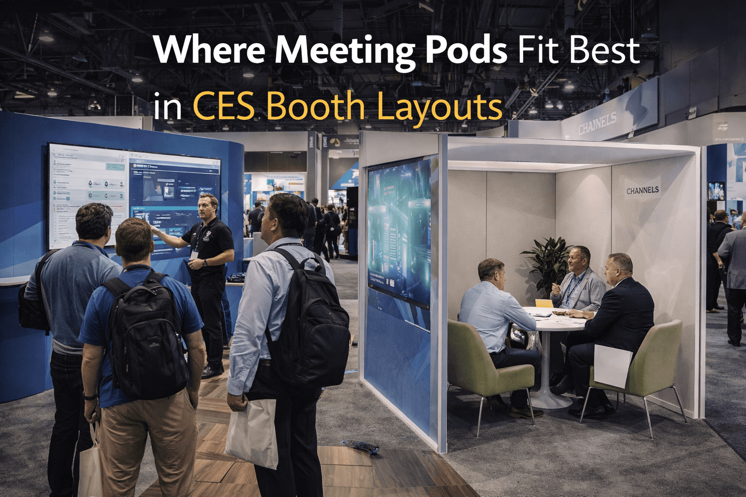
A semi-open side position usually works better.
That kind of meeting pod gives the booth a second zone without turning it into a second booth. Visitors can first see the headline, then the demo, then move naturally toward a quieter discussion area once there is real interest. The conversation stays connected to the product experience, but it does not sit on top of it.
This is one reason a well-planned 20x20 trade show booth works so well for CES. A 20x20 footprint is often the first size that gives enough room to separate demo behavior from talk behavior without making the booth feel oversized. In a smaller layout, the pod often competes with the product story. In a better 20x20, the pod can sit off to the side as a continuation space rather than an obstacle.
The best meeting pods at CES also stay visually light. They should create enough separation for a useful conversation, but not so much enclosure that they begin acting like a wall. Heavy partitions, tall panels, or bulky furniture can make the booth edge feel blocked and can cut off sightlines that the demo still depends on. A pod usually works better when it feels partially framed rather than fully closed.
That is also where graphics and brand presentation matter. The pod should not become a visually separate world with its own unrelated message. It should still feel tied to the booth’s main story. Good graphics help the meeting area stay connected to the product category and use case without forcing the main message to compete in two places. The pod is there to extend the conversation, not restart the explanation from zero.
Another common mistake is oversizing the meeting area because it feels commercially important. It is important, but it should still be sized around actual booth behavior. At CES, the demo earns the stop. The meeting pod supports what happens after the stop. When the meeting area becomes too dominant, the booth starts prioritizing the last step before it has won the first one.
That is why the pod should usually sit along a side edge or rear-side corner that still allows clear sightlines to the main demo face. The conversation area should feel available, not advertised as the booth’s primary function. People who need it will find it. People who are still deciding whether the booth matters should not have to navigate around it first.
This is one reason many exhibitors benefit from working with a Las Vegas trade show booth builder that thinks about booth behavior instead of only footprint. A pod is not just furniture placement. It changes entry, circulation, staff positioning, sightlines, and how the whole booth reads from the aisle. A layout can look balanced in a rendering and still feel awkward once real traffic arrives if the meeting zone sits in the wrong place.
The strongest CES layouts usually get this sequence right. The aisle-facing layer explains the product. The demo layer proves it. The meeting pod gives the right people somewhere to continue the discussion without dragging that conversation back into the main traffic path.
That is where the pod actually belongs.
At CES, meeting zones should support demo behavior, not block it. When they sit beside the main action instead of in front of it, the booth stays open, the product stays readable, and the conversation has somewhere to go once interest turns real.
Planning a booth for CES in Las Vegas?
Start with CES booth planning, then shape the layout with a Las Vegas trade show booth builder approach that keeps demo traffic open while giving real conversations a better place to land.


