CES moves fast. Attendees are usually working through packed schedules, long venue walks, and short decision windows. That means booth performance is often decided before a visitor ever stops for a full conversation. The layout has to do something very quickly: let people understand where to stand, what to watch, and whether the booth feels easy to enter.
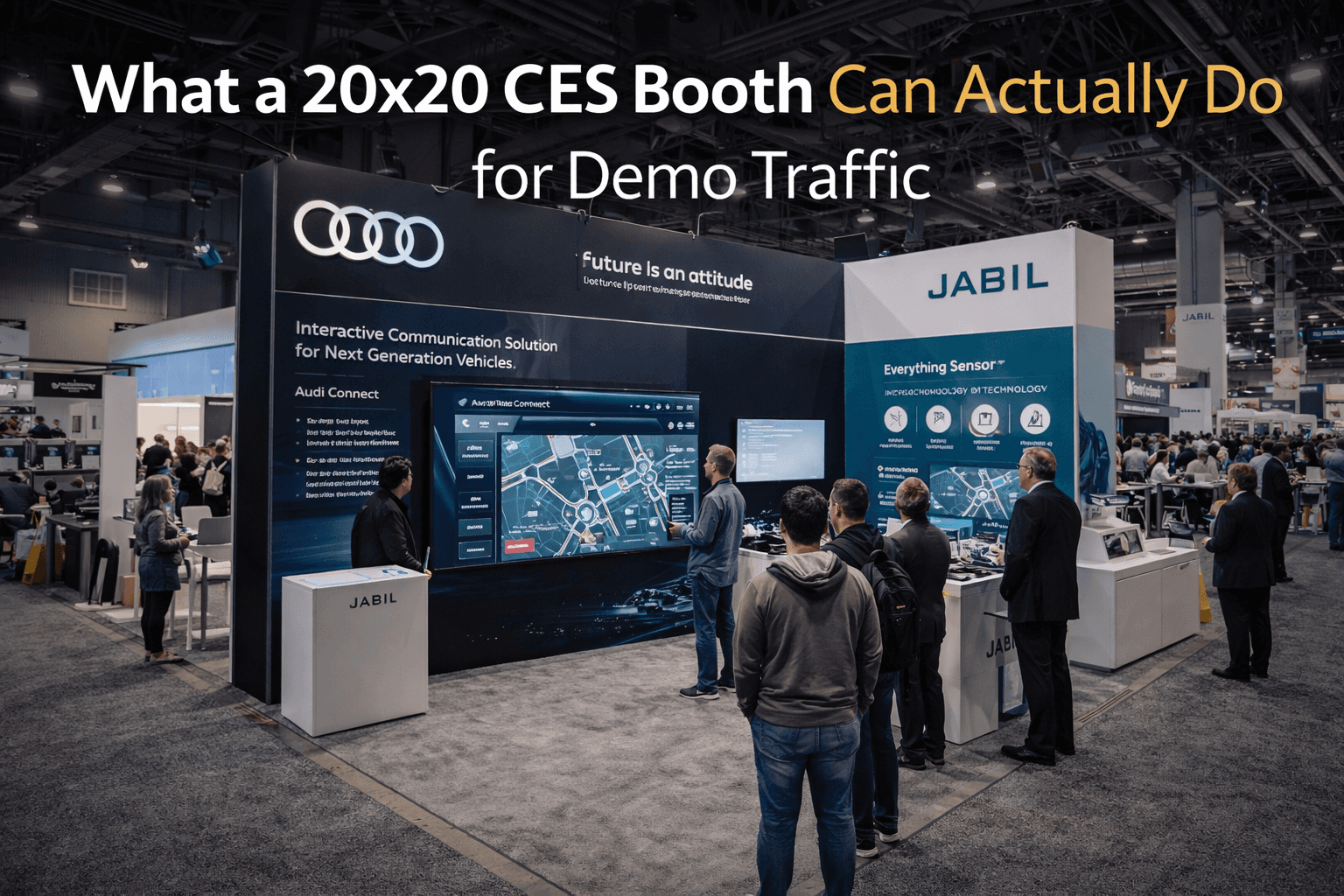
That is why booth size matters more at CES than many exhibitors expect. A small booth can still look sharp, but once live product demos, staff interaction, screens, and visitor movement all happen at the same time, the space often starts competing with itself. This is one reason exhibitors planning for CES in Las Vegas often find that a 20x20 trade show booth changes more than just footprint. It changes traffic behavior.
A 20x20 booth is often the first size that creates real spatial separation between the demo area and the conversation area.
That separation matters. In a smaller booth, people who stop to watch the demo are usually standing in the same zone where staff are trying to answer questions, qualify leads, or explain product details. The result is familiar: the booth feels active, but not organized. Visitors hover at the edge. Staff talk over the demo. Interested attendees step aside because there is no clear place to stay. The booth may attract attention, but it does not always convert that attention cleanly.
A 20x20 layout often solves that by creating three layers instead of one. First, there is the aisle-facing read, where visitors understand the product category and decide to slow down. Second, there is the live demo zone, where the product gets shown or tested. Third, there is the follow-up edge, where real conversations can continue without interrupting the main viewing area. That is usually the point where demo traffic starts feeling controlled instead of crowded.
This is especially valuable at CES because many booths are trying to present products that are not self-explanatory from a distance. Software, platforms, devices, connected systems, AI tools, health tech, smart home products, and workflow solutions often need both message clarity and a visible proof point. If the booth is too compressed, the visitor has to decode everything at once. If the booth has enough room to stage the interaction properly, the message lands faster and the demo becomes easier to follow.
That is where a 20x20 footprint starts doing real work. It gives the booth enough width to create a cleaner entry path and enough depth to stop the demo from collapsing directly into the aisle. Visitors can watch without blocking each other. Staff can engage without stepping into the flow line. The booth starts to feel like it has a front, a center, and a next step.
This is also why 20x20 booths often perform better for brands that need both screens and human interaction. If the screen wall, product counter, and staff conversation zone all share the same few feet of space, the demo can become visually noisy very quickly. In a better 20x20 layout, the screen becomes the main visual anchor, the product touchpoint sits where it can be approached naturally, and the staff discussion area stays close enough to support the interaction without overwhelming it.
Graphics play a big role here too. A booth this size only works well when the message is clear enough to help traffic organize itself. Strong graphics and brand presentation help visitors understand what the demo is about before they fully step in. That reduces hesitation at the aisle edge and makes the booth easier to enter. When the graphics are vague, even a good 20x20 can start feeling uncertain because visitors do not know whether they should stop, watch, or keep moving.
Another advantage of the 20x20 size is that it can create a more natural presentation rhythm. The booth does not need to look large to feel structured. It just needs enough room to let one thing happen before the next. The visitor sees the message, watches the demo, then steps into the conversation. That sequence sounds simple, but it is one of the biggest differences between a booth that feels smooth and one that always feels like it is recovering from its own traffic.
This is why a 20x20 booth can be such a strong planning size for CES. It often gives exhibitors enough room to stop designing around pure compression and start designing around behavior. That is a very different mindset. Instead of asking how much can fit, the better question becomes how traffic should move.
The answer is rarely about adding more furniture or more screens. It is about giving the booth just enough space to separate functions. Demo traffic should not fight sales conversations. Staff should not have to stand in the main viewing path. People should not need to guess where the presentation starts. Once those issues are solved, the booth feels more premium, even without becoming larger.
That is also why many CES exhibitors benefit from planning the footprint together with a Las Vegas trade show booth builder instead of treating size as a simple budget choice. The booth size affects entry, circulation, viewing angles, equipment placement, graphics hierarchy, and install logic all at once. A 20x20 is not just a measurement. It is often the first footprint where traffic can be intentionally shaped instead of merely absorbed.
At CES, good demo traffic is not just about pulling people in. It is about making the booth easy to read once they arrive. A 20x20 booth often works because it gives the brand enough room to separate attention from explanation and explanation from conversation. That is where the booth starts working like a system instead of a crowded stage set.
Planning a booth for CES in Las Vegas?
Start with CES booth planning, then see how a 20x20 trade show booth can create cleaner demo flow, better traffic separation, and stronger on-floor conversations.


