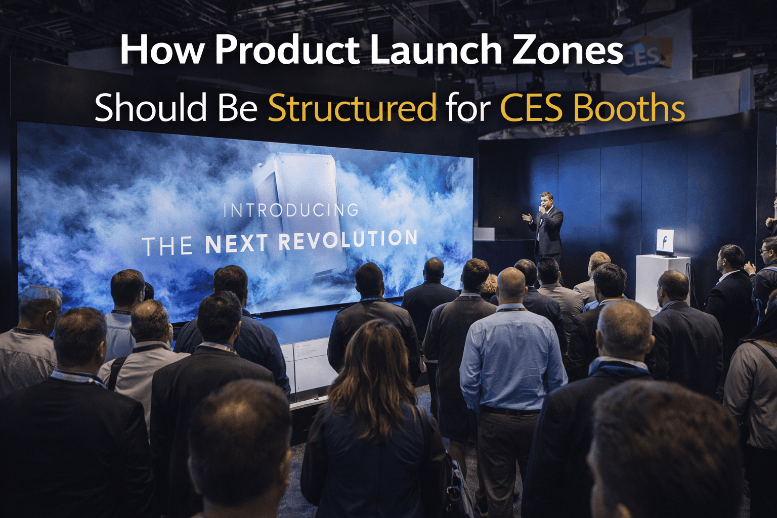
A lot of CES launch booths look busy before they look clear.
That is usually the first problem.
When a company is preparing to launch a product at CES, there is a natural instinct to make the booth feel bigger, brighter, louder, and more dramatic. Sometimes that helps. More often, it creates a zone that pulls people in but does not tell them what to focus on once they arrive.
A launch space should not just create attention. It should control attention.
That is what separates a real product launch zone from a booth that simply has a large screen and a crowd in front of it. At CES in Las Vegas, visitors move quickly and make fast decisions. If the reveal area does not have structure, the booth can fill up without actually delivering a strong product moment.
The first thing a launch zone needs is a clear reveal order.
People should know, even if only subconsciously, what they are meant to see first, what comes second, and where the deeper explanation happens after that. Without that order, the booth starts competing with itself. The screen is trying to lead. The presenter is trying to lead. The product pedestal is trying to lead. The graphics are trying to lead. The crowd ends up seeing everything at once and remembering less of it.
A better launch zone usually works in layers.
The outer layer gets the stop. This is where the headline, brand signal, or visual motion tells people something important is happening. The middle layer carries the reveal. This is the point where the product, main screen content, or live presentation takes over. The inner layer handles follow-up. That is where people move once they want more detail, a closer look, or a conversation with the team.
If those three layers collapse into one, the booth starts feeling crowded even when it is not full.
That is why launch planning is really a layout question before it is a production question. The reveal moment needs enough room to be seen, enough distance to be read, and enough control that staff are not fighting the audience flow while the product is being introduced. A booth can have a great launch asset and still underperform if the viewing position, traffic line, and follow-up space are all stacked into the same few feet.
This is one reason a 20x20 trade show booth often becomes the first footprint that can support a true launch sequence at CES. It usually gives enough room to separate the audience edge from the main reveal point and still leave space for product interaction or conversation after the initial stop. In a smaller booth, the launch often becomes a short burst of attention with nowhere for that attention to go next.
The screen strategy matters too, but not in the way many teams think.
A launch zone does not need the most content. It needs the clearest content hierarchy. One dominant visual layer should carry the reveal. Supporting screens or side panels can reinforce the message, but they should not compete with the main moment. If everything in the booth looks equally loud, the product launch starts feeling like general booth activity instead of a structured introduction.
That is also where graphics and brand presentation become part of the launch system. Graphics should not just decorate the reveal zone. They should help frame it. A visitor coming down the aisle should be able to understand the category, the promise, or the use case before the live presentation begins. The reveal should deepen the message, not rescue a weak first read.
The audience space needs just as much discipline.
A good launch zone gives people somewhere to stop without letting the crowd spread in every direction. If the booth has no controlled standing area, people collect at the aisle edge, block the approach, and weaken the visibility of the actual reveal. If the booth has too much empty space with no defined audience shape, the energy falls flat because the launch moment has no center. The right setup usually feels open, but not loose.
That is why semi-contained audience space often works better than fully open presentation space. It creates enough structure for people to gather and watch, but it still lets the booth breathe. The goal is not to make the launch feel closed off. The goal is to keep the crowd from taking over the whole booth before the message lands.
Product launch zones also work better when the product itself is not doing all the explaining.
At CES, many launches involve devices, platforms, systems, or connected tools that are not instantly obvious from appearance alone. If the audience needs a long explanation before the value is visible, the booth is already behind. The reveal should show something meaningful quickly. The graphics should give context early. The staff should take people deeper only after the launch moment has done its job.
This is one reason many exhibitors benefit from planning the reveal zone with a Las Vegas trade show booth builder instead of treating the launch moment as a layer to add near the end. The size of the screen, the direction of the audience, the placement of the product, the amount of open floor, and the handoff into post-launch conversations all belong to the same layout logic. If those decisions are made separately, the zone often looks stronger in renderings than it feels on the floor.
The best CES launch booths usually do something simple very well. They give the product a clear first moment, a controlled viewing space, and a clean next step. They do not mistake noise for energy. They do not let the crowd write the layout for them. And they do not assume the screen alone will carry the whole reveal.
At CES, a launch zone should feel like a sequence, not a collision. If the reveal order is clear, the booth has a much better chance of turning attention into real interest instead of just creating a brief traffic spike.
Planning a booth for CES in Las Vegas?
Start with CES booth planning, then shape the reveal zone with a Las Vegas trade show booth builder approach that gives your launch more control, cleaner traffic flow, and a better product moment.


