
Why Demo Flow Matters at CES
CES booth traffic moves fast. Most visitors do not walk in ready for a long sales conversation. They stop, watch a demo, ask a quick question, and decide whether the product is relevant.
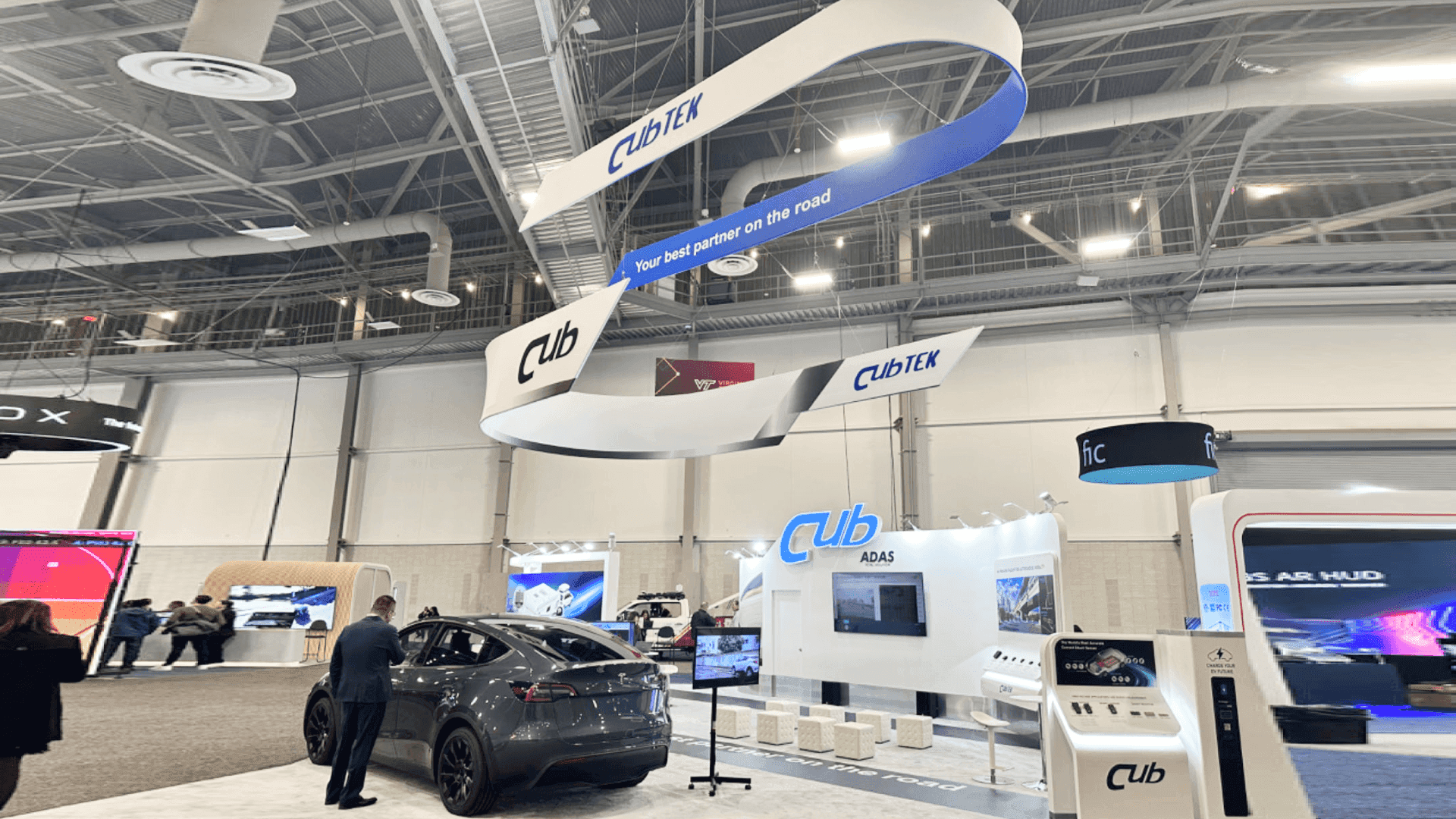
That is why a CES product demo booth should not place every activity in one crowded area. The booth needs a clear path from first attention to deeper follow-up. This is where CES demo booth layout and CES booth traffic flow matter more than adding more furniture.
Separate the Demo Zone from the Sales Conversation Area
The front of the booth should handle fast product explanation. This is where visitors see the screen, watch the demo, scan the product message, and decide whether to continue.
A strong front demo zone may include:
one visible demo counter
a screen or monitor wall
product interaction space
short stopping room near the aisle
clear graphics that explain the product quickly
staff positions that do not block entry
The sales conversation area should sit to the side or rear. It does not need to be hidden, but it should feel separate from the crowd around the demo. This zone can support lead capture, buyer questions, technical discussion, and follow-up planning.

A CES demo booth layout should keep fast product interaction near the aisle while giving qualified buyers a separate sales conversation area for follow-up.
CES Demo Zone vs Sales Conversation Zone
Booth Area | Main Purpose | Best Placement |
|---|---|---|
Front demo zone | Attract visitors and explain the product quickly | Aisle-facing side |
Product interaction point | Let visitors test, touch, view, or understand the product | Near the front, without blocking entry |
Screen area | Communicate fast product value | Visible from the aisle |
Sales conversation zone | Move qualified visitors into deeper discussion | Side or rear area |
Buyer follow-up area | Capture details and discuss fit | Away from the demo crowd |
This table helps define the live demo traffic flow before the booth layout is finalized.
Booth Graphics Should Guide the Visitor
Graphics should help visitors understand what the product does before the demo starts. In a busy CES technology booth, visitors do not have time to read long explanations.
The demo zone should use simple product messaging. The sales zone can support proof points, use cases, technical details, or buyer-specific information.
That is why graphics and brand presentation support should be planned around booth behavior, not just visual style. Good graphics help visitors know where to look, what to ask, and where to go next.
20x20 CES Product Demo Booths
A 20x20 CES booth can work well when the demo is focused. It should not try to do too much.
A practical 20x20 layout may include one main demo counter, one screen area, hidden storage, and a compact sales conversation zone. For a compact CES booth live demo, the product explanation should stay close to the aisle, while deeper buyer conversations sit slightly behind it.
Good 20x20 booth planning usually means fewer zones, clearer movement, and stronger control over the first demo moment.

A 20x20 CES product demo booth can support one focused live demo, a screen display, compact storage, and a short sales conversation zone when the layout stays simple.
20x30 CES Product Demo Booths
A 20x30 CES booth works better when the demo needs more space. This may include two product stations, a larger screen wall, more staff positions, or a clearer split between public demo traffic and buyer follow-up.
Compared with a 20x20 booth, a 20x30 layout gives technology exhibitors more room to separate live demo traffic from sales conversations without making the booth feel crowded. This makes the 20x30 footprint useful for product demo booth layout planning when exhibitors need both public interaction and private buyer follow-up.
For larger demo layouts, 20x30 booth planning can help connect product interaction, screen placement, storage, staff movement, and meeting space in one booth footprint.
A 20x30 CES product demo booth gives exhibitors more room to separate public demo traffic, screen content, staff movement, storage, and buyer follow-up.
Screen Placement Can Make or Break the Flow
Screens should support the visitor path, not block it.
A screen placed too deep inside the booth may not attract enough aisle traffic. A screen placed too close to the front can create a crowd that blocks entry. The screen should help visitors understand the product, then guide qualified buyers toward the next conversation.
Before finalizing the layout, exhibitors should ask:
Can visitors understand the product from the aisle?
Can staff explain the screen without blocking entry?
Can qualified buyers move from the demo area into a conversation zone?
Is storage hidden from the visitor path?
Are graphics helping the demo or adding visual noise?
For broader show context, exhibitors can also review CES booth planning before finalizing booth size, demo flow, and show-site setup.
FAQ
What should a CES technology product demo booth include?
A CES technology product demo booth should include a clear product interaction point, visible screen hierarchy, aisle-facing messaging, staff access, lead capture, storage, and a separate area for qualified sales conversations.
How should live demo traffic be managed in a CES booth?
Live demo traffic should stay near the front or aisle-facing side of the booth, where visitors can stop briefly, understand the product, ask a quick question, and move without blocking deeper sales conversations.
Is a 20x20 booth large enough for CES product demos?
A 20x20 CES booth can work when the exhibitor needs one focused demo counter, one screen area, compact storage, and a short sales conversation zone.
When should exhibitors choose a 20x30 booth for CES?
A 20x30 booth works better when the demo needs multiple stations, a larger screen wall, more staff positions, or a clearer separation between demo visitors and qualified buyer conversations.
Why does CES demo booth layout matter for technology exhibitors?
CES demo booth layout matters because technology exhibitors often need to explain a product quickly, manage short visitor stops, capture leads, and move serious buyers into a clearer follow-up conversation.
Related Planning Links
For exhibitors planning a similar CES booth, these pages connect live demo traffic with booth size, graphics, show context, and layout planning:
CES technology product demo booth planning
Use this page when the booth needs live demos, product interaction, screen support, and a clear path from first interest to buyer follow-up.
CES booth planning
Use the main CES planning page to connect booth layout decisions with event context, booth size, and show-site setup.
20x20 booth planning
Use this size page when the booth needs one focused demo area, compact storage, branded graphics, and a small sales conversation zone.
20x30 booth planning
Use this size page when the booth needs more separation between live demos, screen content, staff movement, and buyer follow-up.
Final Takeaway
A strong CES product demo booth does not push every visitor into the same path. It gives fast demo traffic a clear place to stop, gives qualified buyers a place to continue the conversation, and helps staff move people from first interest to follow-up without crowding the booth.
For technology exhibitors, the best layout is not always the one with the most furniture or the largest screen. It is the one that makes demo traffic, product explanation, lead capture, and sales conversation work together.


