Why SEMA Booth Design Needs One Clear Product Priority
At SEMA, many booths try to show everything at once: parts, tools, accessories, equipment, performance components, mobility technology, and full aftermarket product categories. The challenge is not always the number of products. It is the lack of order when every item asks for the same attention.
A stronger SEMA booth design starts by choosing one lead message. That may be a performance system, a tool line, an accessory category, a parts collection, or a mobility technology platform. Once that priority is clear, the rest of the booth can support it instead of competing with it.
That product hierarchy gives the booth a clearer reading order. The strongest message gets the first sightline, secondary products add context, and the booth team has a cleaner starting point for questions. Each supporting display should answer the next question created by the main message rather than introduce a separate story.
When the main display is an actual vehicle rather than a product category, SEMA vehicle display booth planning needs to account for placement, sightlines, surrounding products, and visitor clearance before the rest of the display is finalized.
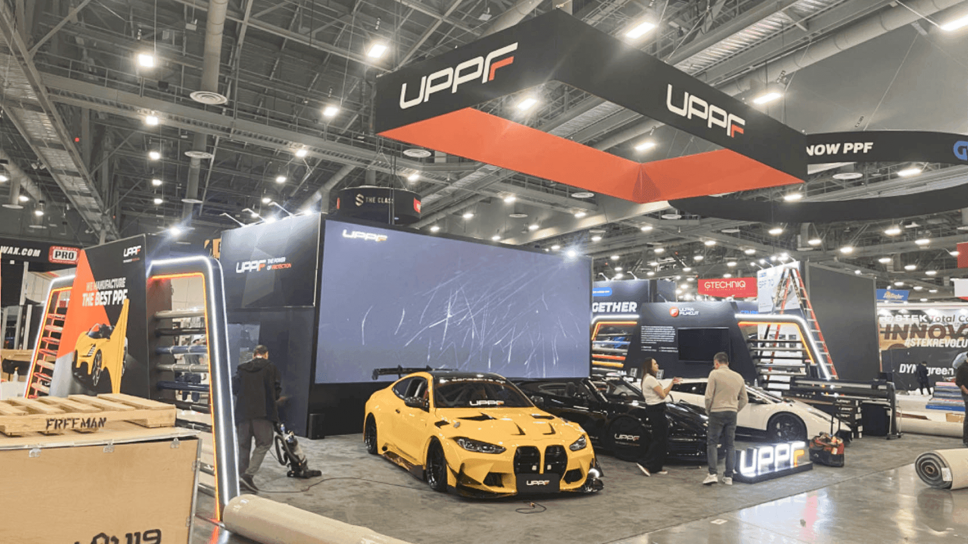
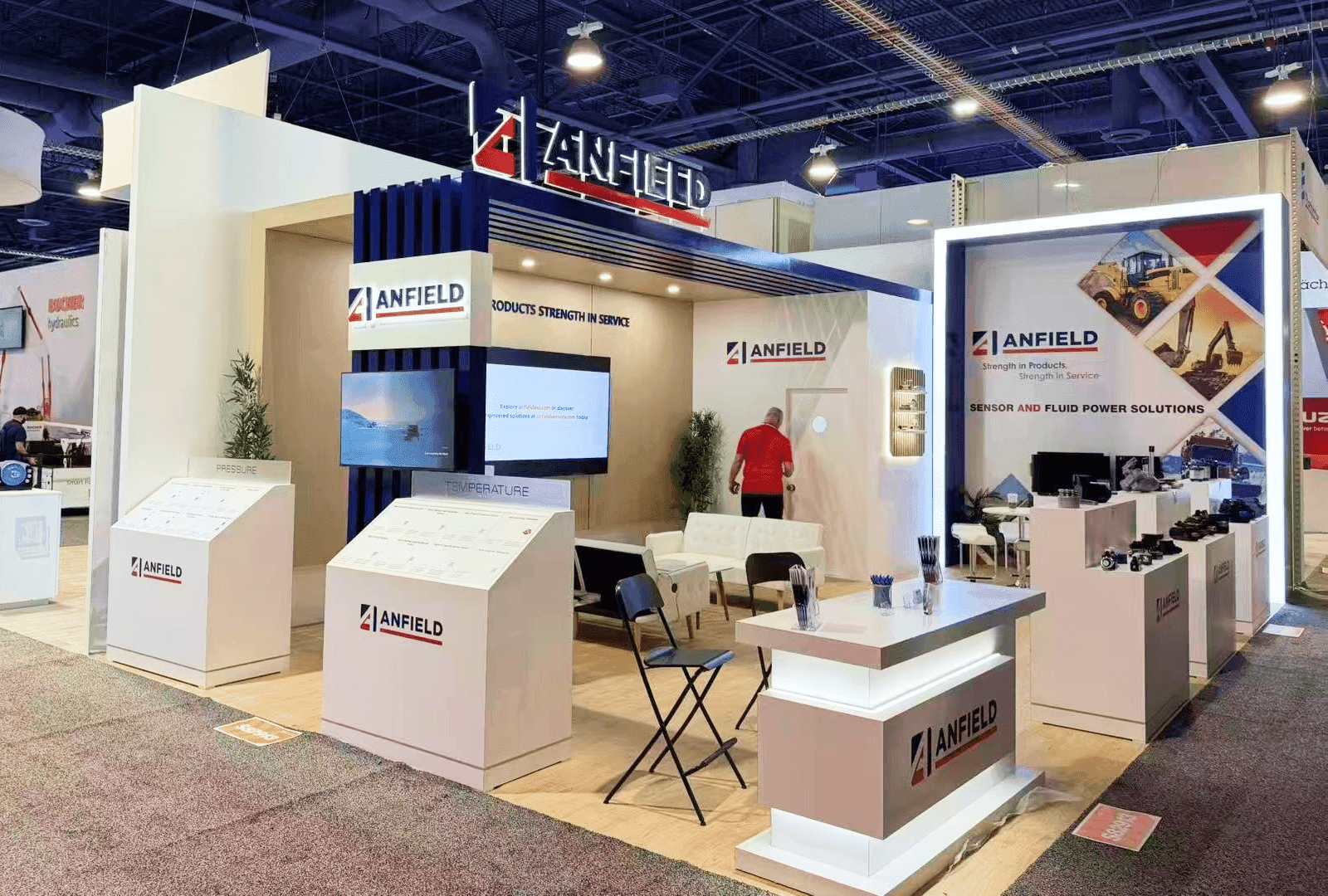
A SEMA booth layout should make the main product message easy to read from the aisle before buyers step inside.
Graphics Should Make the Booth Easy to Read From the Aisle
On a crowded SEMA floor, booth graphics act as the first filter. Buyers are moving quickly, so the first message should tell them what they are looking at before they reach the booth: parts, tools, accessories, equipment, performance components, mobility technology, or another aftermarket product line.
The strongest aisle-facing graphic should carry the product category or core offer, not every feature. Once buyers step closer, smaller labels, demo-area visuals, and short product cues can explain the differences between product lines without making staff repeat the basics.
That layer of clarity helps buyers find the right area faster, compare products with less friction, and begin the conversation with a more specific question. The graphic hierarchy should follow the physical display: main offer first, product category second, and technical detail closer to the point of interaction.
Plan Buyer Flow Before Adding Visual Impact
A SEMA booth can look strong from a distance and still lose buyers once they reach the aisle. Exhibitors need to decide where the first visual cue leads and what visitors encounter next.
The layout should create a simple path from product interest to a useful conversation. A buyer may notice a category label, move closer to a product wall, pause at a demo counter, ask a technical question, and then continue through the booth without cutting across another discussion. Each stop should make the next step easy to understand rather than forcing visitors to search for where to go next.
Clear entry points, visible product categories, and planned pause areas help visitors move through the exhibit without feeling blocked or trapped. If product zones, staff access, storage, and open circulation begin to compete for space, a SEMA 30x40 booth layout can separate those functions more clearly.
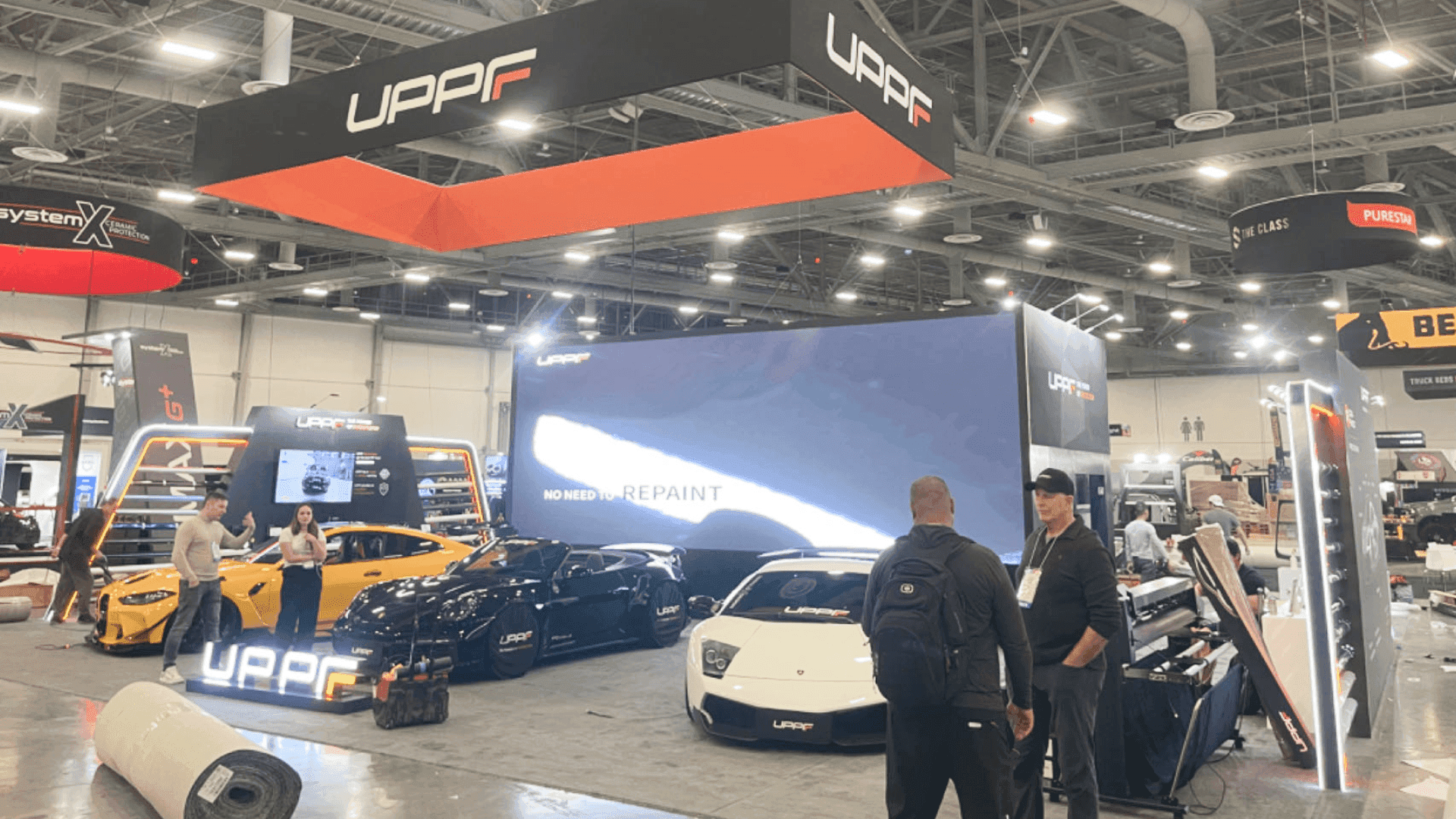
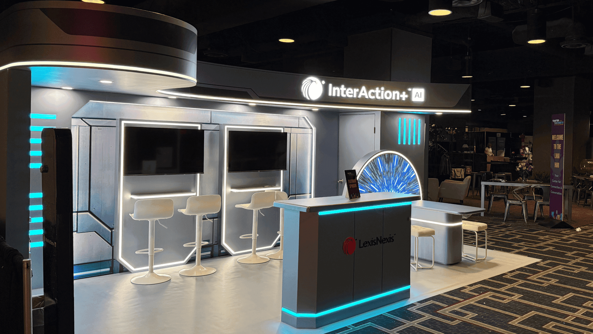
Product walls, demo counters, graphics, and staff positions should support one clear product priority on the show floor.
Staff Conversations Need a Defined Place
At SEMA, a buyer question can happen quickly. Someone may notice a product label, step closer to a demo counter, point to a part, and ask for a comparison before moving on. Without a clear place for that exchange, staff can end up standing in the aisle or blocking the product view.
A demo counter, product explanation area, or small discussion zone gives the team enough room to answer questions, show details, and hand off materials without turning every conversation into a formal meeting.
Staff access matters too. The team needs to move between product zones, counters, and storage without cutting through buyers or interrupting another discussion. When those conversation points are planned, the booth feels more open and visitors know where to pause when they are ready to talk.
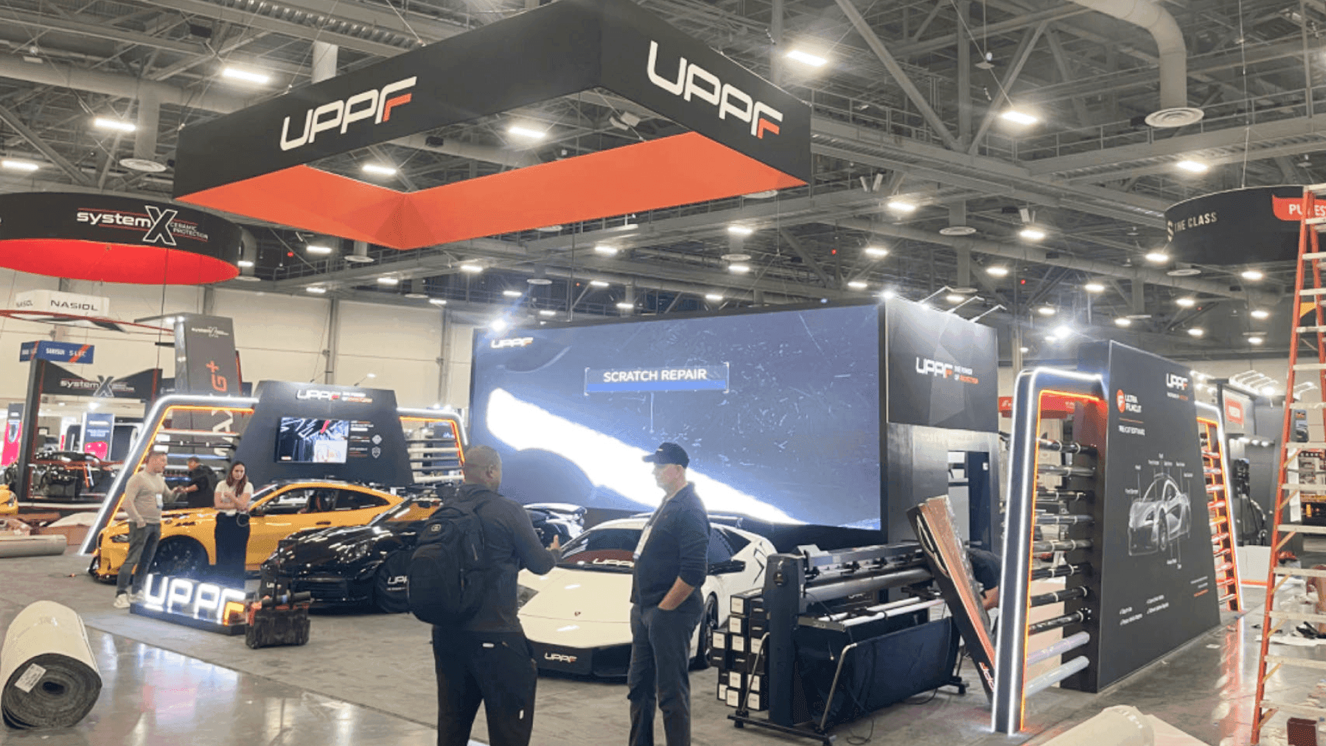
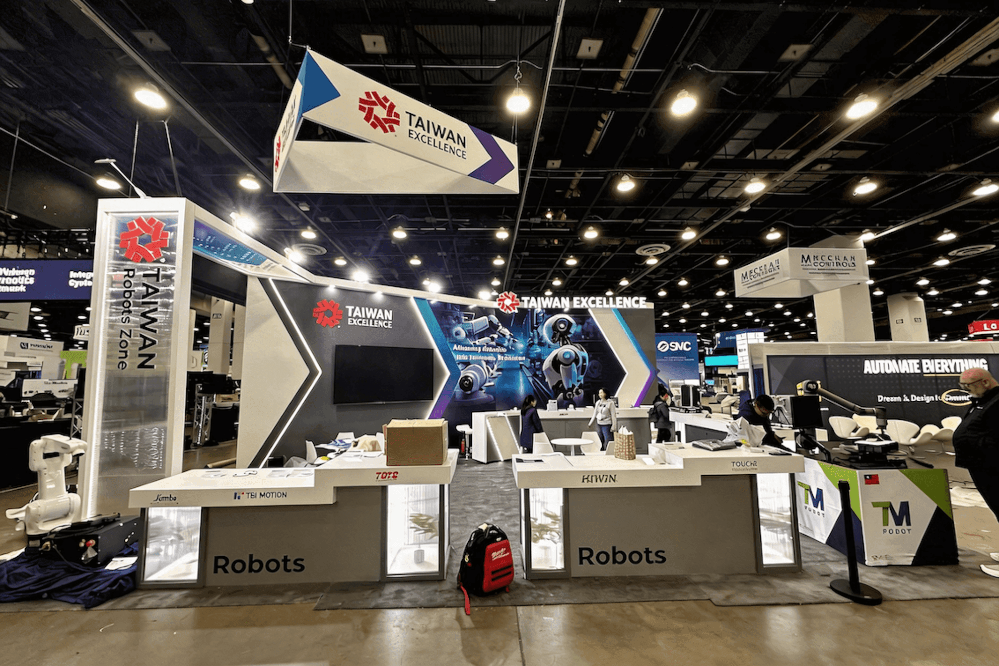
Aisle-facing graphics help buyers identify product categories, compare options, and start more focused booth conversations.
SEMA Booth Design Checklist
Make sure the main product message is clear from the aisle.
Decide what buyers should notice first: a product category, performance system, tool line, parts collection, or mobility technology.
Keep secondary products visually connected to the main offer instead of competing with it.
Use aisle-facing graphics to separate product categories quickly.
Plan where buyers will pause, ask questions, and return to the aisle.
Leave enough room for demo counters, staff access, storage, and short product conversations.
Avoid filling every open corner if it weakens visibility or buyer flow.
If freight, drayage, or LVCC setup starts affecting the layout, those constraints should be coordinated with the SEMA booth installation plan.
Final Planning Note
SEMA booth design works best when visitors can read the exhibit in order: the main product first, supporting categories second, and the right place for questions when they want to stop. The booth does not need to explain everything from the aisle; it needs to make the next step obvious.
The broader SEMA booth planning page covers event-level decisions such as booth size, floor plan, related planning scenarios, and Las Vegas show-floor execution.
FAQ
What makes SEMA booth design different from general trade show booth design?
SEMA booth design has to make automotive products easy to understand in a crowded, fast-moving show environment. Buyers may be comparing parts, tools, accessories, equipment, performance components, and mobility technology quickly, so the booth needs a clear product priority, visible category structure, and a natural path from first look to product conversation.
How should exhibitors decide what to show first in a SEMA booth?
Start with the product or category buyers need to understand first. That may be a performance system, tool line, accessory group, parts collection, or mobility technology platform. Graphics, demo counters, secondary products, and staff positions can then support that lead message rather than compete with it.